Stack sub headings in mega menu

Hi there,

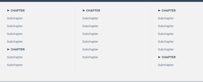
I'm creating a site, based on a facts book, that has 11 chapters and 45 sub chapters - all of which should be visible when opening the menu. To accomplish this I've created a mega menu. Having 11 columns doesn't really make any sense though. It doesn't look good from a horizontal perspective, nor does it look good from a vertical perspective seeing as some chapters only have one sub chapter whereas some have 6 sub chapters.

I solved this issue by having two or three chapters in some of the columns. To have them look the same as the top menu option I added som text effects. See image below.

image

I thought I solved it. It looks really great and I can fit the massive amount of menu options all within the mega menu. Then I resized the window and realize this looks crap on the mobile menu.

Is there any other way to solve my issue with stacking sub headings in a column in a mega menu, without sabotaging the mobile menu?

Is it possible to create a separate menu which is used in mobile mode (or browser width =< mobile resolution)?

Comments

  • HI,
    could you send a link so we can take a look?
    thanks
  • Is it possible to send the link through a private message or email? The site is being built for a commercial book and I do not want to publish the link in public.
  • Please send it here, we will delete it asap.
  • edited November 2017
    Okay, link below. Please delete asap. So the issue is now solved on mobile, where I get the my secondary menu "MenuMobile" when I browse the page from my phone.

    The problem then is when viewing on desktop below 1150 width (when mega menu is replaced by side menu). I want the "sub chapters" to behave as the main chapters do.

    The issue is as following:

    - Chapter
    Sub
    Sub
    - Chapter
    Sub
    Sub
    -Chapter
    Sub
    Sub
    - Chapter
    Sub
    Sub
    Sub
    - Chapter

  • The only thing we can suggest is setting the responsive menu breakpoint to a higher value.
    You can set it in theme options>responsive>header, it is the initial width option.
  • Oh ok. I see, there are three menus now.

    > 1150 shows megamenu
    > 768, < 1150 show mega menu content but on the side
    < 768 shows mobile menu

    What you are suggesting above only affects the break point between mega menu (which needs to break at 1150 or else the full mega menu won't show) and mega menu content but on the right side.

    How would you go about increasing the < 768 mobile menu break point to 1149?

    Best regards
  • See image for what I need to increase to 1149 px
    image
  • Sorry but this is not possbile for now, I have contacted with the dev team. We will work on this. For now you can choose only 1 custom menu for the mobile version.

Sign In or Register to comment.