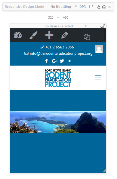
Header Background Image Size on Mobile
On my site http://lhirodenteradicationproject.org I have used body:not(.template-slider):not(.header-simple) #Header { min-height: 450px; } to set the header height to 450px, however on mobiles and tablets I would like it to able to specify a set height or re-size responsively (not 450px as per picture) along with using contain.
Example page to test with http://lhirodenteradicationproject.org/lord-howe-island/

Any help would be appreciated.
Thanks!
Comments
have you tried wrapping your element in @media queries?
Also is there a way to change the gallery to make it the full width of the column on that line (so the next P tag sits below it), and also center the images and caption:
Thanks,
Ryan
You can also try to set the background position to bottom.
Please try to use our gallery item. If you want to use the default wordpress gallery then please set the number of rows to 3 and you will have to make the thumbnails images larger to do this:
2. To change the size of the default WordPress gallery images, please go to settings>media. Notice! Remember to use thumbnail regeneration after you make your changes. Otherwise, the images will not change their size. thanks