
Font responsiveness issue within the title of accordion entries

Dear supporters,
while building a website on BeTheme I ran into a font responsiveness issue within the title of accordion entries. To adjust the size and style of the font (and colors while active / inactive) I have used some custom CSS (partially based on what I have learned from earlier discussions in this forum):
.accordion_wrapper .question .title{
font-size: 18px !important;
font-optical-sizing: inherit !important;
font-weight: 400 !important;
color: #951b81 !important;
}
.accordion_wrapper .active .title{
font-size: 18px !important;
font-optical-sizing: inherit !important;
font-weight: 400 !important;
color: #ec6608 !important;
}
Please note that 18 px is the font size, I use for regular content (<p>CONTENT</p>).
The font sizes which one defines in BeTheme's options (<p>,<h1>...<h6>) do behave responsively, i.e. they scale down on mobile phones. Unfortunately, the font size of the titles of accordion entries titles does not. To illustrate the issue, I add screenshots from a desktop client (Google Chrome on Kubuntu 18.04) and a mobile client (Google Chrome on Android 10, namely a Nokia 7.2 phone).
Here comes the desktop screenshot:

And here the mobile phone screenshot:
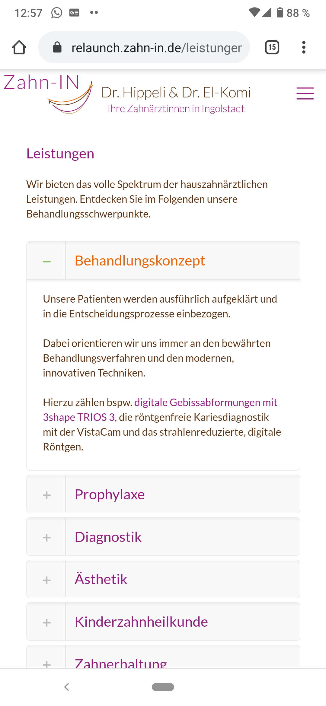
As you can see, the content within and outside the accordion scales properly on the mobile phone, so does <h1>Leistungen</h1>. However, the accordion's entry titles do not scale (e.g. "Behandlungskonzept", "Prophylaxe", ...) making them look somewhat overgrown in that context.
The non-responsiveness of the accordion's entry titles is not a result of the custom CSS, it stays the same when the custom CSS is put in comments (/* ... */), just with BeTheme's default colors, font sizes and styles.
For BeTheme obviously brings mechanisms to be responsive in terms of font size I would like to know, if there is a way to put them in effect for the font size of the accordion's entry titles.
Sorry for the very exhaustive post. I just like to make the problem very clear.
If there are any questions, I will most happily respond.
Thank you very much in advance.
Best regards,
Christian
Comments
Hello,
In that case you can use Custom CSS with media queries.
Your CSS Code should look like this:
@media only screen and (max-width:767px){
   .accordion_wrapper .question .title{
 font-size: 14px !important;
 font-optical-sizing: inherit !important;
 font-weight: 400 !important;
 color: #951b81 !important;
}
.accordion_wrapper .active .title{
  font-size: 14px !important;
  font-optical-sizing: inherit !important;
  font-weight: 400 !important;
 color: #ec6608 !important;
}
}
As you can see with this media queries this Custom CSS will affect only screens below 767px. In brackets you can use any values you want or you can combine max-width with min-width like this: (max-width:767px) and (min-width:400px).
Thanks
Dear Phil,
thank you so much for your quick and helpful response.
Albeit I need to refine the settings (the theme does not seem to scale the fonts in some sort of binary logic [desktop vs. mobile] but in multiple steps - I can figure out the limits using the DevTools within Google Chrome), the general approach just works beautifully.
Regards,
Christian