Muffin Builder and Visual Composer - same element, different look
Hello there,
On my website, I use both, Muffin Builder and Visual Composer.
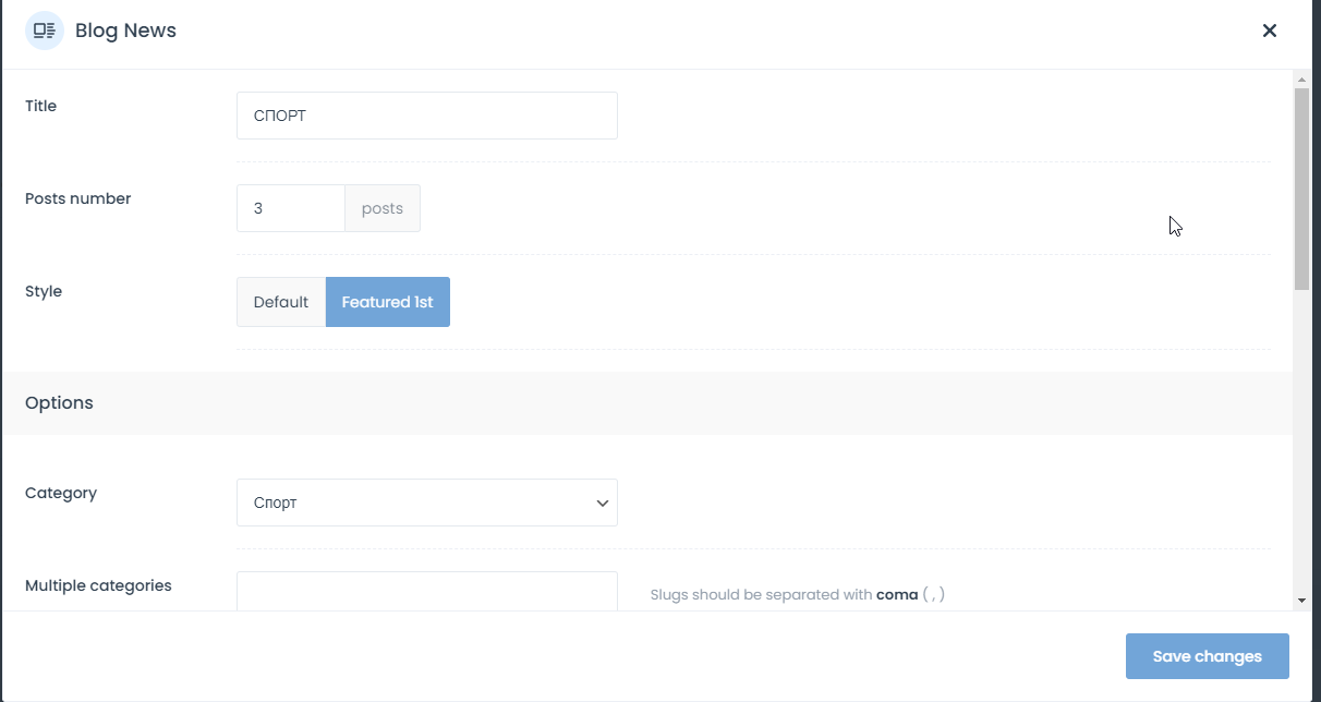
I have the same setup at both builder, here is Myssin Builder example:
And here is the Visual Composer setup:
I will like to make elements created via Visual Components, look the same as elements created via Muffin Builder.
Is it possible in this case?
Best Regards


Comments
Hello,
If you would like to have the Lastest news like in the Muffin Builder, you will have to put the following shortcode into the text column.
https://themes.muffingroup.com/be/theme/shortcodes/loops/#blognews
Thanks
Thank you!
The link is not working.
I will create this short code and update this post.
I hope a new update for Visual Composer will be out soon.
Regards
UPDATE:
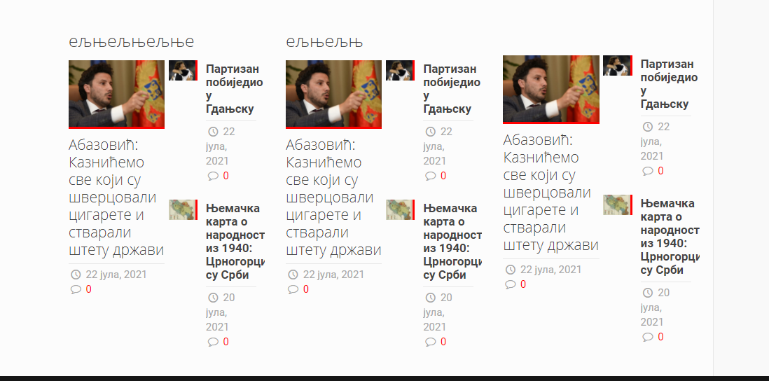
I have add shortcode and my blog box look like this:
I have try with this code:
I will like to have this look at my blog:
Best Regards
Oh, sorry, please check the following link instead:
https://muffingroup.com/betheme/elements/blog-news/
Thanks
Hello Phil,
Thank you for your reply.
I have try examples that you send me:
But still, these boxes look like this:
I will like to get this look:
Best Regards!
Please, put the following code in the Betheme -> theme options -> custom CSS & JS -> CSS, and check if the display suits you.
.Latest_news.featured ul{
   width: 100%!important;
}
Thanks
Thanks!
That help a lot.
This is how it look now:
and this is how it look with muffic builder:
Only problem now is number of comments.
Can i fix that to?
Thanks
Please, attach a link to your website, so I could take a closer look at it.
Thanks
Hello,
Here is my web site> https://cutt.ly/5Q307Vf
Please scroll down to button,
First part of website is made with Muffin Bulder, second part is made by Visual Composer.
Please, use the following code:
.Latest_news ul li .desc_footer .date{
   margin-right: 0 !important;
}
Thanks
Perfect!
Thanks!
Hello,
It is working fine at first 2 boxes, but last box is not fine:
Here is my web site> https://cutt.ly/5Q307Vf
Regards
Hello,
Please use this CSS code, it will decrease a font size a little bit to make it fit in one line:
.Latest_news ul li .desc_footer .date{ font-size:13px !important; }thanks