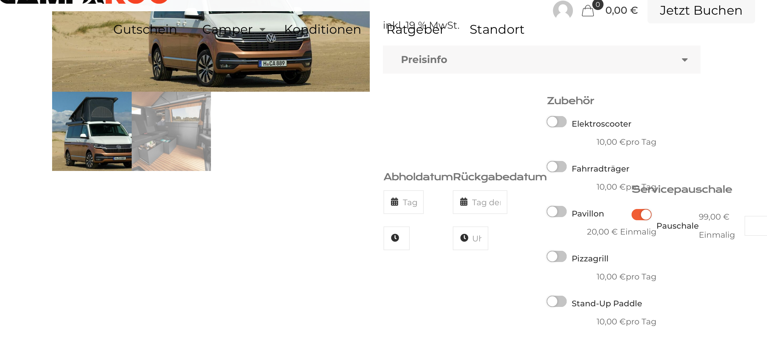
Page Format has changed after Betheme Update
Hi,
after an update of Betheme our format was destroyed as you can see from the screenshot below.
We are using the Plugin "WooCommerce Rental & Bookings System".
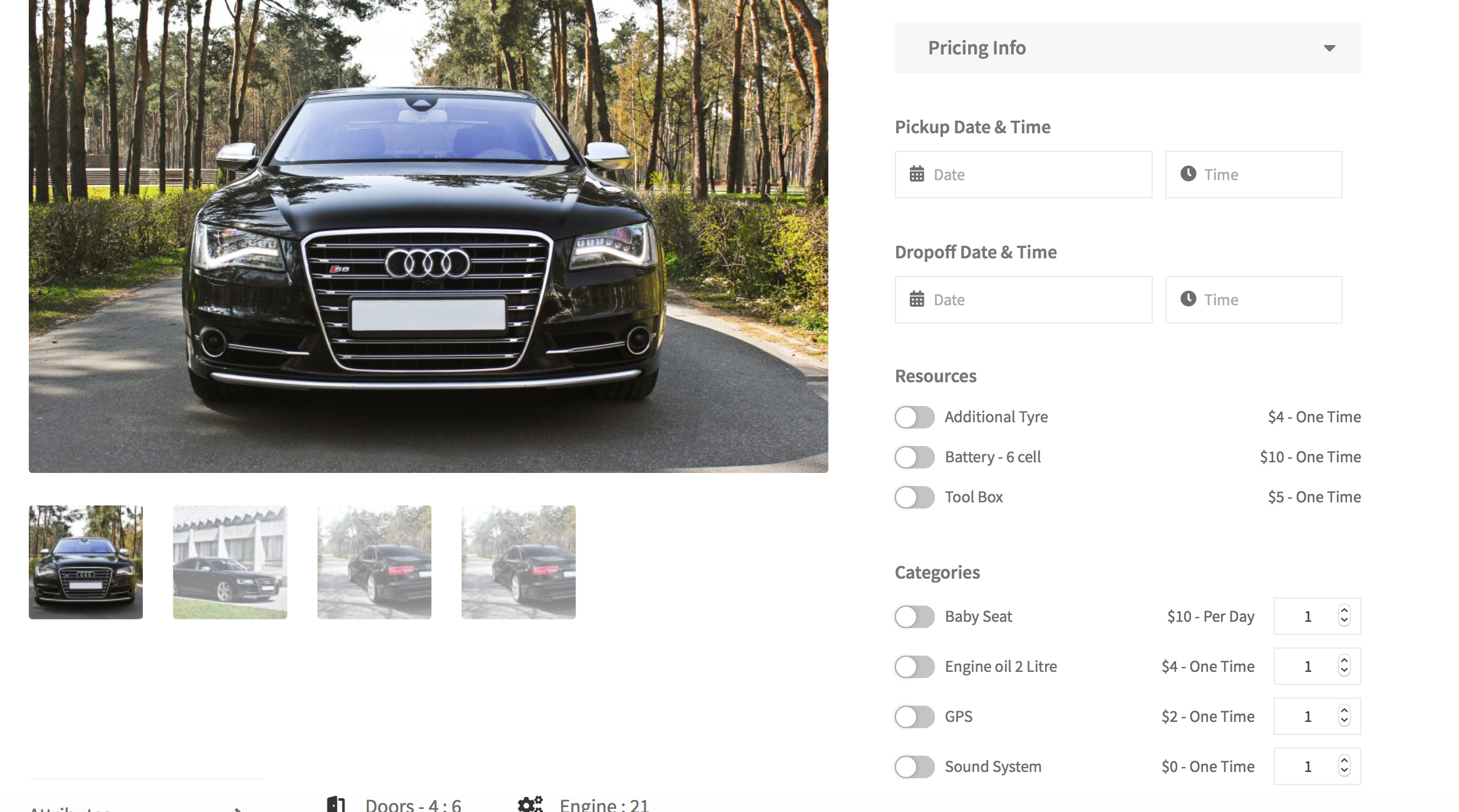
Can you please help us to get the correcting formatting back? Before the update it looked like in the other screenshot below.
Could you please help us out? Maybe this is not this complicated as we think it is.
Thanks in advance for your support.
Best Regards
Roman


Comments
Hello,
Please, go to Betheme -> Theme options -> Shop -> General, and Disable the Custom Variation Swatches option. After that check, if the problem persists.
Thanks
Thanks for you comment, but it doesn't work.
It's the same like before.
Maybe another option to fix this problem?
Kind regards
Roman
Please attach a link to your website so we can check it out. If the page is offline(localhost), then our help will be limited. You will have to contact us when the page is online. Also, please make sure that the page is not under maintenance before you provide us with the link.
Thanks
Hi, here is the link to our homepage, esp. to the page which we are talking about.
http://camparoo.de/product/tokyo/?preview_id=221&preview_nonce=ea920cd82d&_thumbnail_id=187&preview=true
Please, put the following CSS code in Betheme -> Theme options -> Custom CSS & JS -> CSS.
.woocommerce .product div.entry-summary .cart{
   flex-direction: column!important;
}
Thanks
It's quite better than before, but still not like before the update. See screenshot attached.
Unfortunately, I cannot help you more, because we do not support this plugin.
We cannot recommend any plugins other than the ones we support. You can find the list on this page, in the sidebar:
https://themeforest.net/item/betheme-responsive-multipurpose-wordpress-theme/7758048
and here:
https://muffingroup.com/betheme/#plugins
Best regards
Hi Phil,
we tried to find a solution so that our Plugin "WooCommerce Rental & Bookings System" works with Betheme, but after your Betheme Update we couldn't find any solution. :(
Can you recommend any other Plugin for Rental & Booking which is supported by Betheme?
Otherwise we would have to change the theme, although we are not willing to change it, because we are satisfied with your theme.
We would really appreciate your help.
Unfortunately, I cannot recommend any plugins.
You can try to replace the previous code I have sent you with the following one, and check if the display is better.
.woocommerce .product div.entry-summary .cart{
  flex-direction: column!important;
  align-items: normal!important;
  margin-right: 15px!important;
}
Thanks
Hi Phil, thanks a lot the layout is now like we would like to have. Thanks. We really appreciate it.
We have one question. Is it possible to move the description section (see screenshot attached) from the lower right corner directly below the pictures?
Like in this preview: https://preview.redq.io/rnb/shop/seasonal-pricing/
The support from the plugin owner (RedQ) told us we have to clarify this issue with the betheme support, because this comes from the theme itself. Maybe you can help us here as well.
Thanks a lot
Regards
Roman
I can see that the layout of your product has changed.
Do you still need help with that?
Best regards
Hi Phil, thanks for your answer, but this is not our layout. This is the example of the plugin owner. We would like to have like this.
Our product page looks like the following:
Thanks in Advance for your help. We really appreciate it.
Regards
Roman
Hi Phil, we have found a solution to put it in the correct position. For know we don't have a question. In case we need help we will get in touch with you again. Thanks a lot.
Regards
Roman
You are welcome. ?
Best regards
Hi Phil, indeed we have another question. We would like to have a format which is more similar to our layout. As you can see the amount is quite unsatisfying:
Is it possible to put the amount more in one line and and in smaller numbers (Maybe also in our corporate orange). We tried to find anything in the Betheme Options, but nothing happened.
Example:
Thanks a lot.
Regards
Roman
You can try the following code:
.booking-pricing-info .booking_cost .woocommerce-Price-amount{
   float: right;
   font-size: 20px!important;
}
Thanks
Thanks a lot. For the product page it is working now.
But now we have a layout problem with the cart page. :(
Do you also have a code to fix this layout issue?
Thanks in advance
Regards
Roman
Please, disable the AJAX option from WooCommerce -> Settings -> Product because now I cannot add anything to cart, so I cannot see the cart layout.
Thanks
This box is disabled now. Could it be, that the product is shown as sold out? I don't know why, because it is the same inventory as for the Volkswagen T6.1.
But you can see and test the layout for the right one.
Thanks a lot.
Please, open the cart page edit, scroll to page options, set the Full width: Content only, and put the following code in the Custom CSS field.
@media only screen and (min-width:960px){
    .woocommerce-cart .variation dd{
     float: right!important;
  }
}
Thanks
Hi, thanks for the code. It is quite better now, but still not perfect. See Screenshot:
Maybe this can be solved if the Font size will be reduced?
Thanks a lot for your help. We really appreciate this.
Regards
Roman
You can try the following one:
.woocommerce-cart .woocommerce-cart-form table *{
   font-size: 13px!important;
}
And you are welcome. ?
Thanks
Thanks a lot. It looks quite better now.
I had to minimize the font size to 11px. But this works good for us now.
Thanks a lot. :)
Hi Phil,
we have the next format problem. :(
When we click on checkout after the cart page we also have a format problem, see the following:
Can you help us with your excellent support. :)
Thanks in advance.
Regards
Roman
Please, use this code:
.woocommerce-checkout .variation dd{
   float: left!important;
}
Thanks
Try this one instead:
.woocommerce-checkout .variation dd{
  float: left!important;
  margin-left: 10px!important;
}
Thanks
This is not really better. :(
Sorry, but unfortunately I cannot recommend anything else.
I suggest contacting a web developer, and with some more advanced CSS he should be able to help you.
Thanks
Hi,
could you please help us out?
We want to hide "100,00 € Unit Price". Could you please help us and show us where to hide? We also have this on all our other product pages and want to change it.
https://camparoo.de/product/vwbullidreamer/
On this page it is shown without the price, but we don't know where the difference is:
https://camparoo.de/product/vwbulliocean/
Thanks in Advance
Regards