We use cookies to personalise content and ads, to provide social media features and to analyse our traffic. We also share information about your use of our site with our social media, advertising and analytics partners who may combine it with other information that you’ve provided to them or that they’ve collected from your use of their services.
Cookies are small text files that can be used by websites to make a user's experience more efficient.
The law states that we can store cookies on your device if they are strictly necessary for the operation of this site. For all other types of cookies we need your permission. This means that cookies which are categorized as necessary, are processed based on GDPR Art. 6 (1) (f). All other cookies, meaning those from the categories preferences and marketing, are processed based on GDPR Art. 6 (1) (a) GDPR.
This site uses different types of cookies. Some cookies are placed by third party services that appear on our pages.
You can at any time change or withdraw your consent from the Cookie Declaration on our website.
Learn more about who we are, how you can contact us and how we process personal data in our Privacy Policy.
Please state your consent ID and date when you contact us regarding your consent.


Comments
Hi,
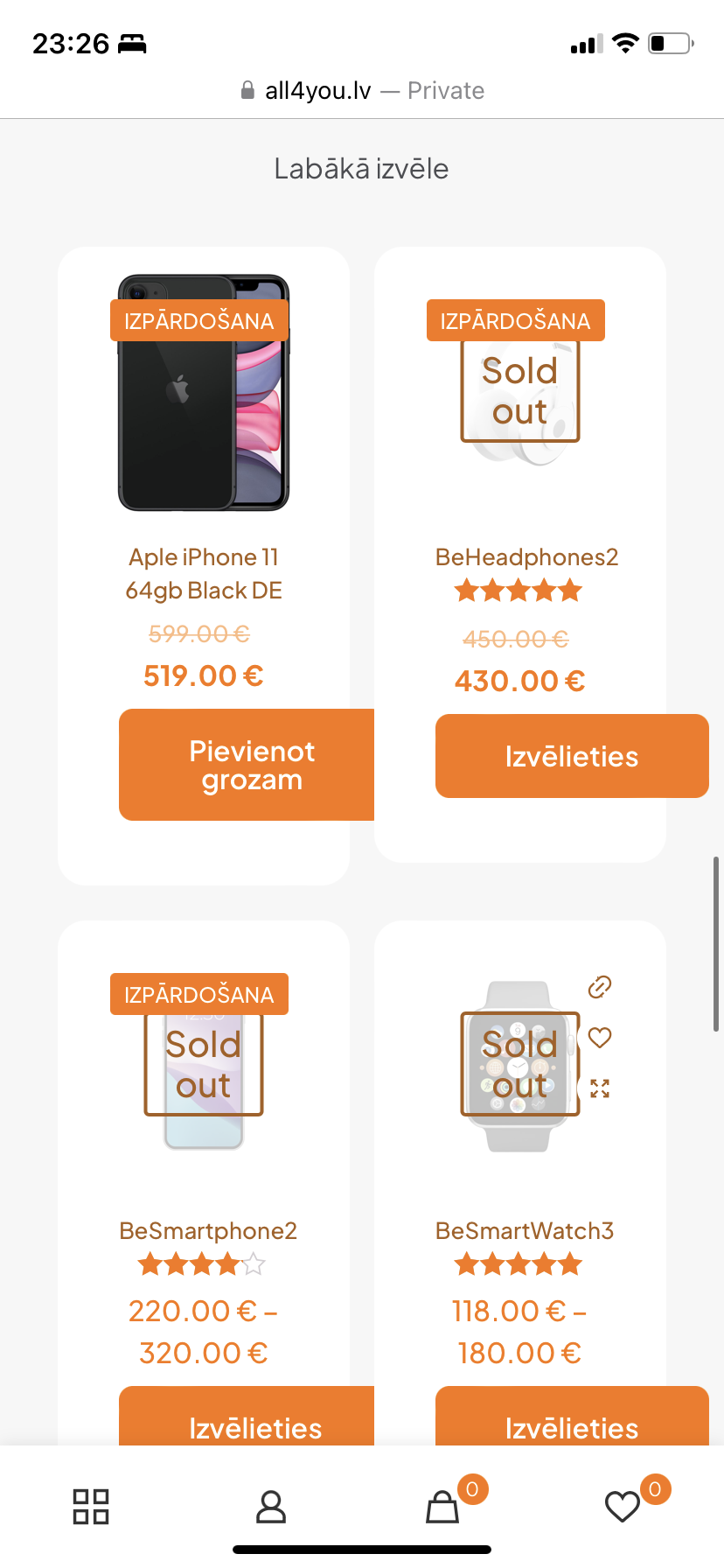
Please, try the following CSS code:
@media only screen and (max-width:767px){
   .products .button-custom.woocommerce .button, .button-custom .button{
      padding: 10px 20px!important;
   }
 .products .mfn-li-product-row-button{
   flex-wrap: wrap;
   justify-content: center
 }
}
Put it in Betheme -> Theme options -> Custom CSS & JS -> CSS.
Thanks
Better but not centred
Please, replace the previous code with this one:
@media only screen and (max-width:767px){
  .products .button-custom.woocommerce .button, .button-custom .button{
     padding: 10px 20px!important;

  }
 .products .mfn-li-product-row-button{
  flex-wrap: wrap;
  justify-content: center
 }
 .wishlist-active.wishlist-button ul.products li.product:not(.align-right) .mfn-li-product-row-button,
 .wishlist-active.wishlist-button ul.products li.product:not(.align-right) .mfn-li-product-row-button{
   margin-right: 0!important;
 }
}
Thanks