Remove Header Top Space on Mobile Version
Hi,
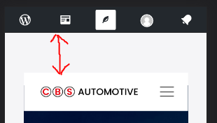
I would like to ask for help removing the space on top of the menu on mobile version.
I already tried the following:
- set the header as full width on theme options
- removed/hide sections
- removed padding
The space is only visible on mobile version.
Please see screenshot:
Thanks in advance!

Comments
Hi,
Please always attach a link to your website so we can check it out. If the page is offline(localhost), then our help will be limited. You will have to contact us when the page is online. Also, please make sure that the page is not under maintenance before you provide us with the link.
Thanks
Hi Phil,
Here's the link: https://cbscentrescouk.wpcomstaging.com/
Please let me know if you need more information.
Thanks in advance for helping!
Try the following CSS code:
body{
   padding-top: 0!important;
}
Put it in Betheme -> Theme options -> Custom CSS & JS -> CSS.
Best regards
Nice one. It worked. Thank you
Hi,
I just noticed that the space on top is back again on mobile.
I already tried to:
Page link: https://cbscentrescouk.wpcomstaging.com/
The CSS code that you provided is still in the Custom CSS on BeTheme options.
Is there a way we can remove the space permanently? Thanks in advance!
I do not see this space.
What device do you use for testing?
Best regards
Hi Phil,
Thanks for sending your screenshot.
I realized that the space is only visible when you are logged in.
I think the WordPress menu is causing the space.
Thanks much for your help.
No problem. If you have any additional questions, please let me know.
Thanks