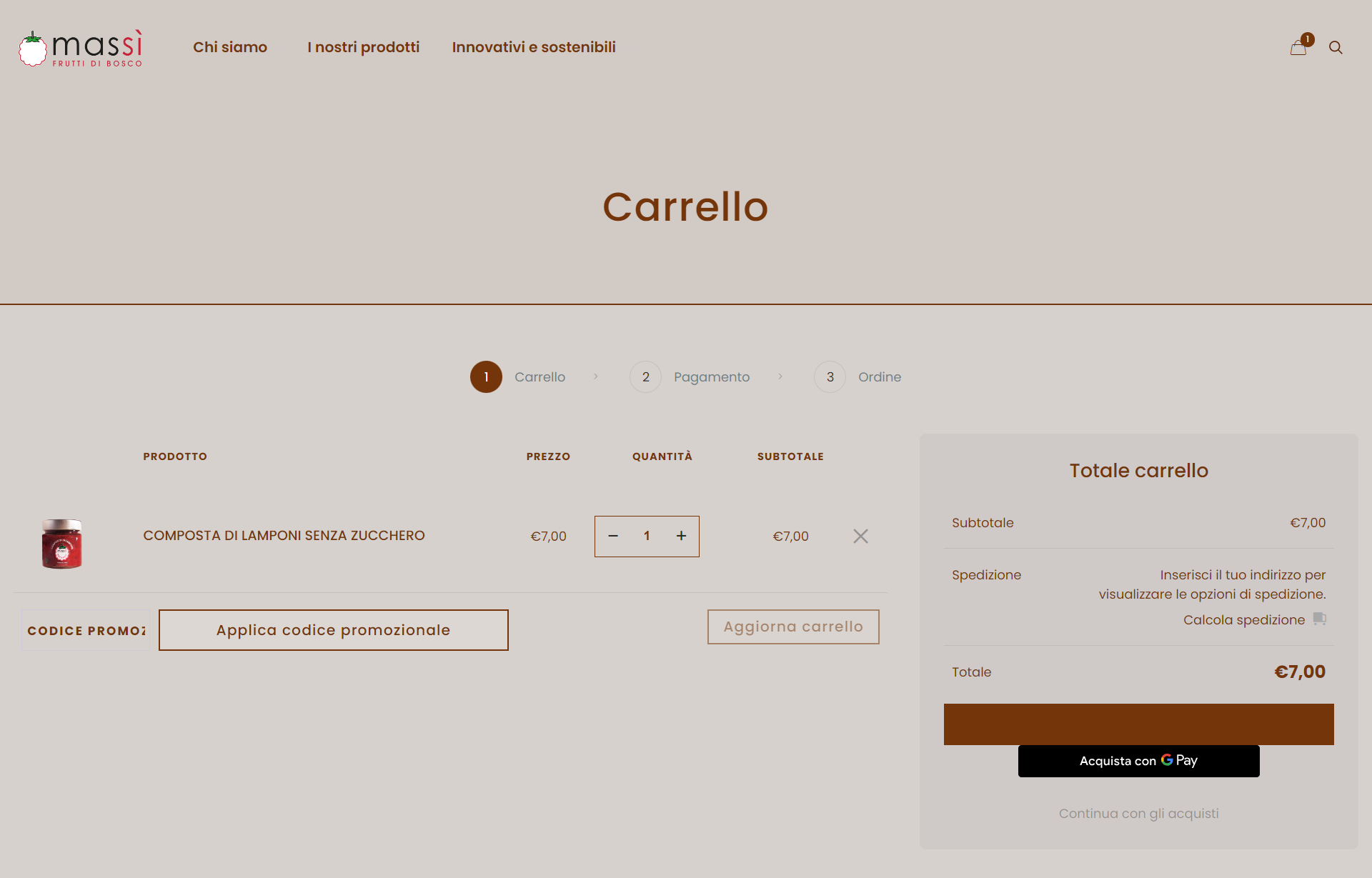
Buttons on Cart page and layout of Checkout page
Hi everyone,
I've got some issues with the two pages above and was wondering if someone could help me with it.
Thanks so much!
- The "confirm payment" button colour covers the button text.
- The input field for the promo code is too small.
- The button "Apply promo code" is too big.
- I'd like to remove the Google pay button.
Please see screenshot:
- I need the payment data form ("Il tuo ordine") to be positioned at the top of the page, at the same height of the invoicing data form.
- I'd like to remove the Google pay button.
Please see screenshot:


Comments
Hello,
Cart:
1) Please try the following CSS code:
.woocommerce a.button:not(.default){
 color: #FFF!important;
}
Put it in Betheme -> Theme options -> Custom CSS & JS -> CSS.
2) You can extend it with this code:
.woocommerce table.shop_table td.actions .coupon .input-text{
 width: 250px!important;
}
3)
.woocommerce table.shop_table td.actions .coupon button{
 padding: 10px 20px;
}
4) It comes from the WooCommerce extension. You should check the settings of this plugin to see if they allow you to hide it on the cart page or reach the plugin author.
Checkout:
1) It is misarranged because of the GPay button. When you hide/remove it, the display should be as you want.
2) The same as in for the cart point 4.
Best regards
Hi Phil, thank you so much for your help, this all has worked perfectly!
Hello again,
unfortunately, I've found another issue on the cart page with the position of the buttons as you can see in this screenshot from a notebook screen:
If possible, I would also like the input field for the promo code to be highlighted better with the text "codice promozionale" less evident (more like the "aggiorna carrello"). Furthermore, the "aggiorna carrello" button should be more highlighted.
Thank you so much again for your help.
Caroline
1) Replace the second code I have sent with the following one:
@media only screen and (min-width: 1340px){
   .woocommerce table.shop_table td.actions .coupon .input-text{
    width: 250px!important;
   }
}
And I quite do not understand. Do you want the promo code input field to be more or less visible?
2) The "aggiorna carrello" button will highlight when you change the quantity of the products in the cart.
Best regards
Thank you again for your quick reply! As for highlighting the "aggiorna carrello" button, you're right, however, this results in this problem (notebook screen size):
Regarding the promo field, I would like the border to be more visible but the text less visible/transparent in order to make users understand that they can input their code there.
Thanks so much again,
Caroline
Alright, now I get it.
Try this:
.woocommerce-cart table.cart td.actions .coupon .input-text{
 border: 2px solid #74350a!important;
}
.woocommerce-cart table.cart td.actions button[name="update_cart"]{
 padding: 15px 30px;
}
Best regards