
Popup options maybe not responsive?

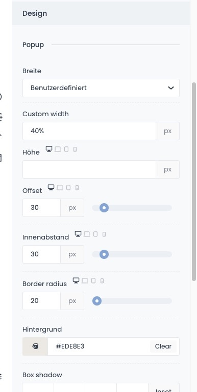
Hi, I would like to include a popup on my website. I also created a corresponding template for this, but I can't quite figure out how to adjust the popup width. Here I can't get a nice responsive look between desktop and mobile. If I leave the width to standard in the popup options, then the window on the iPhone is much too wide. If I only want to specify a user-defined width for this, then I always have to specify this for the other devices as well, as there is not yet a choice (desktop, laptop, tablet, mobile). Does anyone have a tip for me on how I can display the popup size beautifully on all devices?
And how can I set that the popup is only displayed after the GDPR has been confirmed?
https://beta.andreas-trittel.de/
Comments
Hi,
1) I have passed it to the dev team, and we will discuss adding a custom width for each breakpoint.
For now, as a workaround, you can use offset to decrease the popup size.
2) There is no option to display a popup after confirming GDPR. We will discuss it too.
Best regards
Thank you.
When you discuss such new features in your team, how long does it usually take until it is available in an update?
Note that discussion does not mean that it will be implemented.
Also, I cannot tell you the estimated time. It all depends on how it is complicated the feature is, and how much work with another subject we have.
I suggest following our changelog where you can find which features/fixes were implemented in updates.
https://support.muffingroup.com/changelog/
Best regards