
Menu on Mobile device is driving me completely nuts!

I need help getting my menu back in order on mobile device.
I am really lost to what happened and I by trying many different things I think I scr&w&d up the configuration of my website.
Everything seems - as in the menu - to look well when I am looking at the menu's on my laptop computer.
I get either a nice horizontal menu when used full screen; And I do get the hamburger menu when I make the window smaller.
However!
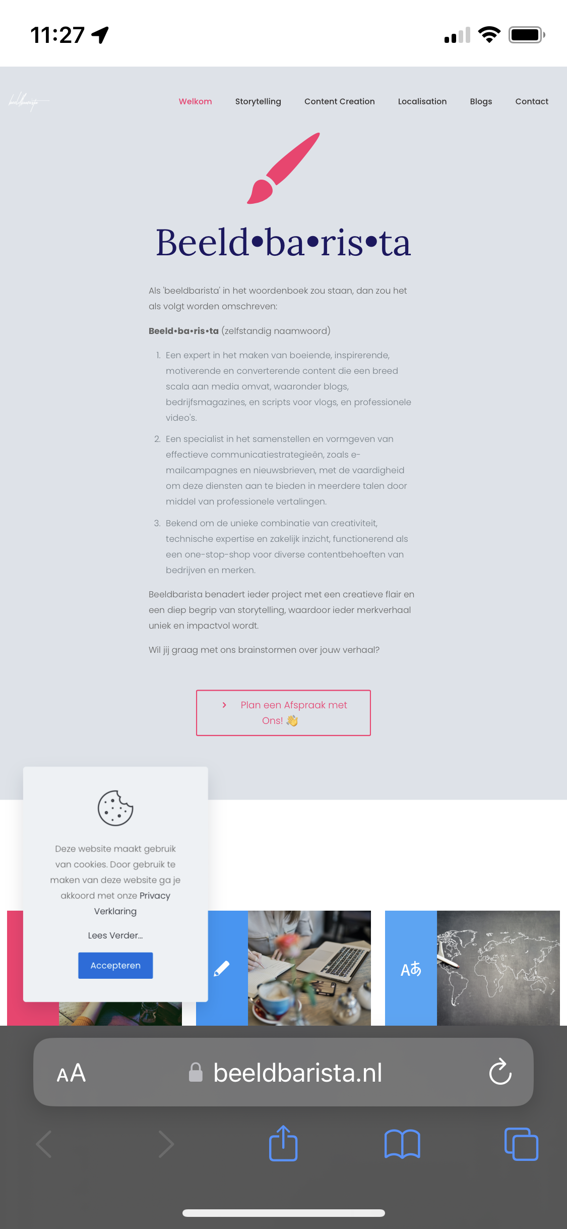
Now going to my ipad mini (6) or onto my iphone.
- The menu still is full page, and full horizontal. NOT showing the hamburger icon.
- Except for the contact page. But this menu then shows an age old menu that I can't seem to get updated.
I am totally stuck at this point not knowing what to do any longer. I have already tried to empty cache on my iphone / ipads but this didn't seem to work (at least not for me)
My website: https://beeldbarista.nl/
The attachment shows a screenshot of my iphone.
Please, please help me as it is driving me a little insane at this point in time.
Comments
Hi,
looks like you have disabled RESPONSIVE option in Theme Options > Responsive > General section.