
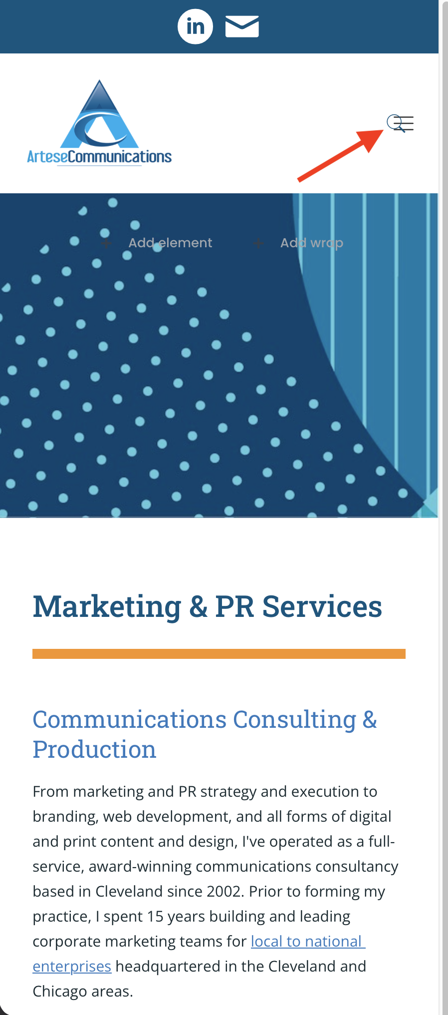
Search Icon & Hamburger Menu Overlapping on Tablet & Mobile

Hi,
On this site [Links visible only for registered users] I'm having a header issue where the search icon and hamburger menu are overlapping on the tablet and mobile views. Please see two attached screenshots. I used Header Builder 2.0.
Please advise. Thanks!

Comments
Hi,
Please send us the WordPress dashboard and FTP access privately thru the contact form, which is on the right side at [Links visible only for registered users] and we will check what might be the reason.
Notice!
Please attach a link to this forum discussion.
Sending incorrect or incomplete data will result in a longer response time.
Therefore, please ensure that the data you send are complete and correct.
Thanks
We have checked your site and found what's the reason. On desktop you set Absolute position for search icon and this setting is inherited by mobile. In such case, you have to change position to default on mobile.
Perfect that worked thanks!
What I found most important in the two instances where the Responsive settings you found where different than those I found initially is that it's essential to use the Navigator to ensure you're selecting and editing the right element. Just clicking on the element itself and editing doesn't always work or apply any changes.
So the fact that in your second instruction you included the Navigator in your screenshot made all the difference. :)
Yes, that's why we always recommend to use Navigator. But we prefer navigator to be stick to the right end with Developer mode.