
mobile version

Hello, a few more questions, after installing and configuring the sidebar for the store, I could not get two display results, for the desktop and mobile version.
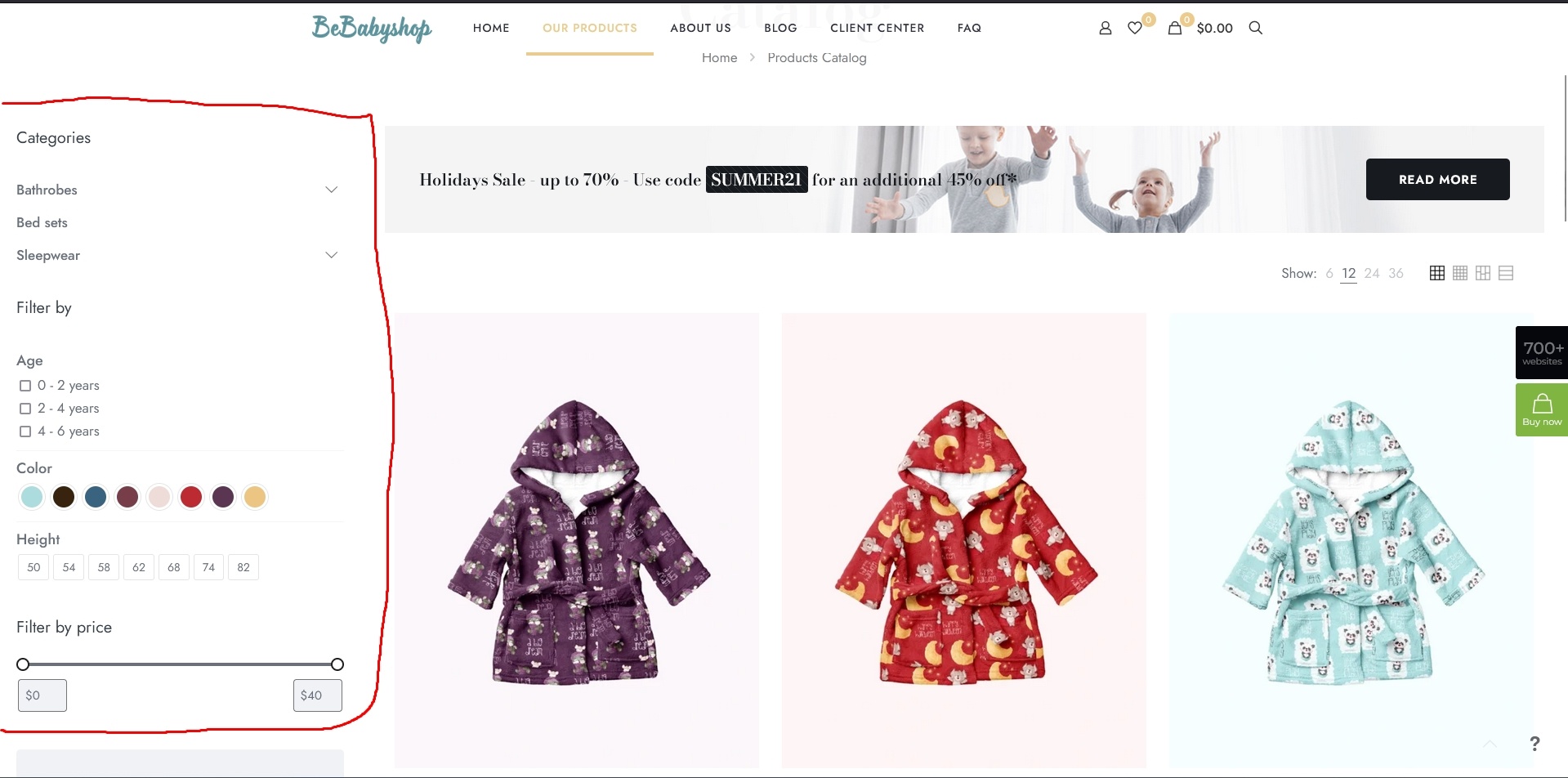
If I want to always display the sidebar, then in the mobile version it goes to the bottom of the page (in this case I would like to use a drop-down sidebar), in other editors I simply made different settings for the device resolution used.
Here it turns out that the sidebar is saved for all versions, and I looked at ready-made sites and found that this function is there, on a PC the sidebar is always visible, on a mobile device it is hidden and is called by a button. How can I get this?
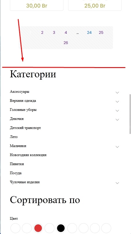
Also interested in the bottom menu mobile.
Screenshots are attached. (screenshot 1 - 2 (your sites)).
Comments
Hi,
Please go to Betheme -> Theme options -> Responsive -> General, and select option Mobile sidebar: Off-canvas.
Best regards
Thanks a lot .
What about the mobile bottom menu?
Sorry, I overlooked that.
You can enable it in Betheme -> Theme options -> Shop -> General.
Best regards
Thanks, it works.