
Question about not being able to adapt to mobile anymore

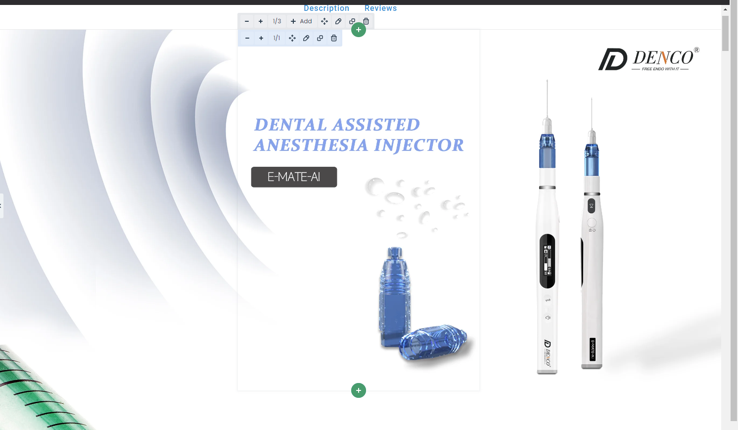
Content of the first image display: there are three images in a section (they are perfectly displayed on the same line to make a complete product page)
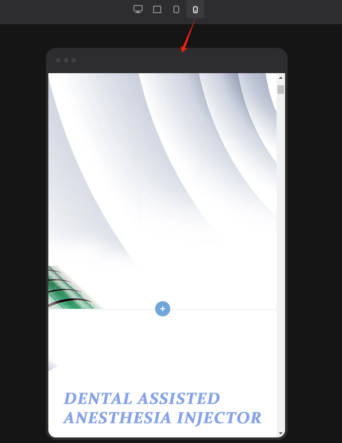
The second image shows the content: in the mobile rendering each image takes a separate line, which makes it impossible for me to display the complete product information.
Please provide me with a solution. Thank you very much.
Comments
Hi,
Please always attach a link to your website so we can check it out. If the page is offline(localhost), then our help will be limited. You will have to contact us when the page is online. Also, please make sure that the page is not under maintenance before you provide us with the link.
Thanks
Now the content of this page is that you can see in the background that there are sections that will have three images in them, but the three images won't show up on the same line on mobile, so I'm hiding them all on mobile.
Also create a section with only one image in it and display it separately on mobile.
I now want those sections with three images in them to be displayed in one row on mobile at the same time.
Sorry, but I am extremely confused by your message, and I do not understand what you want to achieve now.
Can you please explain that in more detail?
It would also help if you have some examples of graphic project or anything like that.
Best regards
The three wraps are inside a setion, and this is pieced together into a single image. Originally it was a big picture I put it into 3 small pictures so it became 3 wraps
But on mobile, each wrap takes up one line, which causes the three slices to be separated.
This is the effect rendered on the phone, I don't know if you can understand it, I've explained so much spent so much time I'm sure you'll give me a satisfactory answer.
Can you imagine cutting your phone vertically into 3 sections and then each section becoming a separate line of display?
?
Or can you understand that this is a topic where pc presents a different content landscape than mobile?
Or have you been checking my messages carefully?
Why is our docking so inefficient? I can't figure it out.
I am sorry. I had some difficulty understanding your message at first. Sometimes language barriers can make communication a bit challenging.
BTW, please do not bump your message, you wrote beyond my working time so I could answer you.
There is no option to put sections side by side as they are always 100% wide. However, wraps and elements can be placed side by side, just as explained in the following video:
https://support.muffingroup.com/video-tutorials/responsive-editing-in-bebuilder/
So what you can do is to put these images with image elements, or as a wrap background, or as one background conjoined together that displays only on mobile.
Best regards
Have you actually checked that this page I'm describing doesn't show up the same on a cell phone as it does on a computer, and does this guidance link you're posting include mobile content, I'd very much hate to have to describe something like I'm treating a muggle Sorry
If you compare the screen using mobile with pc you will see everything 、、、、、、、、、、、、
Hello Actually I seem to have found the answer in your reply, now that I've got this sorted out, I apologize for my rude attitude, thank you for your patience and may you apply a good day.
Salutations.
No worries, I am here to help, and I am glad to see that you handled that with my suggestions.
If you have any other questions or problems, feel free to ask.
Best regards