
Product Tab

Hello,
Please see the following link:
We added product tab, but, there are several issues.
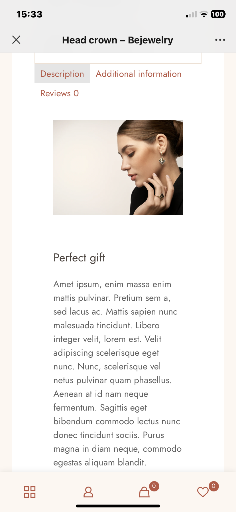
1, the width of product description in the product tab is narrower than the width of original description in the mobile vesion.
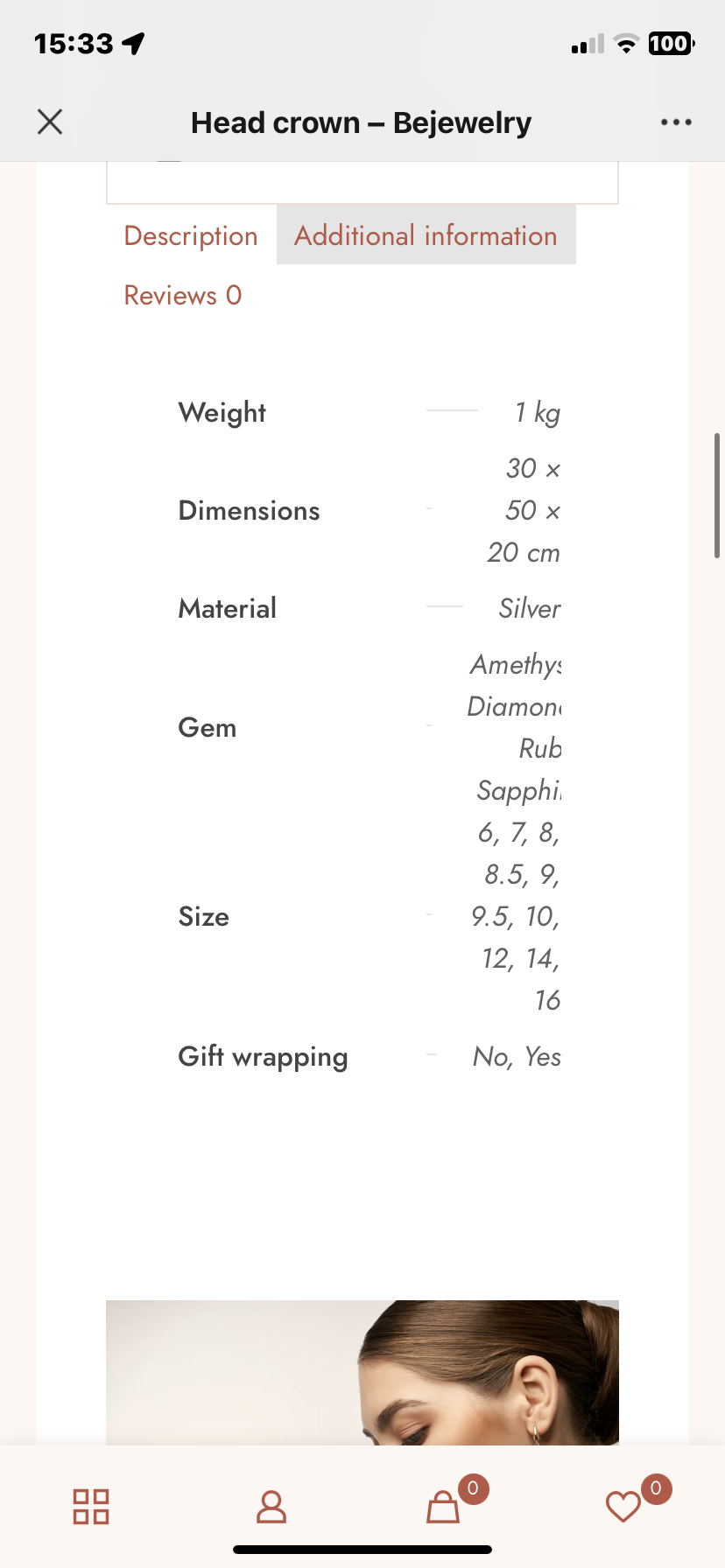
2, Additional information messed up in the mobile
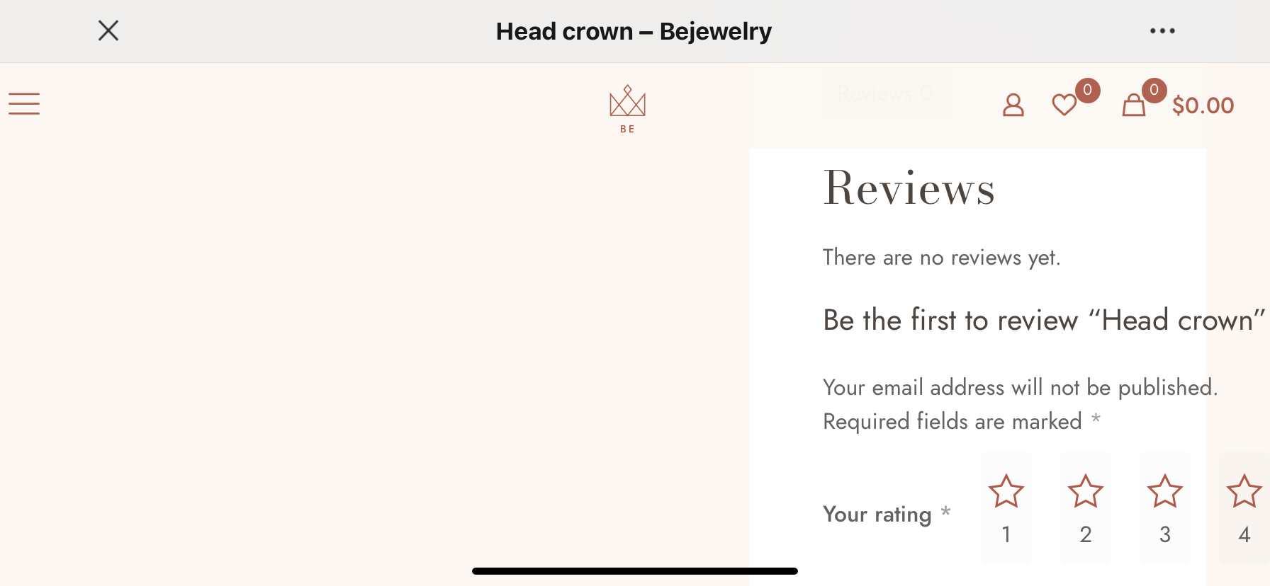
3, Review section was cut off in mobile.
Could you help with those? Thanks.
Comments
Hello,
1, 2) I have passed it to the dev team, and we will take a closer look at this. For now, please use the following CSS code:
@media only screen and (max-width:767px){
 .single-product .column_product_tabs .section_wrapper{
   padding-left: 0!important;
   padding-right: 0!important;
   max-width: 100%!important;
 }
}
Put it Betheme -> Theme options -> Custom CSS & JS -> CSS.
3) On a horizontal view, the width of the devices changes, and the tablet view appears. Please adjust the tablet view of your single product template.
Best regards
1) We put the code, and it works, thanks.
2) Seems like still messed up.
3) We changed the wrap into 1/2 for the review section, and still cut off. Could you tell us the detail to adjust the table view of single product template on a horizontal view.
Thanks,
LA
2) Please also add this CSS code:
@media only screen and (max-width: 767px){
 .woocommerce table.shop_attributes th{
   width: 70px!important;
 }
}
3) It should be rather 1/1 wrap on tablet view.
Best regards
2) Works, and perfect.
3) Could you screen shot to tell it step by step?
Thanks,
Open your Single product template, edit the tablet view, and extend the wrap to 1/1.
Best regards
Perfect, thanks.