
Size of banner shown in smartphone

Good day team, I have a question for my website. ( I am using the theme below,
BeLeasing 2 – Betheme (muffingroup.com) )
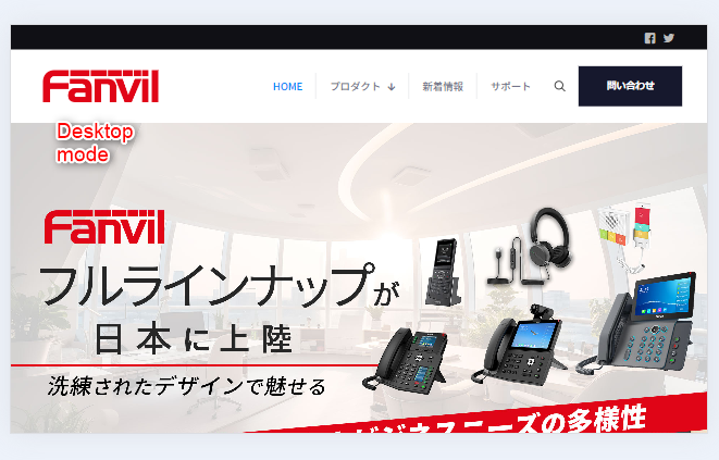
Everything works perfectly when it is browsed in desktop.
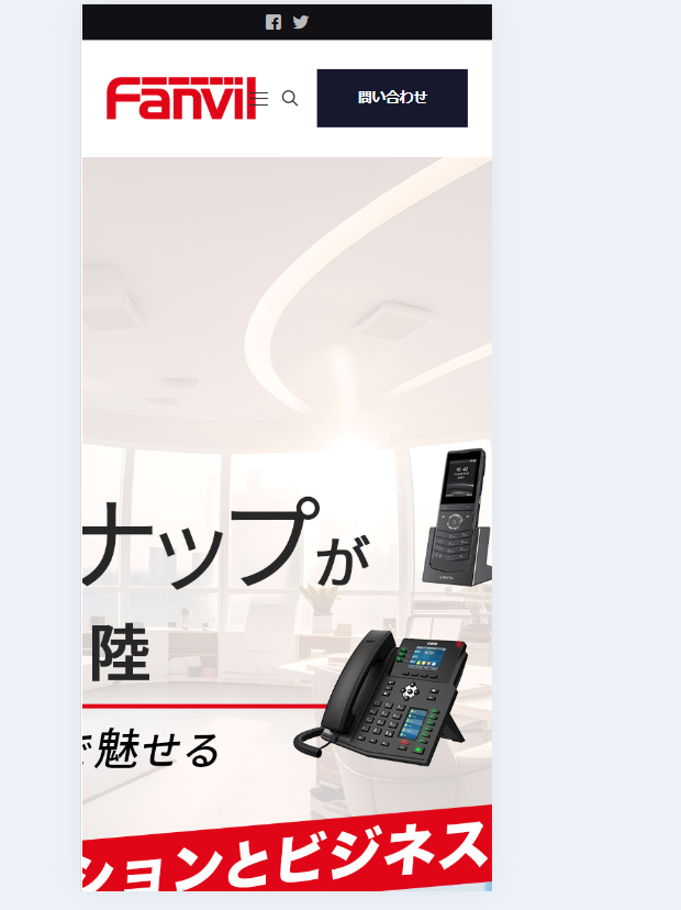
But when it comes to smartphone mode, seems that the banner cannot be shown properly. (I guess it is because of the size or size potion)
Do I need to do some setting for smartphone mode in order to make it shown the same as in desktop?
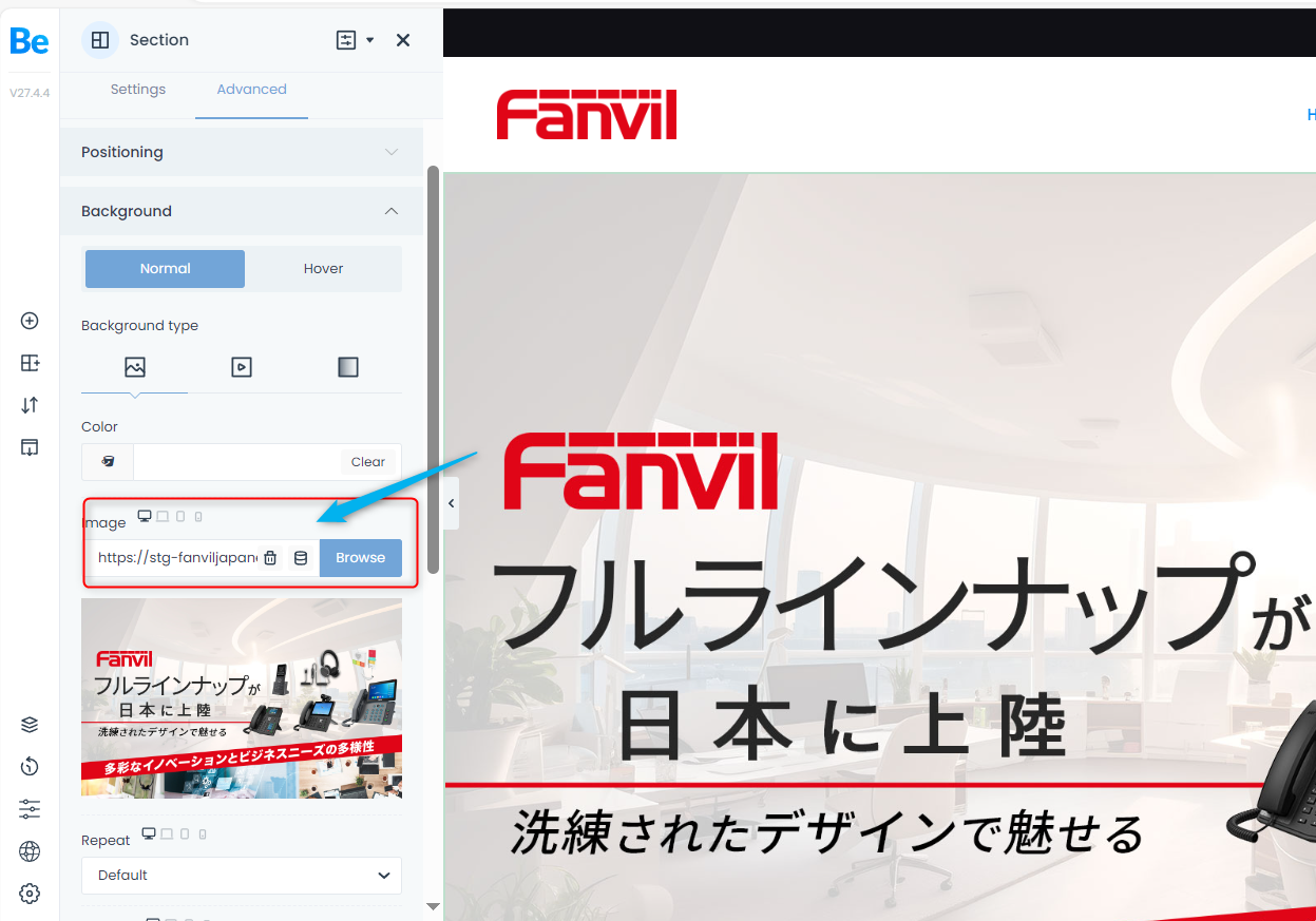
Or I have to create a new banner specially for smartphone mode? If that is the case, I guess it have to change it in background>image (select the smartphone device when uploading the image) Also, would you please advise what will be the size of the image for smartphone model?
Kindly let me know if I have any misunderstanding.
Comments
Hi,
Please edit this section and change the size for the mobile view to contain:
You might also have to adjust the section height, but I do not know how you built it. In general, I suggest checking the following video tutorial:
https://support.muffingroup.com/video-tutorials/responsive-editing-in-bebuilder/
Best regards
Thanks for your reply. Yes, I tried to changed setting to certain and it works. But leaving a lot of blank space so I tried your advice to adjust the section height for smartphone device.
I noticed that i will need to define the height for each devices and it is fine. But seems that banner image looks different from the template default setting.
Please see the video below.
For the template default setting, the banner image size does not change much even I zoom in to make my screen larger.
However, when I change the section height, you can see the the banner image size varies if I zoom in the browser. And I noticed that once I have changed the section height, even if I change back the height into full screen, it does not resume to what it looks in the template default setting.
I wonder if there is any method which allows me to change to section height for smartphone UI only without affecting UI in other devices. Thanks a lot!
Sorry, seems that I cannot upload the video successfully in my previous comment. Please see attached.
This video also does not work.
And yes, you can adjust the mobile display without affecting other resolutions. Did you watch the video tutorial I sent in my previous message?
Best regards
I am not sure why the video does not work. I have enclosed the file please download at your side.
Yes, I have checked the video that you sent me yesterday and I confirmed that I can adjust the mobile display without affecting other device resolution when I change the height in dimension.
However, it comes to another problem when I changed the dimension height. In the video I enclosed, the first screen will be default setting without changing the height.
And the second page shown will be the page I did changes in dimension height. You can see that the big banner size varies and become strange when I zoom in/out on the browser. (While in the page which I did not do any changes, the size of banner almost remain unchange)
I wonder why it happens and would like to know is there any method to keep the big banner size unchange even I zoom in/out on the browser.
Thanks in advance.
You can create two sections: one for desktop and one for mobile, hide them for appropriate resolutions with Responsive visibility settings, and set one section with a custom height and one with default, so it will look good on all resolutions.
Best regards