
separat header image - mobile on portfolio

Is there an option to change the header image ob portfolio posts at mobile devices? On mobile does it not adapt to an smaller, full display.
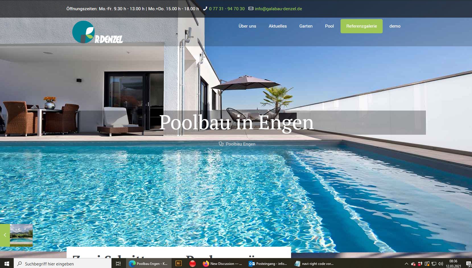
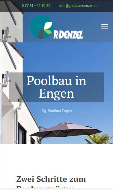
Attached you can see an example of my customer who builds pools and gardens... Or should we deactivate the image by CSS and set an image at the content area who only was diplayed on mobile devices? But in your builder i can´t find an option for colls or rows/items to get them responsive options.
What did you think was the best way to fix this problem?
Thanks for your feedback!
Comments
Hello,
I think that the best option will be adjusting this image for mobile display using Custom CSS with media queries.
Do you need help with that?
Best regards
Hi,
if you can get me an example it will be helpfull!
Thank you ?
Here is an example of what I was thinking of:
@media screen and (max-width:767px){
   #Intro{
      background-size: contain!important;
   background-repeat: no-repeat!important;
   }
}
Thanks
Hi,
thanks a lot - works well!
Kinds regard