Portfolio Items Padding Issue
I recently added a few items to my site's portfolio
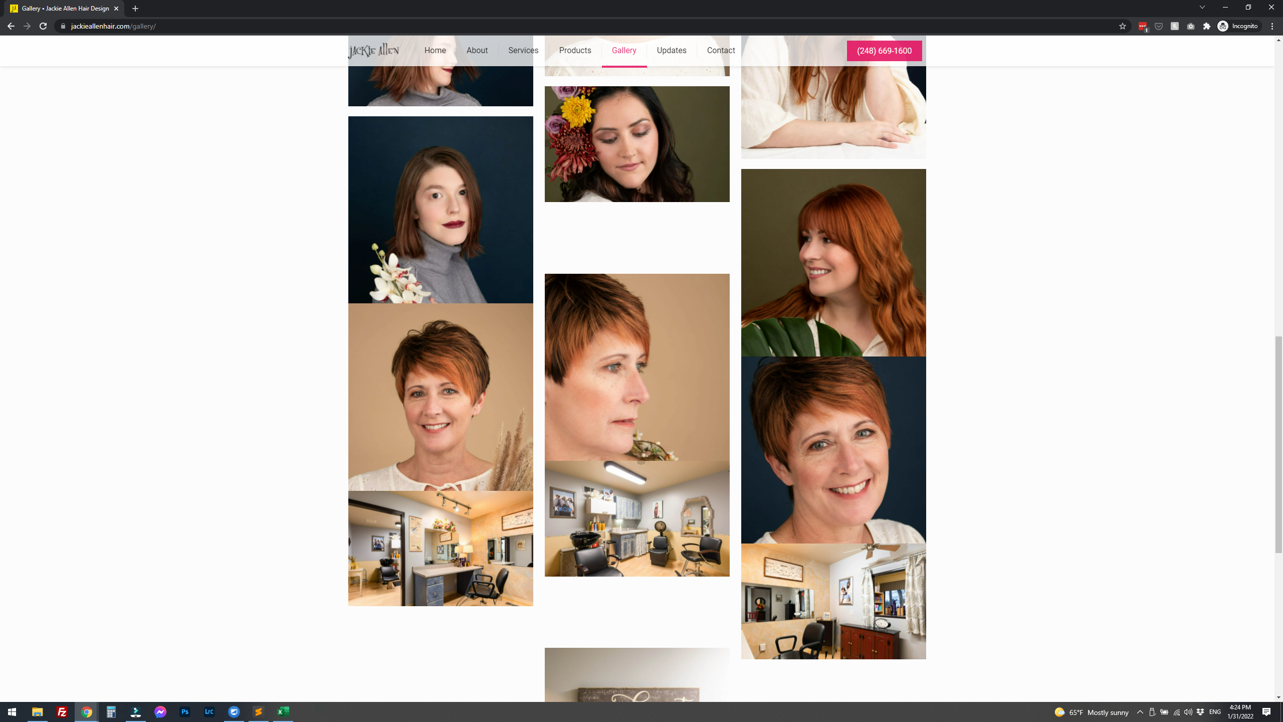
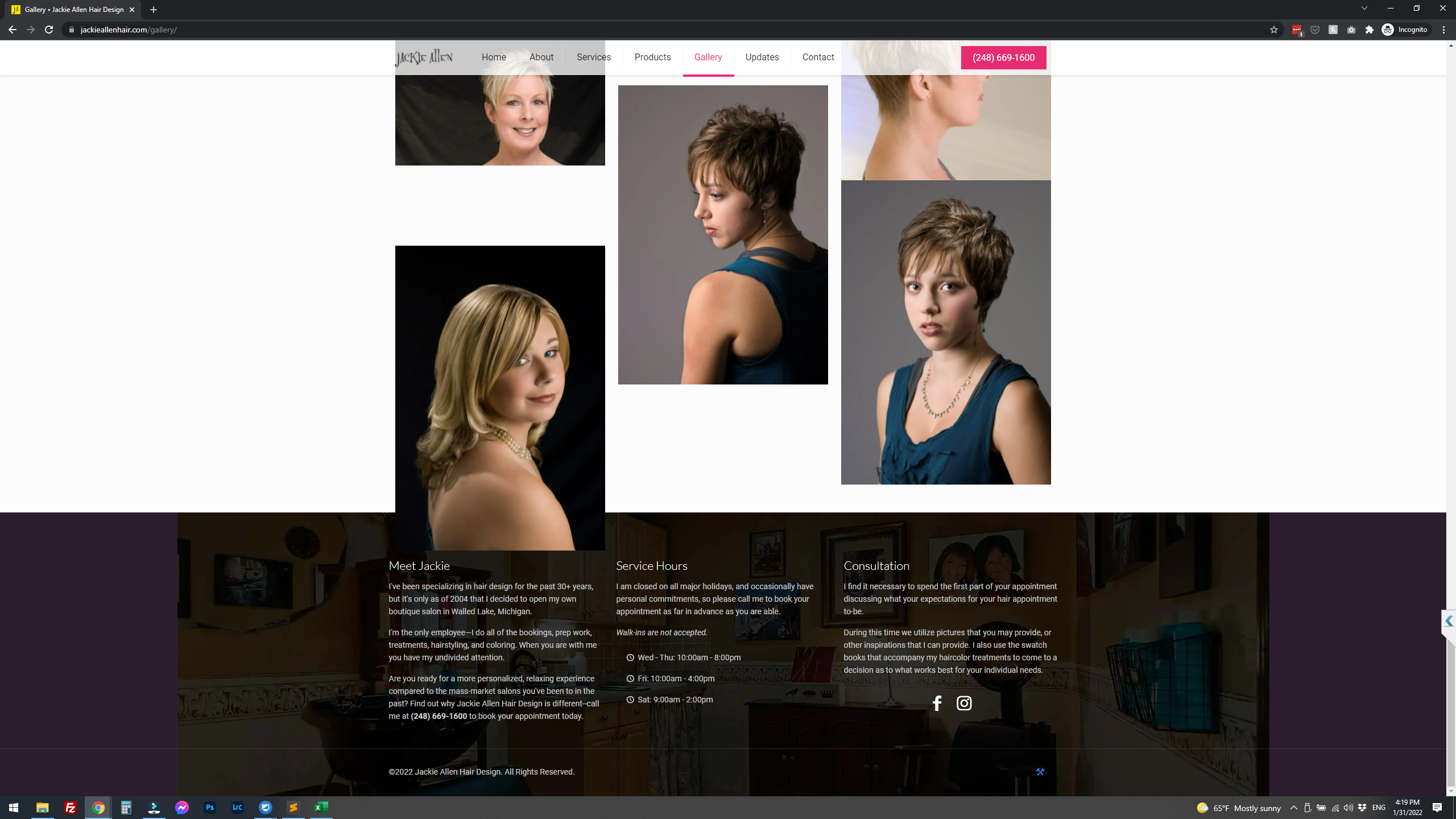
At first, they look fine on the GALLERY page on my website, but as you scroll down you'll see images start running into each other (no padding or too much padding between images), and then the last image runs into the footer quite a bit.
I have tried using different portfolio display options, but there is always the same issue (although in slightly different ways).
The weird part is that when you scroll back up, the images automatically re-align themselves to what they should look like (proper padding between each one).
This happens in both the latest versions of Chrome and Edge.
--
(^ this shows the uneven padding between images as you scroll down)
(^ this shows the issue where the last image runs into the footer)


Comments
Hi,
Please, go to Betheme -> Theme options -> Custom CSS & JS -> JS, put the following code there, and check if the problem persists.
jQuery(function($){
   $(window).load(function(){
      $(window).trigger('resize');
   })
})
Thanks
Hello,
I have added the code to the custom JS section of the BeTheme options, and cleared all caches, but the problem still persists.
Please, turn off all of the plugins, refresh your cache, and check the problem then.
Moreover, if you use a child theme, switch to parent, and recheck it.
Thanks
Hi Phil,
That solved it. For anyone else experiencing something similar, it was one of the options I had turned on in the Siteground Optimizer plugin. Not sure why it wasn't an issue before, but that fixed it. ?♂️