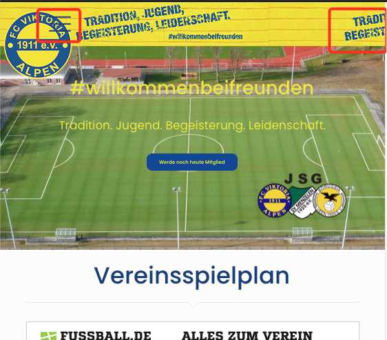
Issues with Mobile Header
Hey great support
Maybe you can help me solving 2 issues with my mobile header:
- Using BeBuilder and I want to align burger menu to the left. It seems to be sticked next to the logo.
- My background image is repeating after x px - can this be more like a "stretching"?
Thank you!

Comments
Addition to 1: Adding the word MENU in front of it would make it more obvious
Sorry I want to align the menu to the right, logo stays on left
Hi,
Did you see our video tutorial about builder a mobile header with header builder?
https://support.muffingroup.com/video-tutorials/building-mobile-headers/
If not, please do that. There you should find how to adjust your header view.
Please let me know if something is unclear or you have additional questions.
Best regards
Thank you for the link.
The issue is I am using a background picture on the whole wrap, because of that I have added logo and menu burger into one wrap. So aligning them left or right will affect both elements.
Is there a custom CSS available to get the burger menu aligned to the right?
You can divide the logo and menu burger into two wraps, so you will be able to align the logo to the left and the menu burger to the right.
In the video tutorial ~2:13 min, you can notice that the hamburger menu is placed in a different wrap than the logo, so it can be aligned to the right without affecting the logo.
Best regards