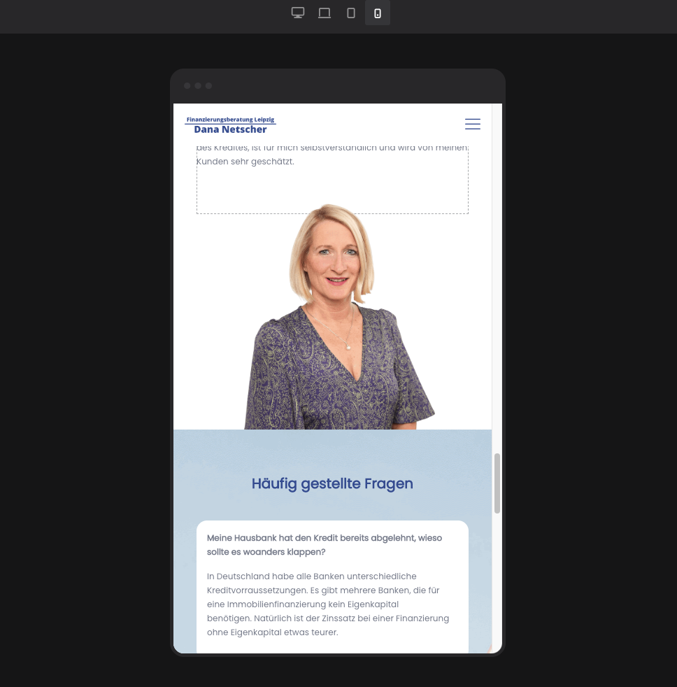
mobile Version looks different do the Bubuilder
Hello Betheme,
I have the following page: https://finanzberatung-leipzig.de/neue-startseite/
following problem:
The site looks perfect in BeBuilder. See picture 1. But not on the mobile version of my cell phone. There is a white space between the picture and the next section that shouldn't be there, see picture 2.
What can I do so that the white space is not displayed on the mobile version?
Best regards
Fabian


Comments
Hi,
Are you sure that this link is correct?
It shows me that it is for sale:
Best regards
im sorry, thats the correct link: https://finanzierungsberatung-leipzig.de/neue-startseite/
On mobile display, change the section background position to the top, and check if the problem persists.
Best regards
I did that, unfortunately it didn't change anything.
But I'm not 100% sure if I did it correctly. Attached is the screenshot of the change I made.
Please send us the WordPress dashboard access privately thru the contact form, which is on the right side at http://themeforest.net/user/muffingroup#contact, and we will check what might be the reason.
Notice!
Please attach a link to this forum discussion.
Sending incorrect or incomplete data will result in a longer response time.
Therefore, please ensure that the data you send are complete and correct.
Thanks
I have changed the background-size to cover.
Please check it now.
Best regards
perfect, Thank you now its working