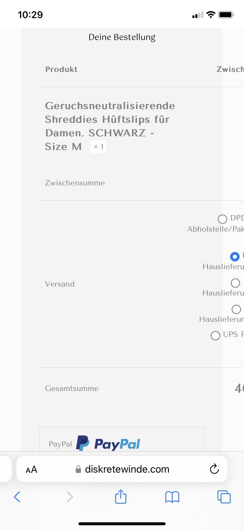
checkout page not fully responsive on mobile
It is a step two on the payment path. In the cart everything is fine, but on the checkout page, after giving a shipping address, when it comes to summary, it looks like this. I will never find a solution on my own as I am totally tech green :( so, please, help...

Comments
Hi,
Please always attach a link to your website so we can check it out. If the page is offline(localhost), then our help will be limited. You will have to contact us when the page is online. Also, please make sure that the page is not under maintenance before you provide us with the link.
Thanks
oh, I am sorry for causing trouble, I am not experienced, the link is as follow
the page in not in maintenance mode, I am still working on it but "on production", because main functions work already and I have returning customers all the time on the site
Some texts are to long and do not fit in a table on mobile.
Try the following CSS code:
@media only screen and (max-width:767px){
 .woocommerce-checkout table .cart_item .product-name{
   font-size: 12px!important;
 }
 .woocommerce-checkout table thead{
   font-size: 11px!important;
 }
}
Put it in Betheme -> Theme options -> Custom CSS & JS -> CSS.
Best regards
Thanks, it helped, i changed it a bit (font sizes 11 and 9) and now it is almost perfect. I am grateful for your prompt help, boys ?(blows a kiss)
Hi, I thought I will share it with you: I got some CSS from BeTheme community on FB, from De Pjoter. The code says:
@media only screen and (max-width: 767px) {
.mfn-cart-step-2 .woocommerce #order_review { flex-basis: unset;
max-width: unset; }
And for this case, it works better, as I have now everything contained on the screen without making the font smaller. Those mobile screens are small enough to be (sometimes) difficult to read, so I prefer this way (as I feel my customers in this matter because I use sometime reading glasses for really small print myself). So, as both method worked, this one from De Pjoter worked wonders.
Look:
Thanks for sharing the solution from our FB group.
Indeed, it seems to be a better solution.
Best regards