error on smaller mobile devices
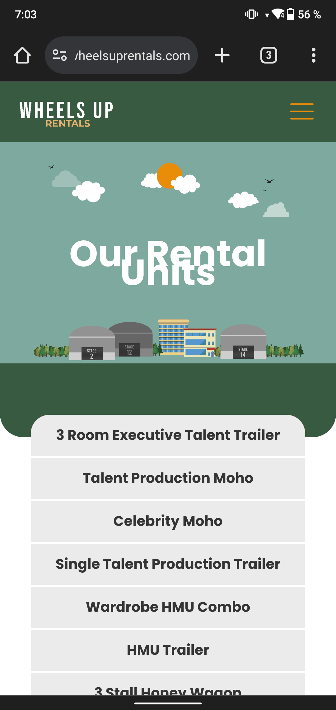
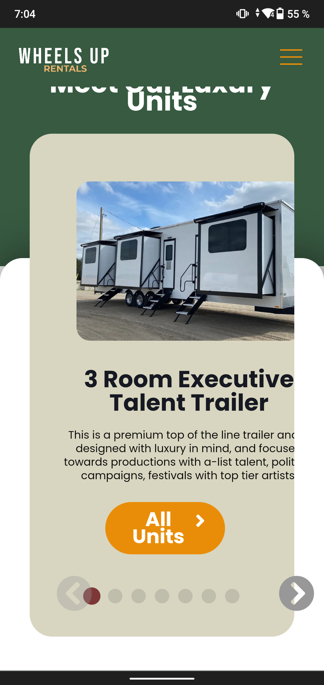
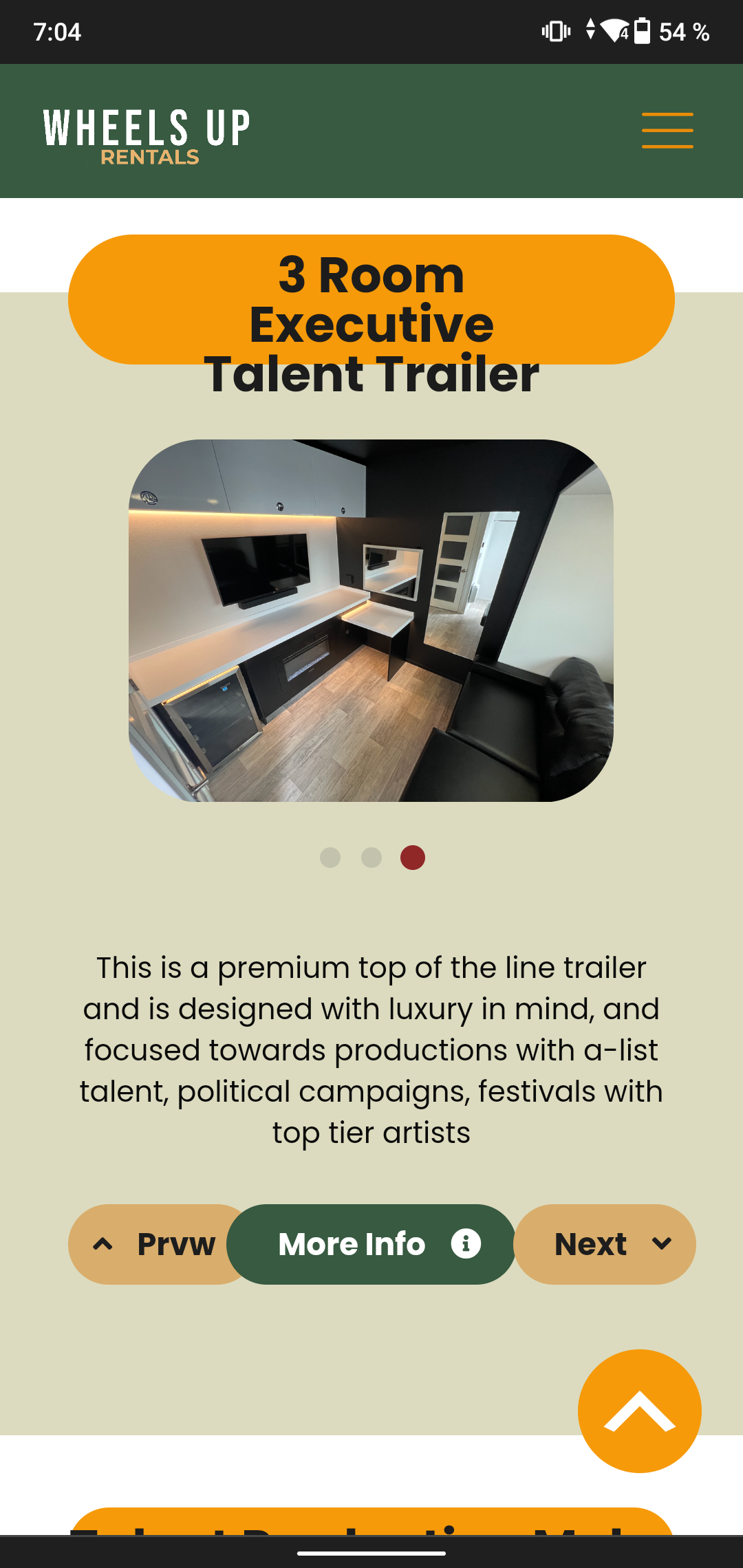
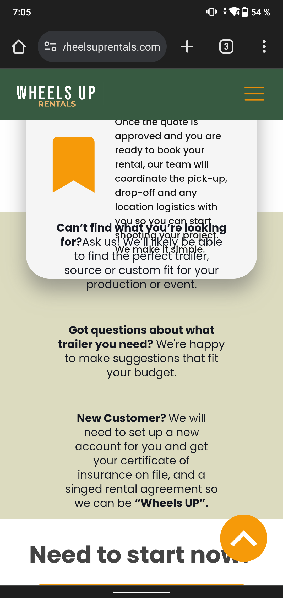
The website looks messy on some devices with small screens, can you help me? Tell me what mistakes I am making and what I can do, because when working in the builder the elements are not disordered, even when opening the website on some devices it looks correct but on smaller phones everything is disordered, as if there was no space or as If the elements are very large, I need help please.

Comments
Hi,
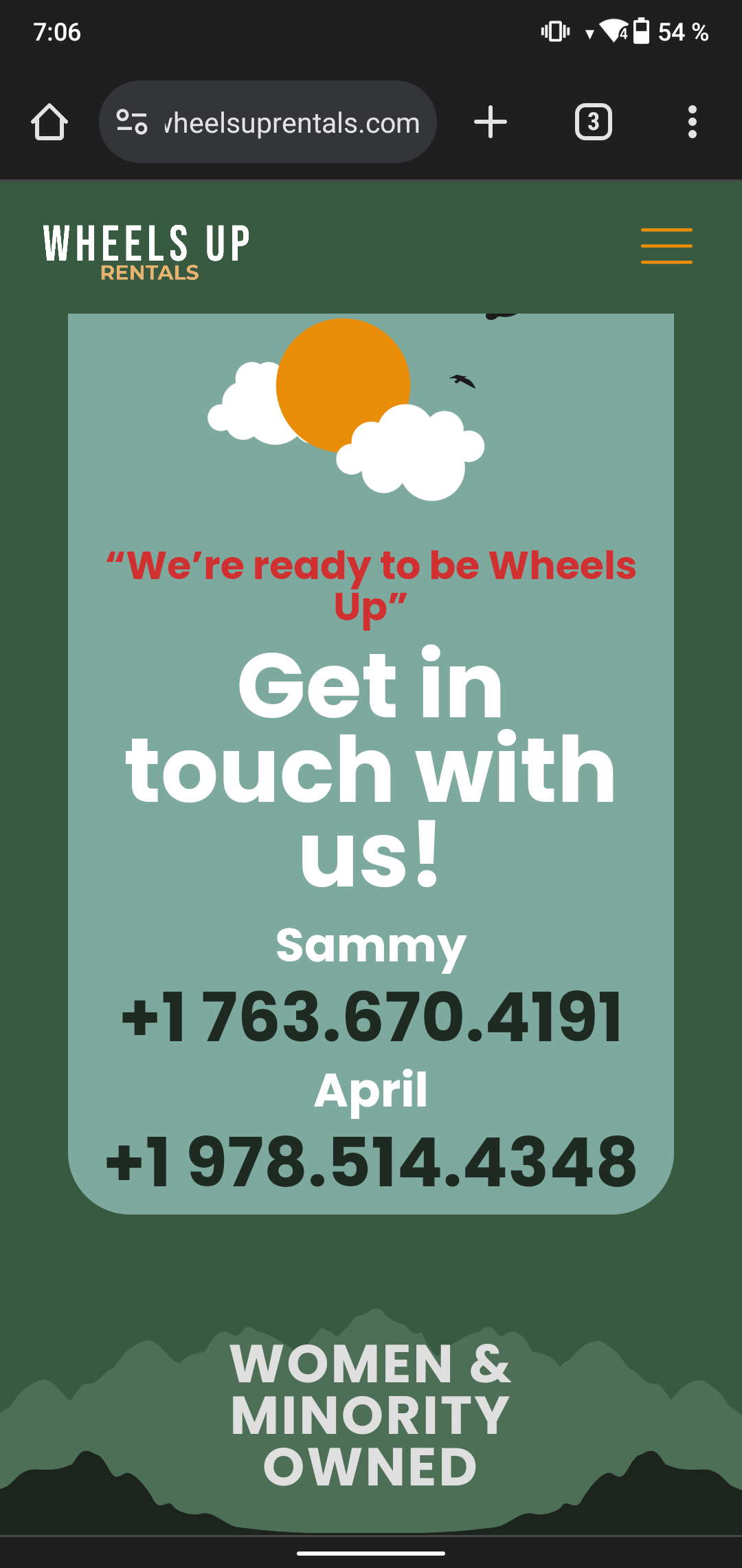
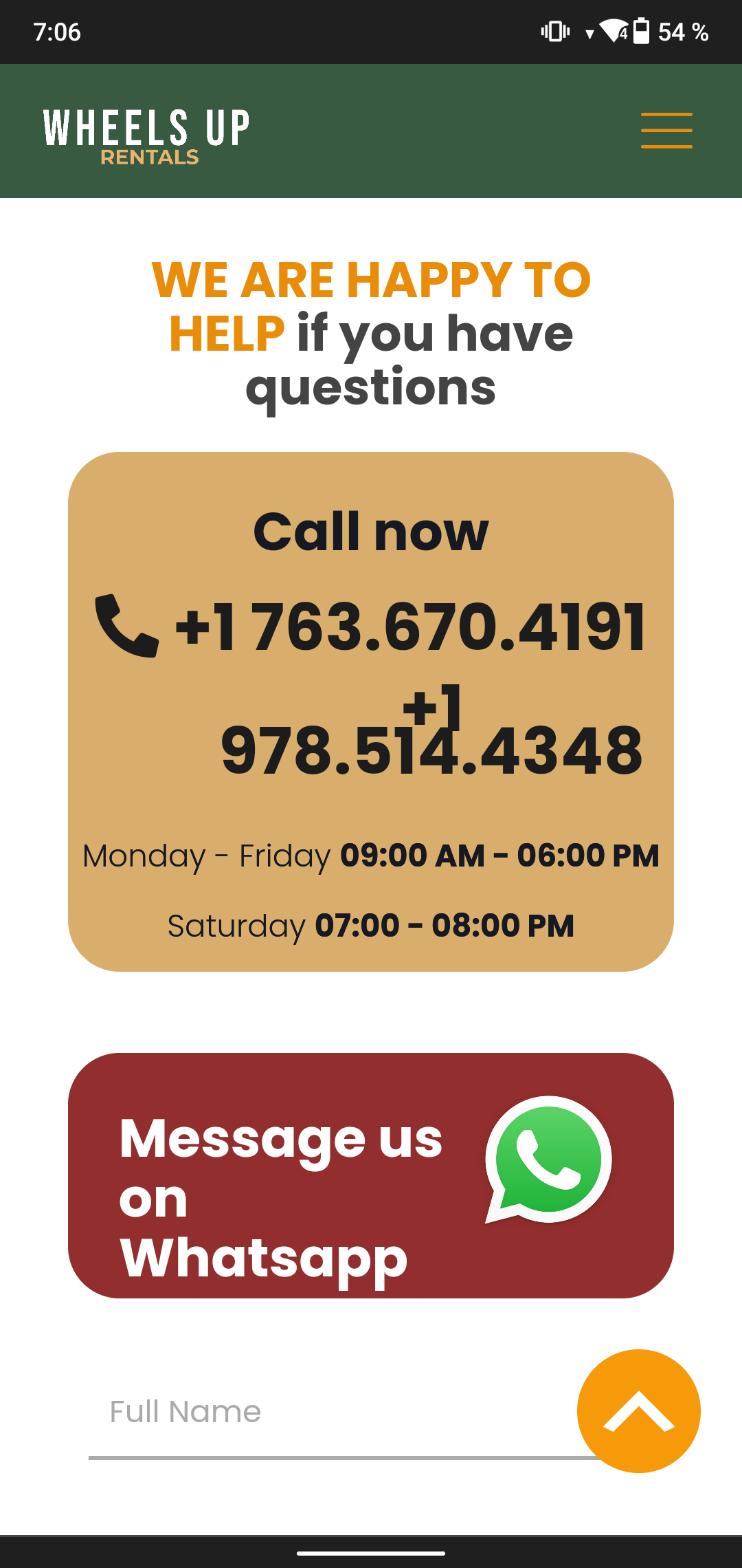
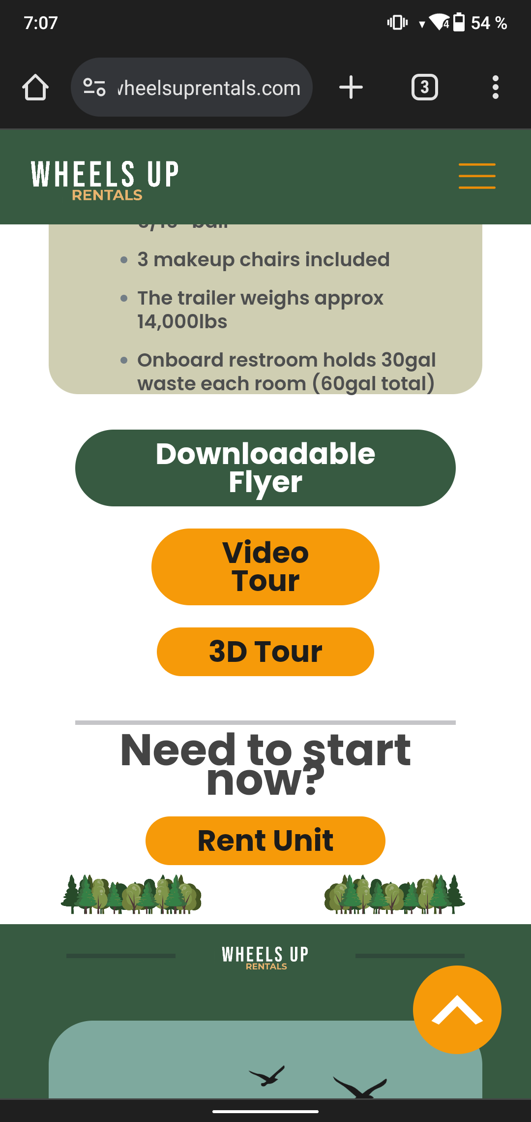
Here, you have set up a custom height for the element. Remove it, or change for the mobile display.
Here, you assigned font size, but did not add line height. Set the line height for this element:
Here custom width breaks the layout. Remove it or set it to 100% for mobile display:
Here, you have assigned a custom height for the section. Do not use custom height for sections, or adjust this value for mobile display:
Here you must decrease the mobile font-size:
On the rest of your screenshots I do not know what you refer to.
The following video tutorial will be helpful:
https://support.muffingroup.com/video-tutorials/responsive-editing-in-bebuilder/
Best regards
The problem is that on some mobile devices with large screens the web page looks very good, but on phones with smaller screens everything is messy, as shown in the images of the first message I sent you, so if I make these modifications that You say what I should do, devices with large screens will no longer look good, I am attaching images of what it looks like on devices with larger screens so you can understand me.
What I want to know is, WHY DOES THE WEBSITE NOT LOOK AS WELL ON MOBILE DEVICES WITH SMALL SCREENS AS IT DOES ON DEVICES WITH LARGER SCREEN? It is as if the browser were too small for the texts, shapes and images of the web site.
https://wheelsuprentals.com/
The mobile view starts below 767px width, so it is shared for all devices whose width is below that.
When you adjust the mobile view, you adjust it for everything below 767px, so you must do it in a way that it will look good on all devices.
Anyway, all the things I mentioned in my message before can be changed without breaking larger screens.
Best regards
But the problem is that it looks great on bigger devices, as I see it on the builder, but on small devices doesn't look as look on the builder and I if I make the changes you told me, it will change on bigges devices, let me show you:
so, how I will fix it if on the builder looks good?
https://wheelsuprentals.com/
As I already mentioned, the mobile view starts below 767px width and is shared among all devices. The only option is to adjust the view for all devices.
If you struggle with that and search for a Betheme expert who will adjust it for you, I suggest asking on our FB group:
https://www.facebook.com/groups/betheme
Best regards
You are not understanding and are not answer my question, HOW DO I WILL FIX IT IF ON THE BUILDER LOOK GOOD??? if it werent for a friend showed me how it looked like on his mobile device with a smaller screen, I wouldn't have noticed this error.
I understand what you are saying, and all this time, I have tried to explain to you that mobile view is shared for all devices with a width below 767px.
So, if, e.g., you set the element's custom width to 400px, it might look good on a screen that is wider than 400px, but if the device has a 350px width, the element with a 400px width might not look good. So, instead of setting 400px, you should set 100% so it will adjust the screen width.
I have pointed out screenshot after screenshot where you have misconfigurations and possible solutions here:
You can create a staging domain to download any newer pre-built website to see how it was built on a mobile device.
https://support.muffingroup.com/how-to/how-to-set-up-betheme-staging-site/
Best regards