
Categories Image Size Adjustment

Hi! I'd like to include logo images of designers I'm licensed to print miniatures through on my home page, and then each logo to be linked to their Products Category so it opened to a pre-filtered products page.
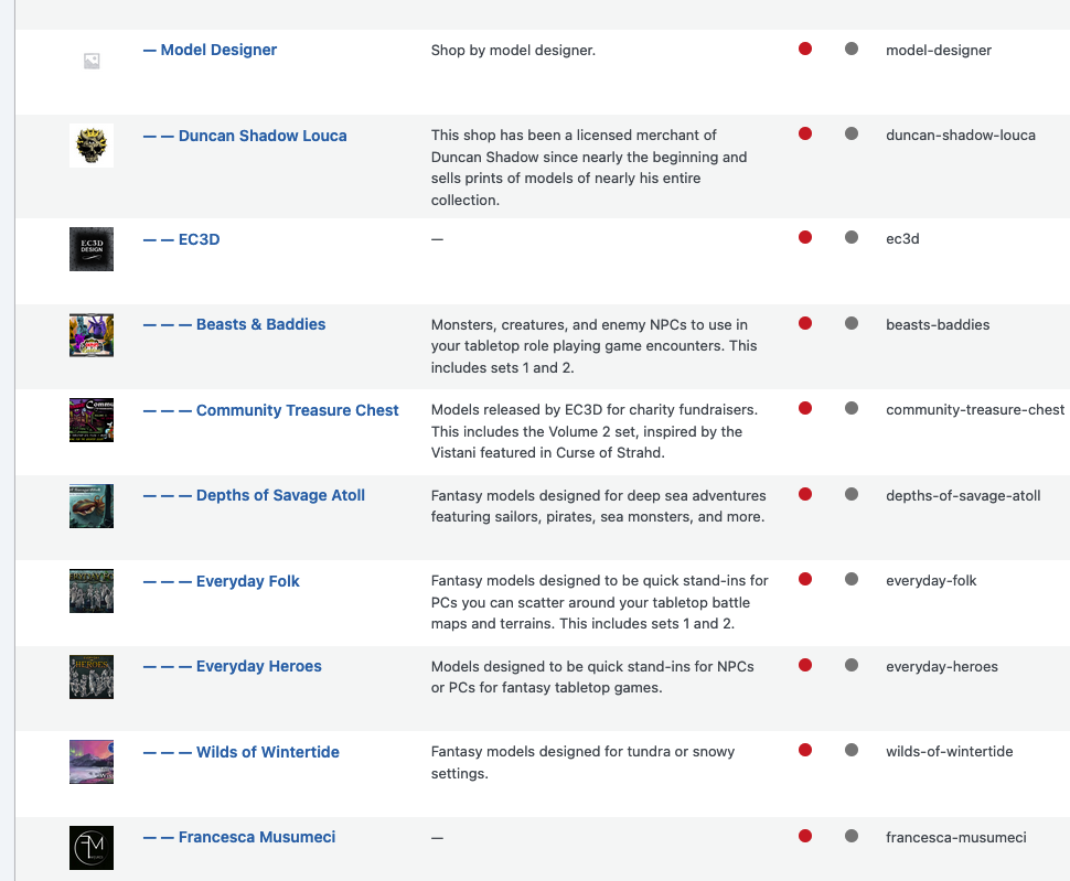
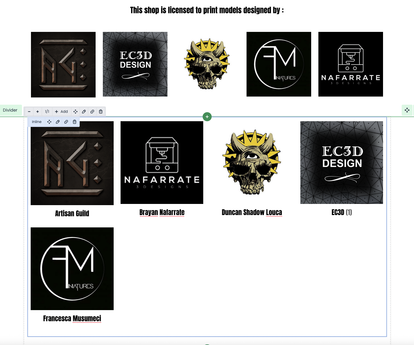
In Products - Categories, I've setup a category "Model Designer" that has 5 children under it (the 5 different designers I have access to), and each designer has their respective sets and/or models they released under it, which is where I want the customer to be directed to when they click on the images.
As a placeholder on the home page I put each logo image in an image gallery and got it to be 5 across, which looked great. But I couldn't figure out how to connect the images to a link or categorized product page.
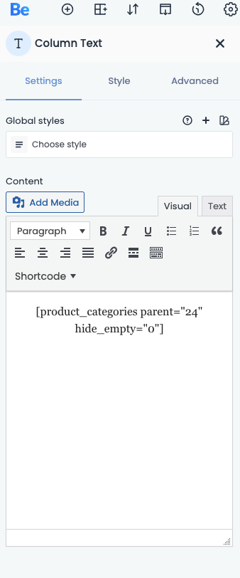
Then I learned how to add the code in text fields to add Categories. I finally figured out which code would get me the 5 logos and click to their products page, but the size of the images is too big. I'd like them to fit 5 across like before.
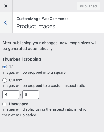
I tried adjusting product image sizes wherever I could (in BeTheme settings and Appearance settings) and tried Regenerating Thumbnails, but it always seems to get stuck in progress (I never see it get to 100%).

(These WERE set at 800, 800, 300, but I reduced them all to see what it affected and where after Regenerating Thumbnails....and for a brief second I saw them get smaller, but it still appeared in 2 rows for some reason...and now it reverted to the bigger size and I can't get it back to the smaller size)
I tried searching for patch CSS codes online to help fix it, but I don't think I found the rights ones or placed it in the correct places.
Is there an easy fix to this or an easier way to do what I'm trying to do? It'd be great to add a hyperlink of some sort to the logo images in an image gallery, or if there was an option to have 5 columns across in a section so I can add individual logo images (or maybe category codes and hope they fit to size within their column).
Thanks for your help!
Comments
Update: I found another way to do this using a pre-built section that allowed me to make 5 columns wide with link-able images! I can work with this option!
Hi,
I am happy to see that you found a suitable solution for you.
Is there anything else I can help you with?
Best regards
@Phil Maybe? I checked how it would look in Mobile view and was horrified at how many of my sections/blocks become huge and don't scale down.
The header text is all bunched up now.
The brand/icon images are now huge and in a stacked column. I'd like these to remain in a single row across, even if the images are small.
And this grid image gallery that was 2 rows @ 5 images across, full width, is now another single stacked column. I'd like this to stay a 2x5 grid gallery, even if the images are small.
Do I have to toggle the Responsive visibility and make separate wraps/sections/blocks that appear they way I'd like? Example: the home page I have as it stands would remain visible for desktop and laptop, and not visible for table or mobile. Then I make a version visible only to mobile and tablet with a whole separate set of blocks? Or is there an easier way to shrink the images down to fit like they do for desktop?
To check that I would need a link to that page.
If it is the link from your first message, I cannot view it because of the under construction enabled.
Please disable it for a while, or send access to your website privately through the contact form, which is on the right side at http://themeforest.net/user/muffingroup#contact.
Notice!
Please attach a link to this forum discussion.
Thanks
@Phil I sent a private message yesterday with login access since I can't seem to disable the Coming Soon page.
We didn't received any message from you unfortunately. Please send the message once again and make sure it was sent.
You must decrease the width of these wraps on mobile view:
Also you might want to decrease image height value:
Best regards
@Phil got it. Thank you! Is there any way to fix the bottom images are are now in a single column? The image gallery.
For the gallery, try the following CSS code:
@media only screen and (max-width:767px){
 .gallery .gallery-item{
  width: 25%!important;
 }
}
Put it in Betheme -> Theme options -> Custom CSS & JS -> CSS.
You will also have to adjust the height value in the gallery element in the Style tab.
Best regards