
Mobile Adjustment for Navigation Bar

I've build a custom header template using a custom Menu I setup in Widgets. I like the way it looks in Desktop view, but it gets all squished in Mobile View. How do I make it so that the Navigation Menu turns into a burger while in Mobile view? Or is there another option so that the Navigation Menu doesn't turn into a stack?
Desktop View:

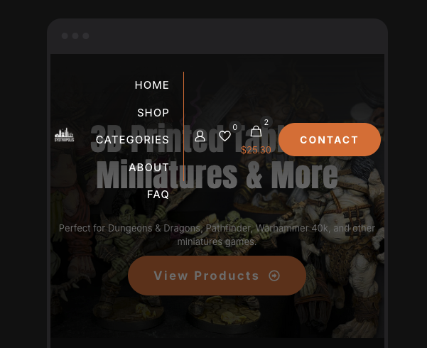
Mobile View:
Comments
Sorry, I should have waited a little longer before posted. I figured it out! I'm used to more intuitive ways to adjust Desktop vs Mobile layouts and have realized BeTheme works quite a bit differently.
Hi,
I am glad to see that you handled it.
If you have any further questions or concerns, please don't hesitate to ask.
Best regards