help with menu spacing and mobile view

Hello,
I have a problem in menu spacing and mobile view.
Can you please help me in reducing space between menu items from desktop so that they can stay on the same line?


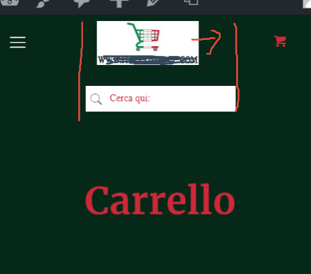
While from mobile view there is a problem because logo is not centered with the search field below.


Can you fix that and let me know how I can center the logo with search field?
Or maybe I could just upload a wider logo, but I need to know the right width

Thank you very much


Comments

  • Hi,
    Please always attach a link to your website so we can check it out. If the page is offline(localhost) then our help will be limited, you will have to contact us when the page is online. Also please make sure that the page is not under maintenance before you provide us the link.
    It is always a good idea to also attach a screenshot, for that use services like snag.gy or pasteboard.co
    thanks
  • Hi Phil the screenshots were attached. Can you see them?
    As in the past I am sending via support the info to reach my website.
    When you get them, please let me know
    Thank you

  • edited November 2020
    1) There is no way to change the spacing of the menu using MHB, they are calculated by JS and CSS won't be a solution here.
    The only way to fix that will be by extending the "Grid Width" (Theme Options > Global > General) or decreasing the menu items by inserting them in submenu.

    2) We strongly suggest not to create this kind of menus for mobile, the menu for mobile should be the most minimalist as possible.
    But, use this CSS:
    @media(max-width:768px){.mhb-row.first-row .mhb-col{flex-basis:33% !important}}
    Thanks
  • Dear Pablo
    thanks a lot for your suggestions.
    Grid width is perfect now

    Regarding point 2 I think there is somethng wrong in the CSS you gave me because from mobile now the logo is too small (I just needed to center it):


    And with that CSS code I have problem also with the desktop menu which is like that now

    Please let me know
    Thank you
  • I corrected the code and it should be fine now.
    I cannot notice the smaller logo or problem on desktop after that :)

    thanks
  • Dear Pablo,
    ok thank you, now it's better
    BUT the logo in my opinion becomes a little too small from mobile ...

    Also I would like to ask you if there is a setting in theme to decide when to switch to toggle menu.
    I need to swtich to toggle menu under 1240px

    Thanks again for your prompt ansers

    Orsola 
  • Did you change the hosts file or moved is somewhere?
    I cannot get into your website right now.

    thanks
  • I changed it few days ago but I immediately sent to your support the new url and admin info.
    Can you please check?
    thank you

  • I through that you made a typo, sorry - I changed the link to proper in hosts file and it works fine.
    But, as I see, the logo is different now and it's full-height right now, so I do not understand what you want to achieve right now.

    thanks
  • Dear Pablo,
    yes the typo was in the first version ;-)
    Now this is the good one.

    I didn't change the logo, it's the same as before.
    The problem is that when you go under let's say 380px the logo becomes too small.
    But I understand that it's full height ... so now the question could be: is there a way to increase header height from mobile under 400px?

    Also don't forget to tell me if there is a setting in theme to decide when to switch to toggle menu.
    I need to swtich to toggle menu under 1240px

    Thanks a lot

  • It cannot be bigger now, because of the proportions of the image - the script is made to not distort them and you should not touch it.
    Even if I tried to make it bigger in CSS, then script tried to keep the proportions and it caused the items to be pushed off the screen.
    Also, it will not cross the original size of the logo which is: https://prnt.sc/vmuov0 because of the distortion.

    About the mobile breakpoint, sadly - it's not possible to make now, we got some requests about making that feature, we noted it and we'll discuss it :)

    If you have some further questions, feel free to ask! :)
    Thanks
  • Dear Paul,
    but I don't understand.
    Can you please tell me why in your demo here
    from tablet and mobile view the logo keep always the same dimension?


    Regardin the other issue I hope that you can fix it soon.

    Thank you

  • It's because it has more space than your menu, take a look - your menu has a lot more elements than the BeGrocery.

    Also, the mobile menu does not contain that much elements, only the logo and hamburger menu.
    You have to know, that MHB divide your header into three containers, when basic betheme headers divide it to 2, so they have more space.

    Thanks
Sign In or Register to comment.
This website uses cookies

We use cookies to personalise content and ads, to provide social media features and to analyse our traffic. We also share information about your use of our site with our social media, advertising and analytics partners who may combine it with other information that you’ve provided to them or that they’ve collected from your use of their services.

Cookies are small text files that can be used by websites to make a user's experience more efficient.

The law states that we can store cookies on your device if they are strictly necessary for the operation of this site. For all other types of cookies we need your permission. This means that cookies which are categorized as necessary, are processed based on GDPR Art. 6 (1) (f). All other cookies, meaning those from the categories preferences and marketing, are processed based on GDPR Art. 6 (1) (a) GDPR.

This site uses different types of cookies. Some cookies are placed by third party services that appear on our pages.

You can at any time change or withdraw your consent from the Cookie Declaration on our website.

Learn more about who we are, how you can contact us and how we process personal data in our Privacy Policy.

Please state your consent ID and date when you contact us regarding your consent.