
Wrap - responsive

Hello, can you help me? I have a problem with responsive.
Is there a way to optimize the wrap?
Hello, can you help me? I have a problem with responsive.
Is there a way to optimize the wrap?
Comments
Hello,
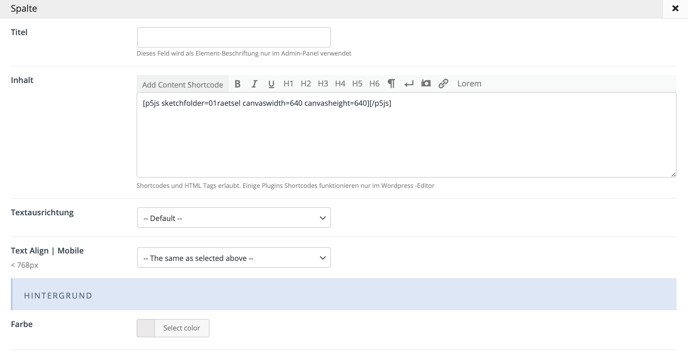
Please, try to put this image in Image item, and check if it works then.
Thanks
Many thanks for your response?
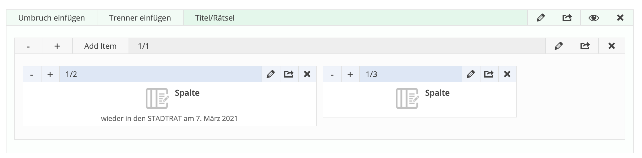
I want to insert a Javascript code (P5js) and I cannot insert this code into an image wrap. I need a column wrap for this. I can paste the code there. How can I add this code so that the wrap adapts (without gaps)?
Can you tell me what gaps are you talking about, please?
It would be great if you attach a screenshot pointing these gaps.
Thanks
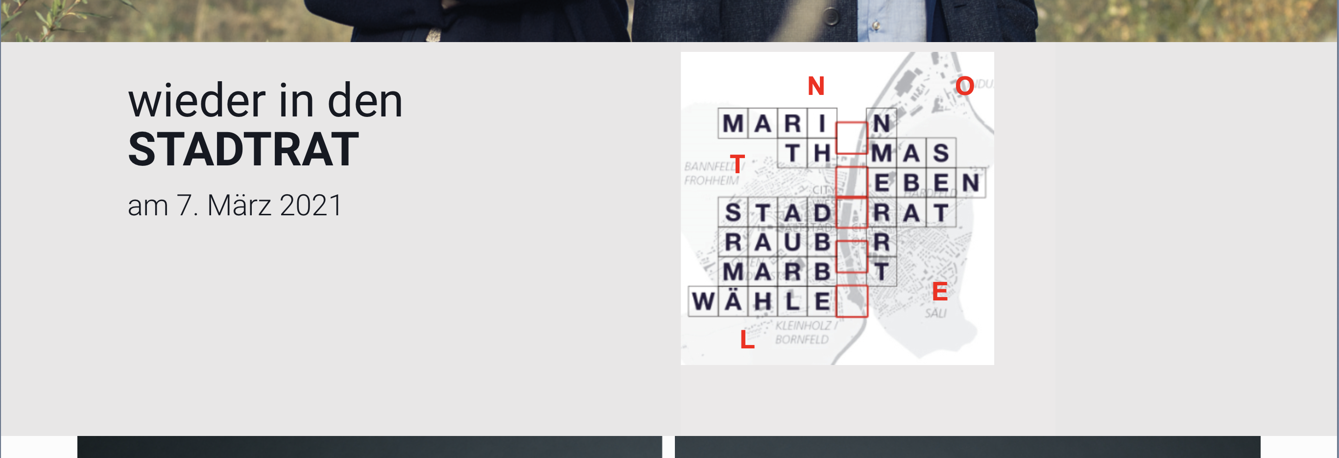
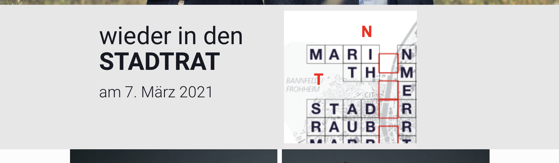
I programmed an animation with the size 320 X 320 px (smartphone size). This looks good on the smartphone view. The wrap distance is increased in the computer view. When viewing the pad, not all of the animation is shown. You are welcome to check out the website with the animation (crossword puzzle) via the link below.
(Password: Sh1swF20)
https://www.oltenunserestadt.ch
Sorry, but that gap is coming from your script:
We do not support and we do not know how the p5js script works, so we cannot give you a solution of that problem.
Also, you have to be aware, that it's using the iframe which does not recognize the responsive version of the website. (is simply not created to rwd)
Thanks
ok, thank you for your reply