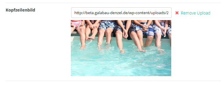
header image size - correct?
Hi, on post´s and portofolio items we set an header image.
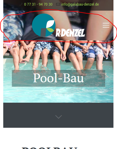
It looks fine on a desktop, but on mobile it is always split: 1 version of the image and a separate, fuzzy version of the image on top. We test it with different image sizes but nothing changes. Is there a separate setting to display a full screen version of the image, or does it have to be in a special format? And which one?
Thank you!


Comments
Hi,
Please always attach a link so we can check it out. If the page is offline(localhost), then our help will be limited. You will have to contact us when the page is online. Also, please make sure that the page is not under maintenance before you provide us the link.
Thanks
Hi,
you can watch/check it here: http://beta.galabau-denzel.de/pools/pool-bau/
Thank´s!
Please, go to Betheme -> Theme options -> Responsive -> Header, and check the Transparent option.
After that, please, check if the display suits you.
Best regards
Hi,
all right. I understand, works fine.
Thank you!