
Responsive Issue

The website does not seem to be resizing properly when viewing on smaller screens. I know it is an issue in the setting but I can't seem to find the problem. On desktops it displays properly but as the screen decreases the menu moves down into the images below. When viewed on the phone nothing displays properly. Any help you can give would be greatly appreciated. The web address is http://alamobusinesscenter.com .
Thanks
Comments
Hello,
I noticed that you do not have the newest version of Betheme.
Please, update it, and check if this issue still persists.
Thanks
Hello,
Sorry it has taken so lone for me ta answer, I just got out of the hospital after emergency surgery. After speaking to my client I found they tried to make changes to the responsive but they do not remember what they did. When resizing the browser the main menu drops into the content below and when on mobile phone the content does not display properly. Any help would be greatly appreciated.
I am still seeing that your Betheme version is not the newest one. Can you update it, please? It might be the source of this issue.
Best regards
Hi,
Thank you. The theme has been updated. The responsive issue is still there.
Please, go to Betheme -> Theme options -> Responsive -> Header, decrease the Header height, and check if this problem still remains.
Thanks
Thank you for your reply. I did as you suggested and there is still an issue with the responsive. I am completely baffled as to what they changed to cause this. Do you have any other suggestions?
Thank you.
Can you tell me how it suppose to look/how it looked before, please?
Because now it seems to look better than on the screenshot you showed.
Thanks
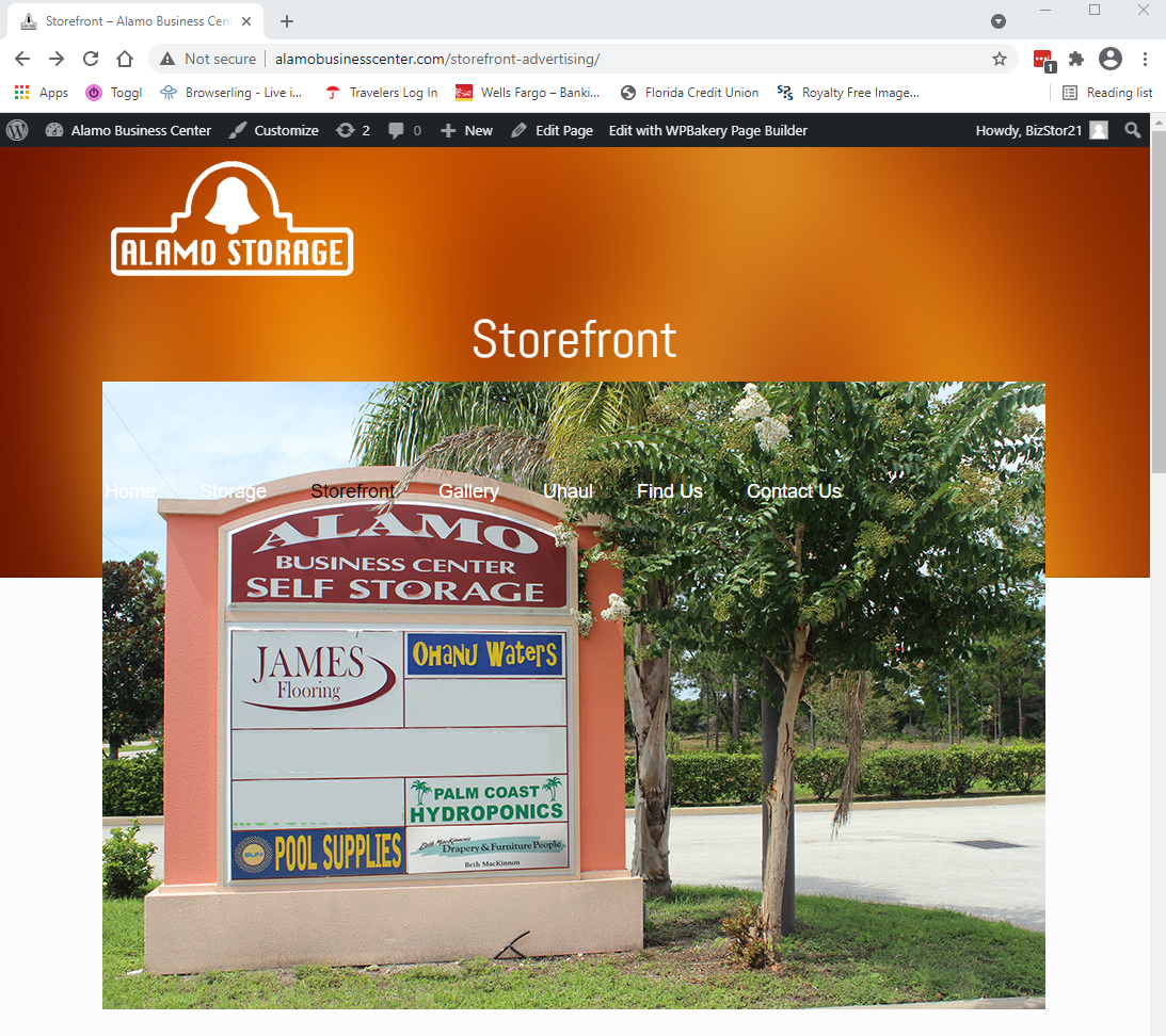
Everything is crowded up. There should be the logo, "Storage" is the page title so there should be a 60px gap between the title and the image. Also, there should be a gap between the bottom of the image and the text. Prior to their changes it displayed as it should when in mobile.
Please, turn off all of the plugins, refresh your cache, and check if this problem persists.
Moreover, if you are using a child theme, please, switch to parent, and recheck it.
If the problem remains, I think the best option would be to use a backup before this change. If you did not do any backup, please, contact your hosting provider if they do not have any.
Thanks
I've done all that you suggested and it still isn't right.
If even a backup did not help, please send us WordPress dashboard access privately thru the contact form, which is on the right side at http://themeforest.net/user/muffingroup#contact, and we will check what might be the reason.
Notice!
Please attach a link to this forum discussion.
Thanks