Highlight Padding Edit CSS Did Not Work
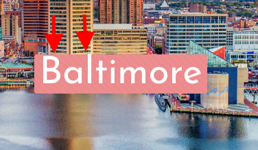
The highlighted text in the fancy header section goes to the edge of the border of the highlighted section and it looks really off-balance. I tried to edit the CSS line 2505 to increase the padding size of the highlight section, but it did nothing. I changed it from 1px to 7px clicked update file and nothing happened.
website: https://chesapeake-traveler.ambitdigitalservices.com/


Comments
Hello,
Sorry, but you have "Coming Soon" enabled on your website, and I was not able to investigate it properly.
Can you turn it off for a while, please?
Thanks
Thanks, Phil. I have several problems I hope you can help me with.
Problem 1: Hightlighted Text
Sure, I have published it so you can see it publicly now. The pixel change from 1px to 7px on line 2507 of the CSS code seems to have actually worked overnight because today it is showing the padding increase on the top part of the highlighted section, however, the highlighting is still really off-balance. It shows quite a lot more padding on the bottom so the word is floating much closer to the top border. Can you fix this so it's even?
https://chesapeake-traveler.ambitdigitalservices.com/baltimore/
Problem 2: Unable to change Lorem Ipsum in Blog element.
I have tried using both Yoast and RankMath to update the "descriptions" of the blog posts, but there doesn't seem to be a place or way to change this text.
(Same page as above)
Problem 3: Selecting "Equal Height | items in wrap" does not work. The images/elements in problem 2 (above) should all be the same size when I select this style option in the section editing. This is also the case on the home page in the regions section. It weirdly creates a huge gap of space between sections, but does not make the items in the wrap equal height.
Problem 4: Images in the backend of the Sliding Box Element are GIANT and make it nearly impossible to see what you're doing.
This may be okay for me to figure out, but when I hand the site over to my client, she is not going to be okay with this. I realize the newly updated Muffin builder is still working out quirks, and wondering if there's an easy fix. If I zoom way out to 50%, you can see the perspective.
Problem 5: Fancy Heading
I'm wondering if there's a way to show more of the background image than just using 5 or 6 <br/>
This is how I made it work. Otherwise it only shows a small section of the image (same pages as above).
<br />
<br /><br /><br /><br /><br /><h1>[highlight color="#ffffff" ]Baltimore[/highlight]</h1><br /><br />
<br /><br /><br /><br />
Problem 6: Updated Theme makes it difficult to see the wrap section when hovering over the section. It's confusing if you don't know what you're looking for and how to hover over it.
Unfortunately, I can't show you a screenshot of this because I can't select screen shot and hover over it at the same time. It's in the backend, in the sections. The Section is in green, the Wrap is in gray, and the Elements are in blue. The gray hover doesn't show up very easily unless you know what you're looking for.
Thanks very much for your help. I'm a loyal BeTheme user and have many licenses.
1) Are you sure that you turned off the Coming Soon page? Because I still see it.
2) Please edit the posts, and check if the Lorem ipsum is not placed in the WP editor. It may also be placed in the Excerpt field in the right sidebar.
3) The Equal Height | items in wrap option applies to the builder items, so the blog item is one element.
If you want the displayed posts to be the same size, then you should choose the right Style. Also, your posts should have featured images the same size, and post titles and excerpts should have similar lengths because they might make posts taller.
4) Please ensure that you have the newest version of Betheme because the issue with the image display in builder was fixed in one of the recent updates.
5) You can add padding to the column in the settings of it.
6) You can turn off the hover effect in the builder settings.
If you do not see this option, please, update the Betheme.
Thanks
Hi Phil, thanks for your help. Okay, I apologize, I checked and it was still showing as an unpublished page. I have corrected this so it will now show you a published version https://chesapeake-traveler.ambitdigitalservices.com/ so maybe you can now help with problem 1. For problem 2, I figured out that when I have the Classic Editor plugin installed, it does NOT show the excerpt options on the right sidebar in the backend. For problem 3, I can try to change the image size and excerpt but was hoping there is a simple way to make all of the items uniformly the same. For problem 4, updating the theme helped with the giant images problem. For problem 5, you might have to look at the backend. It's in the fancy heading element, not the column element. Problem 6, got it and that helped.
1) Please try to add some top padding. For example, 13px or more if you need.
2) So now you do not need help with it?
3) I think that is the simplest way to achieve that. You could adjust their size with custom CSS, but it requires a little more advanced coding, and for that, you should contact your web developer.
5) After looking at your website, I understand what you were talking about. To increase this space you can use the padding as well, but the section padding.
Thanks