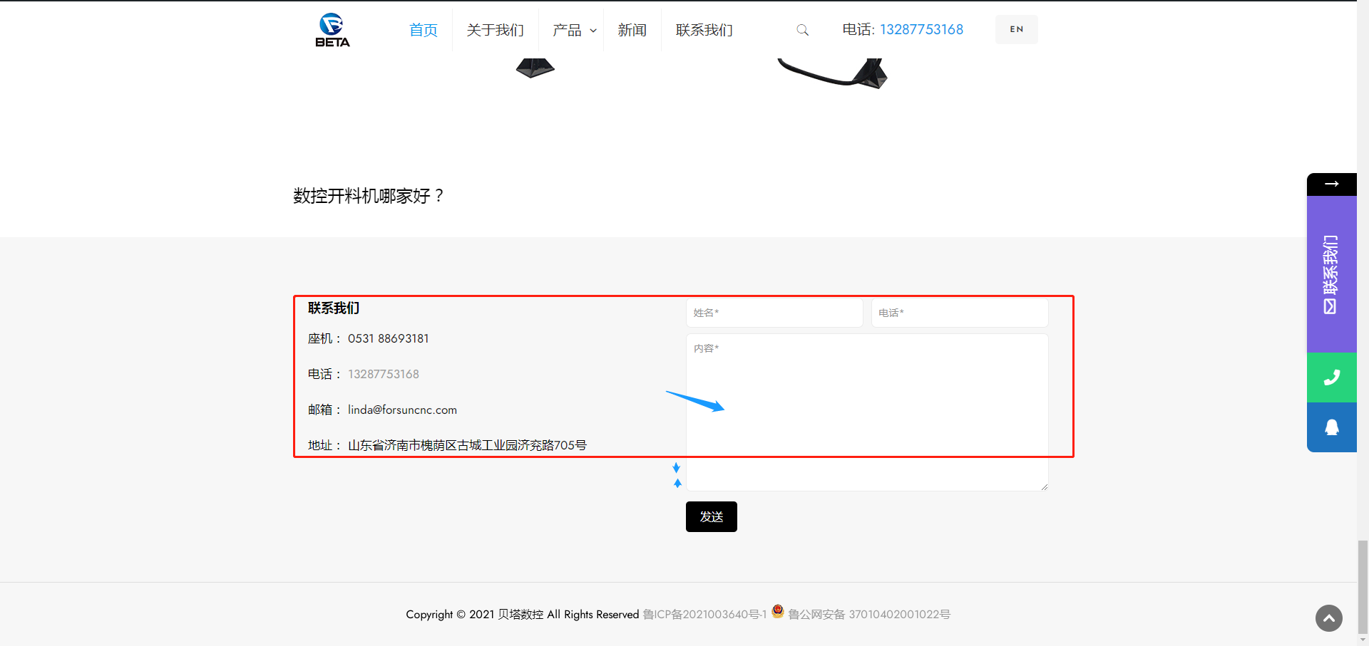
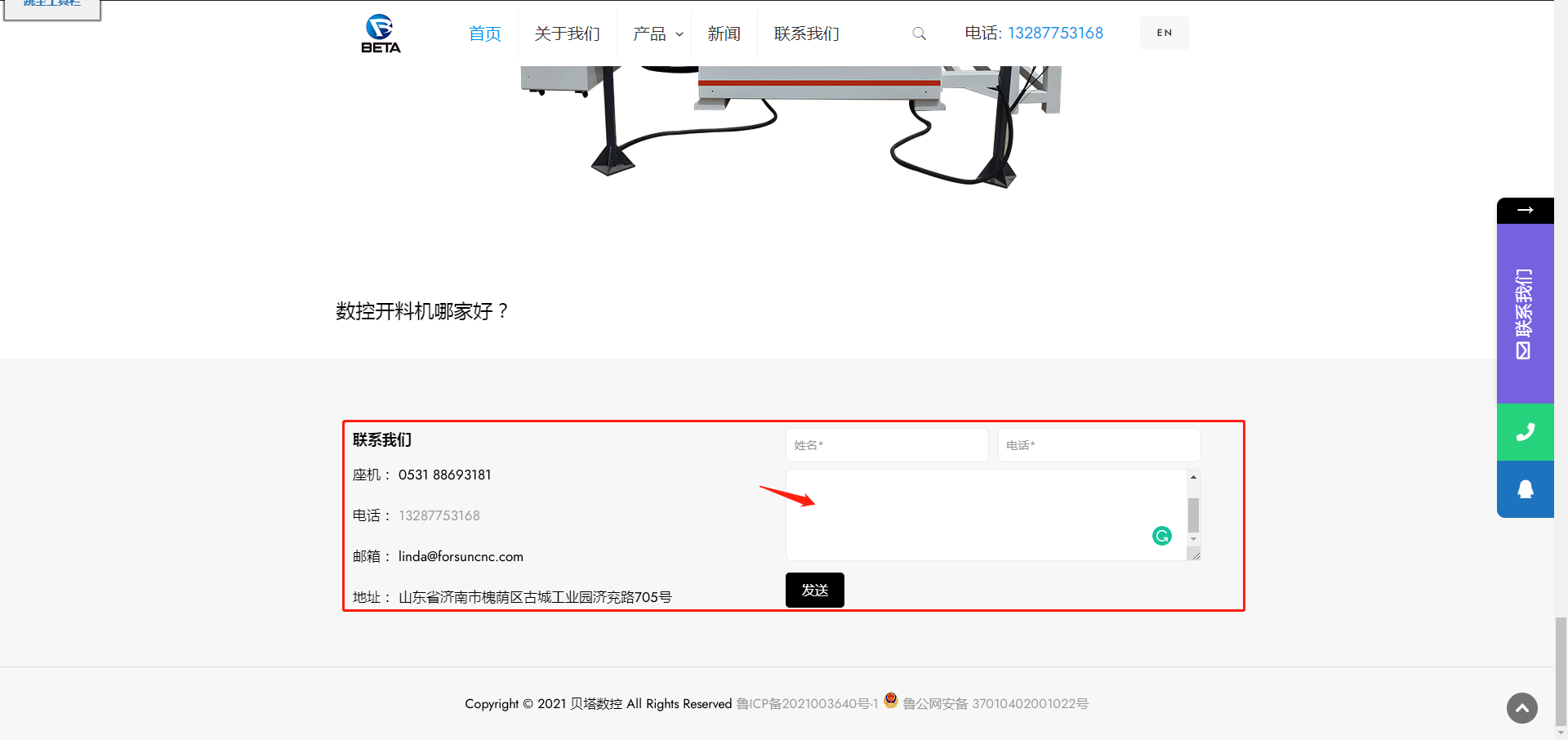
The contact form plug-in in the bottom navigation bar, can I fix the position?
Hello, this is my website:https://www.betacnc.com/. I have added the contact form generated by the "contact form 7" plug-in at the bottom navigation bar of the website. Can I fix the size of the "内容*" column?
This is what it looks like now, he has one more piece than the left column
Can it be like this, as high as the left side?


Comments
Hello,
Please, try to shorten the message input with the "xNumber" attribute.
Check the following screenshot for a better understanding.
You can try x3, x4, etc.
Thanks
Thanks