
problem with menu

Hi support,
We have problems with menu on apple devices on Chrome and Safari.
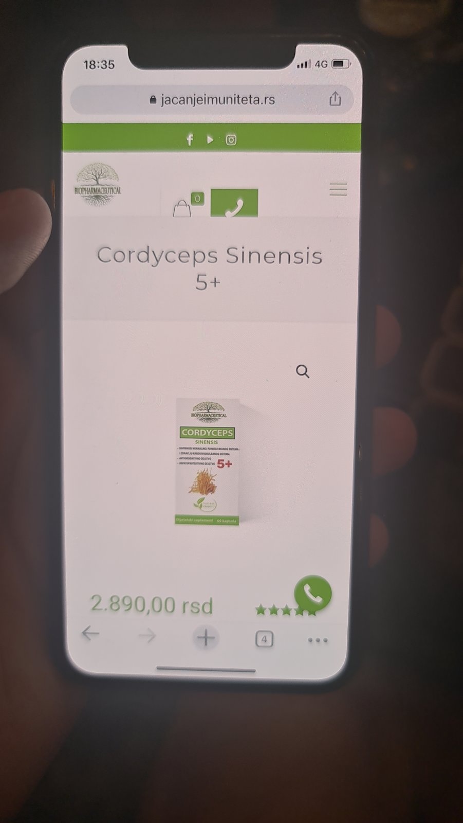
In attachment we are sending you 3 photos, 1 is on android and everything looks good but on iOS devices it goes down below line.


Hi support,
We have problems with menu on apple devices on Chrome and Safari.
In attachment we are sending you 3 photos, 1 is on android and everything looks good but on iOS devices it goes down below line.
Comments
Hello,
Please, turn off all of the plugins, refresh your cache, and check if the issue persists.
Moreover, if you are using a child theme, switch to parent, and recheck it.
Thanks
Hi support, The issue still persists. We tried to turn off all plugins and refreshed cache but nothing happens. We are using parent theme.
We added some custom css to move up call to action button (green button with phone icon), and cart button. We asume that this line of css code doesnt work in iOS. This is the code:
@media only screen and (max-width: 767px) {
.header-plain #Top_bar .top_bar_right {
margin-top: -30px;
margin-right: 10px;
height: 0px!important;
}
}
margin-top - 30px is problem. When we delete this line of css, the problem is shown on android also.
Can you help us to write useful code for this?
Best regards
Please send us WordPress dashboard access privately thru the contact form, which is on the right side at [Links visible only for registered users] and we will check what might be the reason.
Notice!
Please attach a link to this forum discussion.
Thanks
ok, thanks. We sent you details.
Best regards
Sorry, but we didn't get any message from you yet.
Please check your mail inbox for our response. Look also inside the spam folder.
If you don't have any message from us, please send your login credentials again.
Be sure that you sent all of the required information mentioned in the previous message.
Thanks
Never mind, I just got it and noticed that you do not have the newest version of Betheme.
Please, update it, and check if the issue persists. If this will not help, I will take a second look at your website.
Thanks
Thanks Phil. We updated theme but still have this issues, only on iOS, on android it is working fine. Photo in attach for iOS.
I have added the following code, and it is working, but only when I remove all of your CSS's.
@media only screen and (max-width: 767px) {
   body.header-plain .top_bar_right_wrapper,
  .top_bar_right{
      margin-top: -80px!important;
      margin-bottom: 30px
   }
   body.header-plain #Top_bar a.action_button{
      line-height: 50px!important;
   }
}
I did not want to modify or remove your codes, so you need to find which one needs to be changed/replaced.
If you do not see any difference after saving changes, please, turn off the WP rocket because it holds the cache with previous settings.
Best regards
Now it is even worse when it was before. Slider is down and tel is abowe logo also on android. We deleted cache and tried on devices that hasnt used website before and the problem is still there.
Here is empty space between header and slider and phone and cart are in upper header now fully viewable.
There is no solution to remove all css and to have only yours. Do you have any other solution?
Just write here and we will test it live on our website so we dont do in the same time
It is not working properly because it is not getting along with your CSS's and I did not want to touch them.
Look at the following screenshot:
I removed all your custom CSS's from your website's source and placed the one I have written. It would be best to modify the codes you used for the mobile header so the one I have sent will look like on the screenshot.
Unfortunately, there is no other way to achieve that.
Best regards