Change cart layout
Is there a way to change the cart layout back to full width as it was previously?
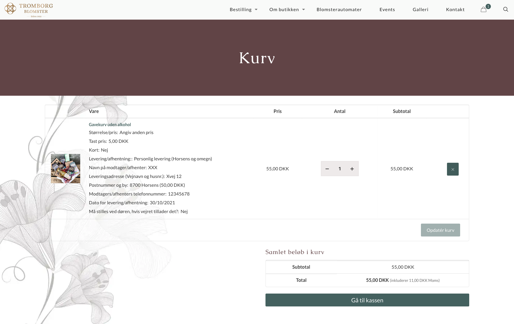
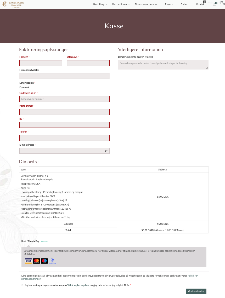
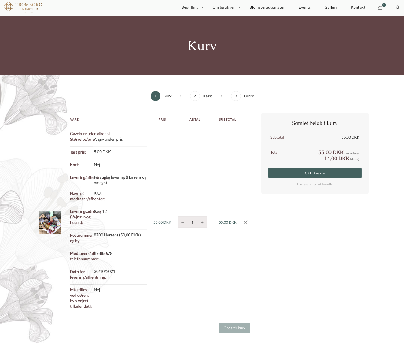
In this florist web shop where customers are able to customise bouquets, the narrow width of the order overview table makes the cart look very messy.
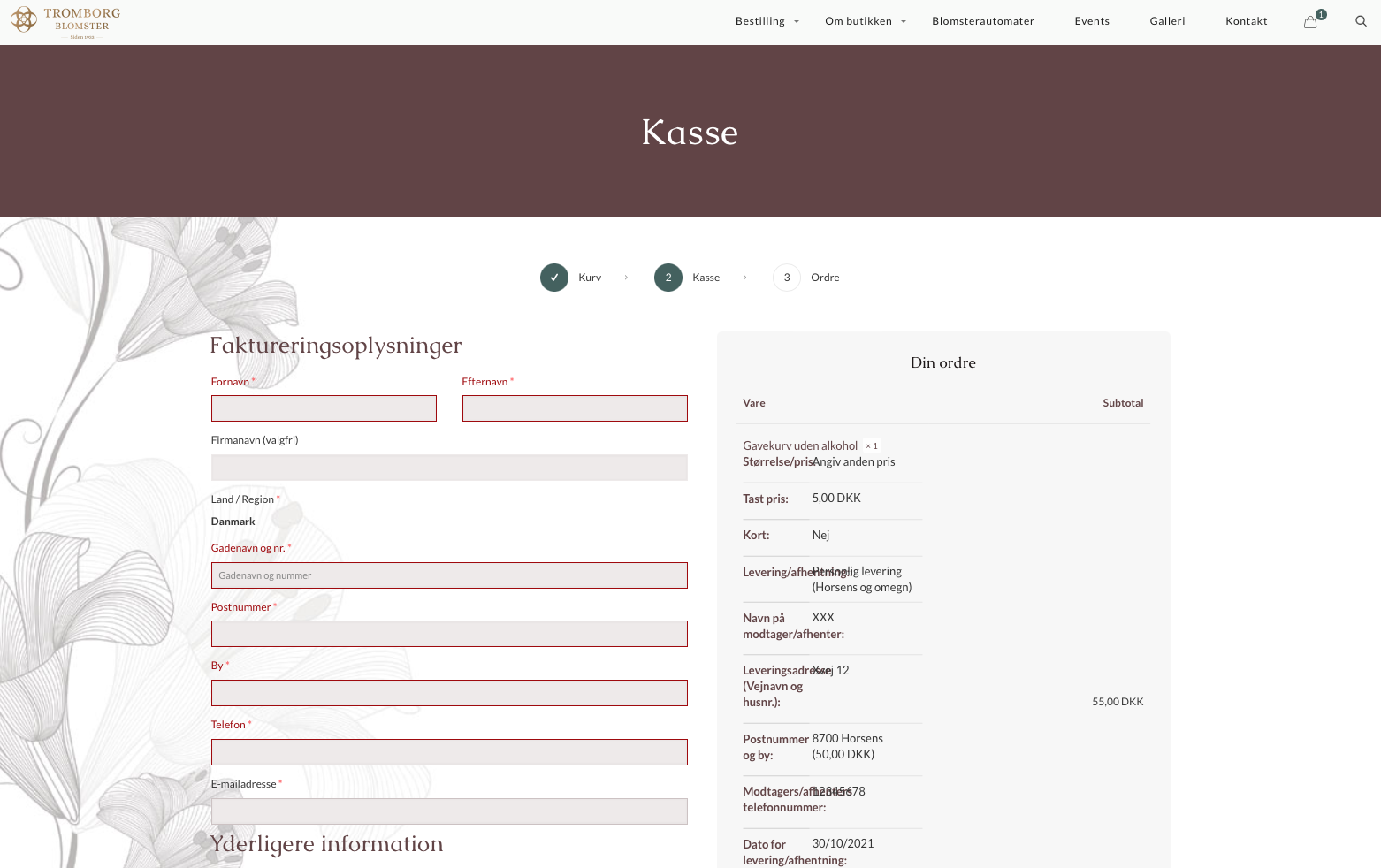
Attached are three images of
1-2: Cart on live site with BeTheme 25.0.4 (https://blomster-horsens.dk/)
3-4: Cart on staging site with BeTheme 25.1.5.1 (https://tromborgblomster.staging.tempurl.host/)


Comments
Hello,
Can you share with us the login and password for staging site?
I'll remove it as soon as I'll notice it.
thanks
Thanks, Pablo - but can I please send it directly/privately/securely instead?
Please send this information privately thru the contact form, which is on the right side at http://themeforest.net/user/muffingroup#contact and we will check what might be the reason.
Notice!
Please attach a link to this forum discussion.
Thanks
1) To make the table in cart page full width, please, use the following code:
.mfn-cart-step-1 .woocommerce .woocommerce-cart-form{
   flex-basis: 100%;
 max-width: 100%;
}
The text overlaps each other because some strings of characters are not separated with space, and they do not break into another line. Therefore, the display should be correct if you add a space in these words.
2) Please turn off all of the plugins except WooCommerce, refresh your cache, and check if the problem with the checkout page persists.
Moreover, if you use a child theme, switch to parent, and recheck it.
Thanks
Hello,
we have a little problem with the checkout also. It's possible to have the old checkout like before on two sites and not on three? Just cart and after directly the information, payment methods and the button for the order?
After the installation of the last Betheme version we don’t have the button to go to the last page (order) after the Cash-Desk (Screenshot). Do you have any ideas what’s can be the issue?
For the moment, we came back to the old betheme version to don’t lose customers.
Thanks a lot
The problem with the button to the last page is resolved. But we still have the question if its possible to have the old style and to don´t have the checkout on three sites.
Thanks
Hi @DieTreuetester,
Sorry, but I do not understand what three sites you are talking about.
Can you explain it to me in more detail, please?
Thanks
Hello,
for better understanding: iMark81 post in the first question 4 screenshots.
Pictures 1-2 layout of the cart with BeTheme 25.0.4
Pictures 3-4 layout of the cart with BeTheme 25.1.5.1
We would like to keep the layout like on picture 1 and 2 without to have the steps (cart-desk-order) in the version 25.1.5.1.
Thanks
So, do you want to remove this part:
Am I getting this right?
Thanks
No, we want that everything is on one site like the screenshot 1 & 2 of iMark81 from Betheme Version 25.0.4
There is no setting to restore the display from that version.
The only option would be a backup of your website to this version.
Best regards
Hi Phil,
Above (your screenshot from Dec 2021), you are suggesting that it's possible to remove the "cart - checkout - order" header. I don't see a solution mentioned here or elsewhere. Is it possible?
I have purchased a Woo Commerce extension to redirect directly to checkout (skip cart) when a product is "added to cart", so it would be great to avoid this header.
Staging site is:
https://tromborgblomster.staging.tempurl.host
user: imj // pw: angled.other.quality
Thanks,
Ivan
Hi @iMark81,
Please, put the following CSS code in Betheme -> Theme options -> Custom CSS & JS -> CSS.
.mfn-cart-step .mfn-checkout-steps{
   display: none!important;
}
It will remove these steps from the header.
Thanks