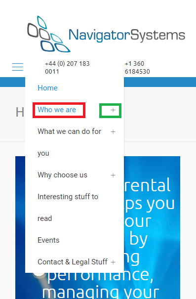
Mobile menu - click on text to expand
For the mobile menu, any sub-menu is closed by default and requires to press on the plus icon to toggle it open. Is there a way to extend the click area to cover the text as well as the + icon ?
i.e currently the user has to click on the + (highlighted in green) to expand the menu, which is fiddly on a mobile. I'd like them to be able to click on the submenu caption (highlighted in red) to expand the menu.

Comments
Hello,
If you want to have the whole menu item clickable, please, head to the following topic: https://forum.muffingroup.com/betheme/discussion/39360/optimising-dropdowns-mobile#latest
There you will find instructions on how to achieve that.
Thanks
Thanks, but I can't get it to work. As I'm using the header builder I'm guessing that the CSS wants to be slightly different
I've tried the CSS given in the other message, as well as removing the #Side_slide and adding #mhb-menu (all three options), but none of them change the menu. What am I missing please ?
URL is https://www.navigator.uk/
#mhb-menu #menu ul li.submenu .menu-toggle::after {
color: red !important;
}
#mhb-menu #menu ul li.submenu .menu-toggle::after {
position: absolute !important;
right: 10px !important;
}
#mhb-menu #menu ul li.submenu .menu-toggle {
width:100% !important;
}
Please, try the following code instead:
.mobile .mhb-menu .menu-toggle::after {
   position: absolute !important;
   right: 10px !important;
 padding-left: 178px!important;
}
Thanks
Thanks. That works perfectly.