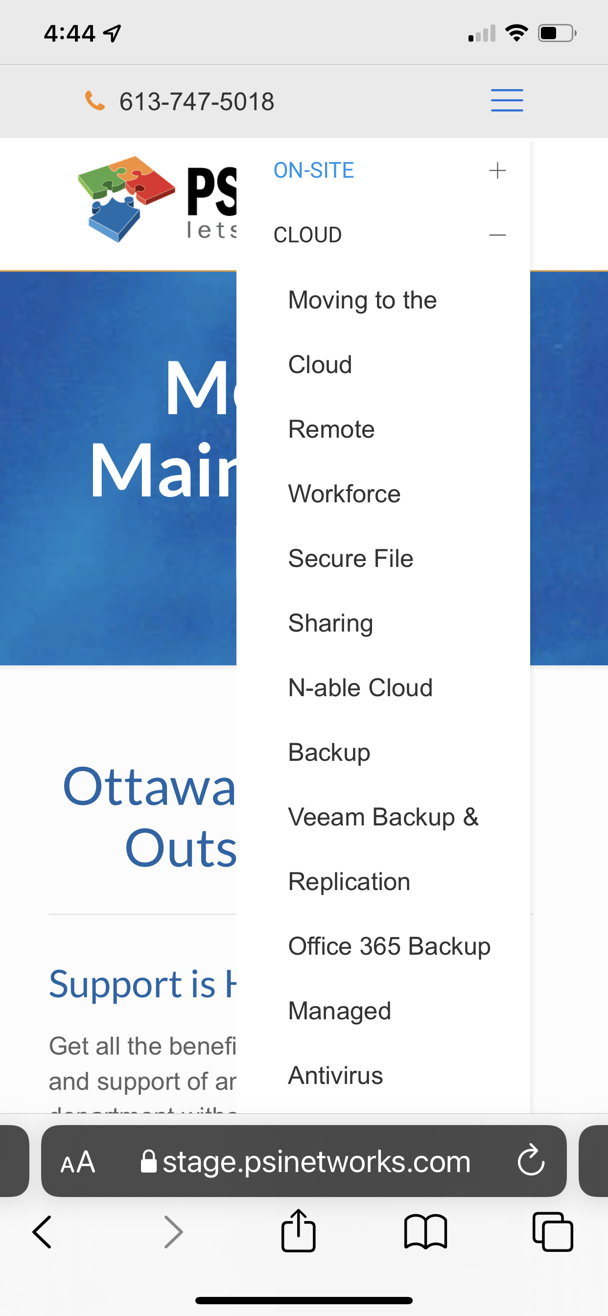
Header Builder Mobile Menu Spacing Problem
Current setting has uniform spacing between single line and two line titles (see image).
How do I correct the leading for two line titles so they are properly grouped visually?
First item is "Moving to the Cloud" then "Remote Workforce", etc.
Knowing how to widen that menu would also be helpful.
THANKS!

Comments
Hi,
Please always attach a link to your website so we can check it out. If the page is offline(localhost), then our help will be limited. You will have to contact us when the page is online. Also, please make sure that the page is not under maintenance before you provide us with the link.
Thanks
Hey thanks. The link was right there in the graphic.
https://stage.psinetworks.com
If you put the following CSS code in Betheme -> Theme options -> Custom CSS & JS -> CSS, it will widen your menu, and menu items that are long, will be displayed in one line.
.mobile .mhb-menu .menu li ul li,
.mobile .mhb-menu .menu{
    width: 280px!important;
}
Thanks
Thank you very much. What about spacing between menu items breaking over on to two lines?
Can you show me what spacing you are talking about on a screenshot, please?
When you use the code I have sent you, all menu items in two lines will be in one line, and spacing between all will be the same.
Thanks
See first entry in this post.
Sorry, but I still do not know what spacing you are talking about exactly.
Can you point it to me, and explain in more detail what you want to achieve, please?
Thanks