Updating from version 21.2 breaks layout
Hello,
This site is using BeTheme version 21.2: https://communicators.com/
I've cloned the site to https://communicators.clients.greenstrands.com/ and updated BeTheme to version 26.1
I'm trying to match the layout but can't find the right combination using the flex settings in the new version, especially on mobile.
Specifically these 2 sections:
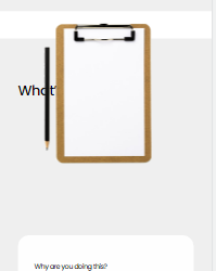
What’s Your Story?
On mobile the text and image overlap. How do I get them to stack on mobile? (image1.png)
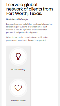
I serve a global network ...
The 4 boxes won't stretch to full width and they loose the space between boxes. (image2.png)
I can give an admin login if needed.
Many thanks.


Comments
Hi,
1) In advanced settings of these elements you can set the z-index for the column and image.
2) Please send us WordPress dashboard access privately thru the contact form, which is on the right side at http://themeforest.net/user/muffingroup#contact and we will check what might be the reason.
Notice!
Please attach a link to this forum discussion.
Thanks
Credentials sent.
z-index won't make the columns stack on mobile.
There's also the second problem about spacing mentioned above. This would be a big help, thanks.
Problem solved - I just rebuilt each section instead of trying to figure out the differences.
Thanks for your help.
Please disregard and close ticket.
Good to hear that you manage to resolve it.
If you have any other questions or problems, feel free to ask.
Thanks