
Header Builder in BeTheme trying to make changes

Hi There,
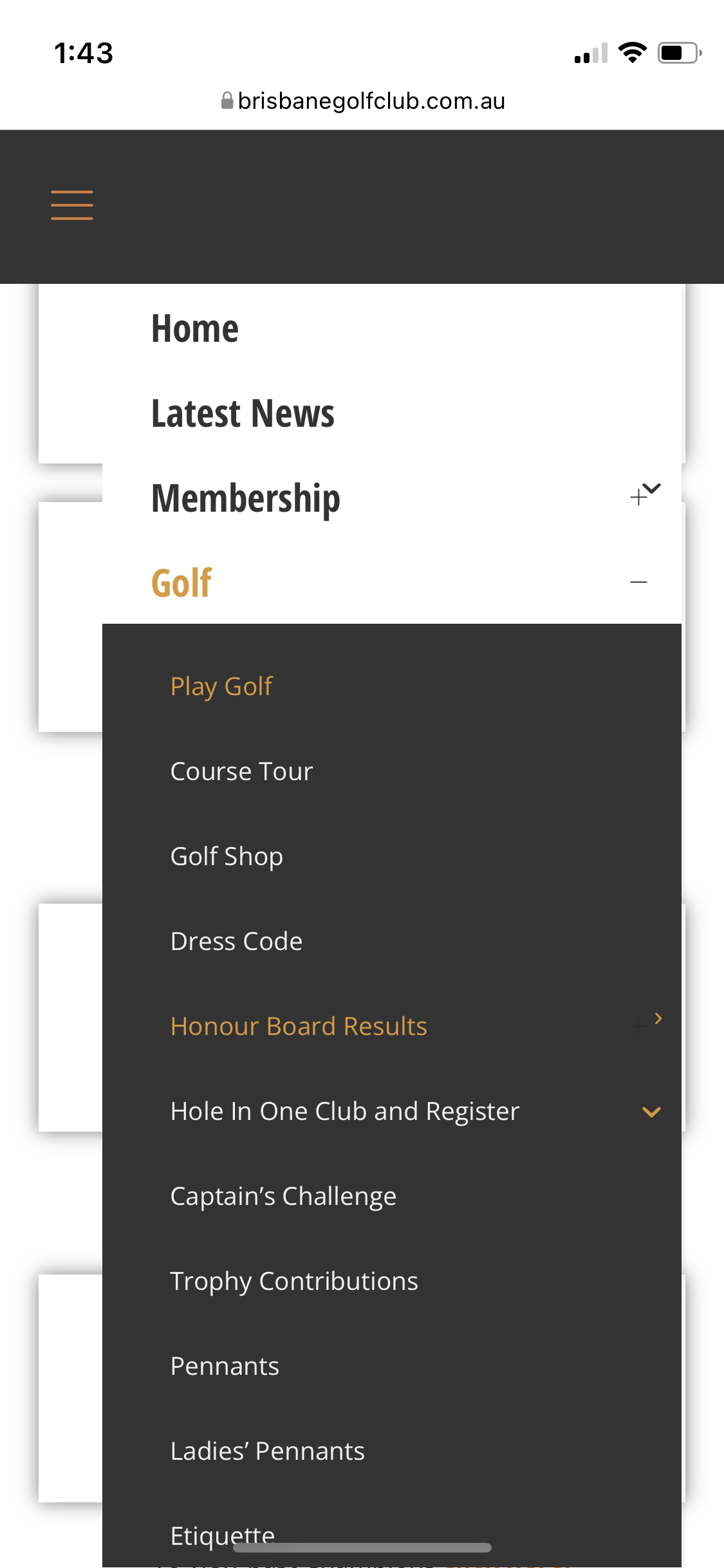
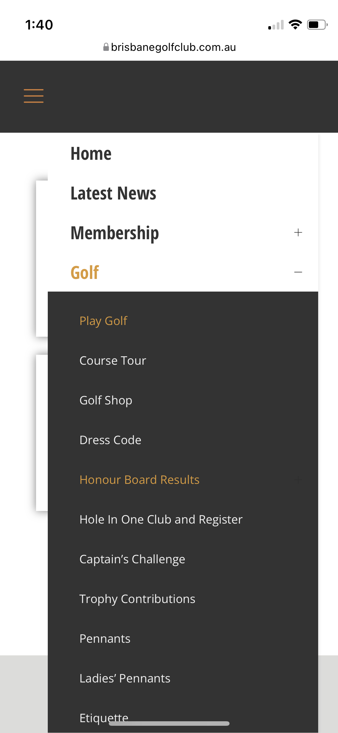
I've used Header Builder as I need to customise the header for desktop and menu. I'm not having much luck trying to get the dropdown menu on mobile fall flush left. Can anyone help on how I can position this?
It also wont scroll down so you can read the rest of the menu on mobile. Any idea to fix this?
website: brisbanegolfclub/dev/play-golf
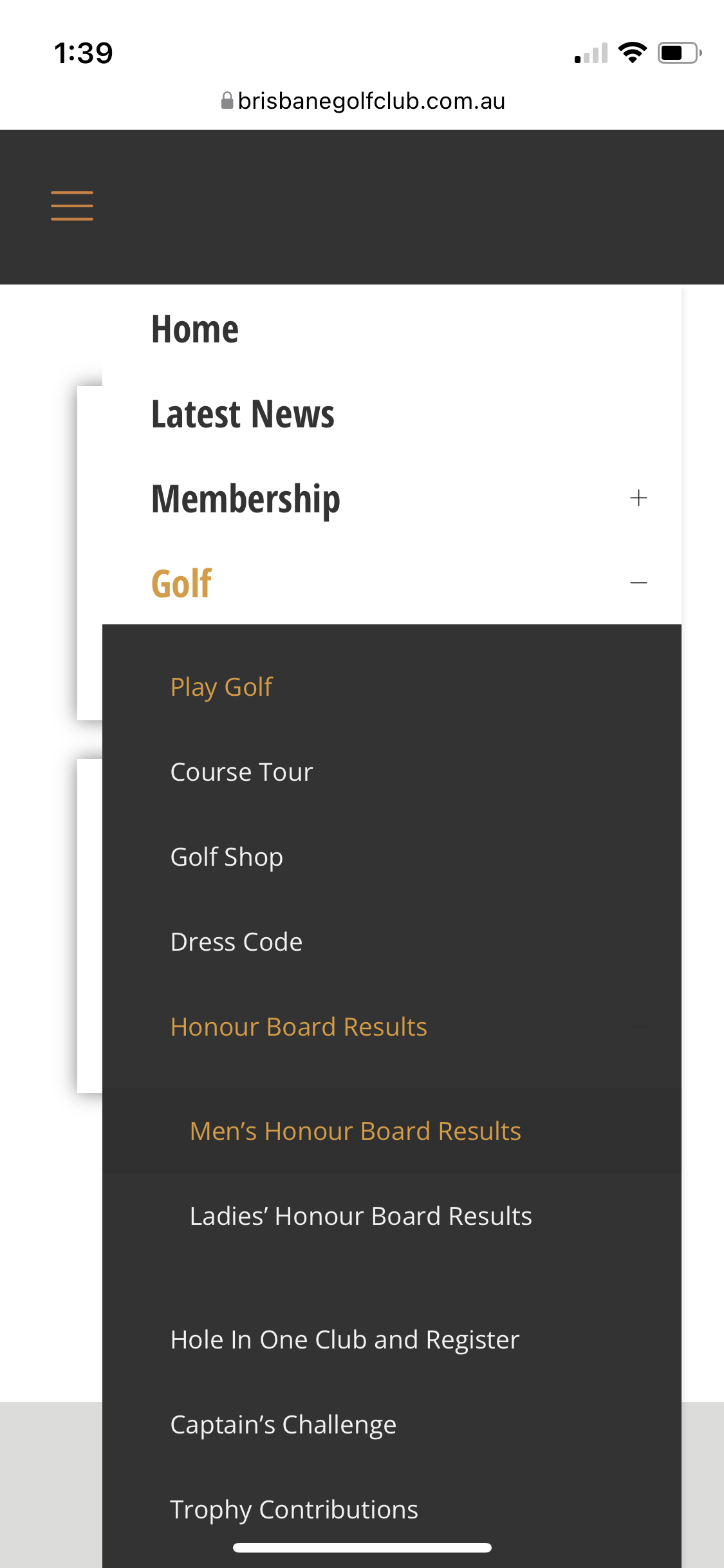
Also, I have a sub-menu that falls under play-golf/honour-board-results/
- Men's Honour Board Results
- Ladies' Honour Board Results
On desktop a little toggle appears in the menu to let you know there is more, but I can't seem to get it working on mobile. You can still press on the menu item and it will drop down it would be nice to have some sort of icon. In Header Builder when I tick the box to have the toggle I end of having two different icons. There seems to be some sort of crossover between the theme menu and header builder.
Can anyone help.
I've added some images below.
Thanks,


Comments
Hi,
1) You can move the menu on mobile to the left by writing a custom CSS code and placing it in Betheme -> Theme options -> Custom CSS & JS -> CSS. Do you need help with writing it?
2) There is no setting to add scroll for the mobile menu in the Header Builder. You would have to create a new menu for the mobile display to fit on the screen.
3) There is a toggle, but it has the same color as the background.
This also can be overwritten by the custom CSS code.
Thanks
Yes are you able to help with the code. I've tried a few things and it hasn't worked.
Thank you.
Please, use the following CSS code:
@media only screen and (max-width: 767px){
   .mhb-col.left .mhb-menu .menu {
   left: -50px!important;
 }
}
Best regards