
responsive for the tablet does not work

Hi,
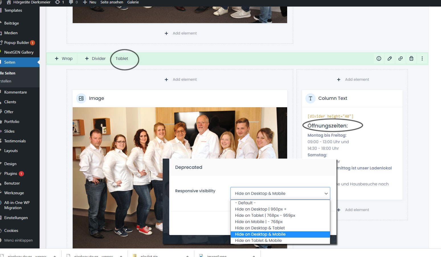
I have created a display for the desktop and for the iPhone, now I have created a version for the tablet to prevent the line break of the word "Öffnungszeiten:". Unfortunately it doesn't work, although I set the tablet setting to "Hide on Desktop & Mobil" for Responsive visibility, but
every time I save this it is reset to "Default" afterwards.
https://www.hoergeraete-dierksmeier.de/dinslaken-hauptfiliale/
Thanks and a nice weekend
Comments
Hi,
Did you try using the new responsive options?
You can find them under the advanced tab in the element.
Please, try these settings, and check if the problem persists.
Thanks
Hi,
Yes, I used this function, see screen.
Do I also have to enter something under Responsive visibility?
thanks
This option should be enough.
Please send us WordPress dashboard access privately thru the contact form, which is on the right side at http://themeforest.net/user/muffingroup#contact and we will check what might be the reason.
Notice!
Please attach a link to this forum discussion.
Thanks
I have checked your website, and it is working correctly.
The section that should be visible only for tablets is visible only for tablets.
Best regards