Portfolio – related posts without image get compressed to the left, not displayed orderly
Hello,
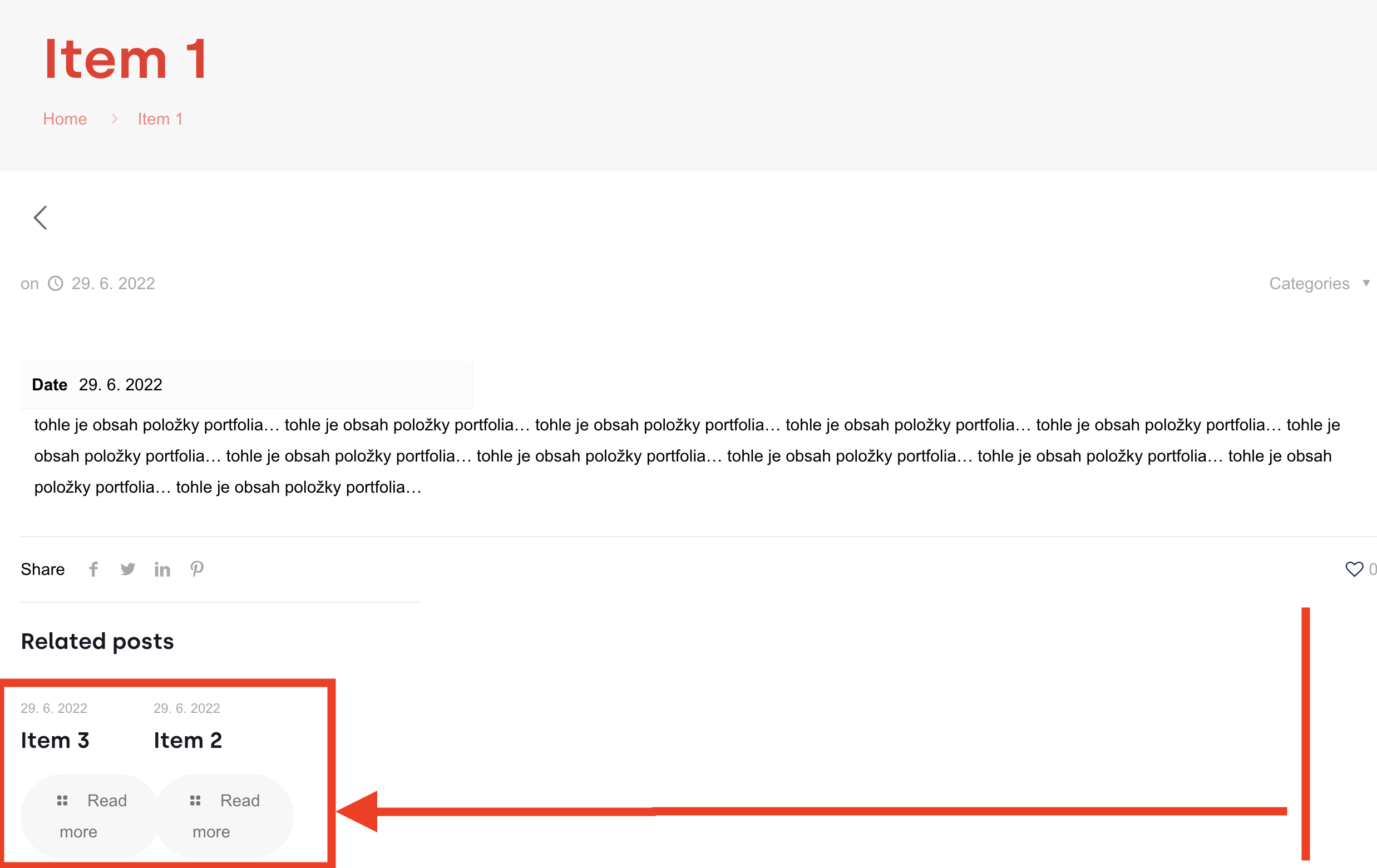
Since the update to version 26 (which added Flexible positioning) there is a problem with "related posts" if none of the related posts has an image. The related posts without images are "compressed" to the left side instead of being evenly stretched across the page:
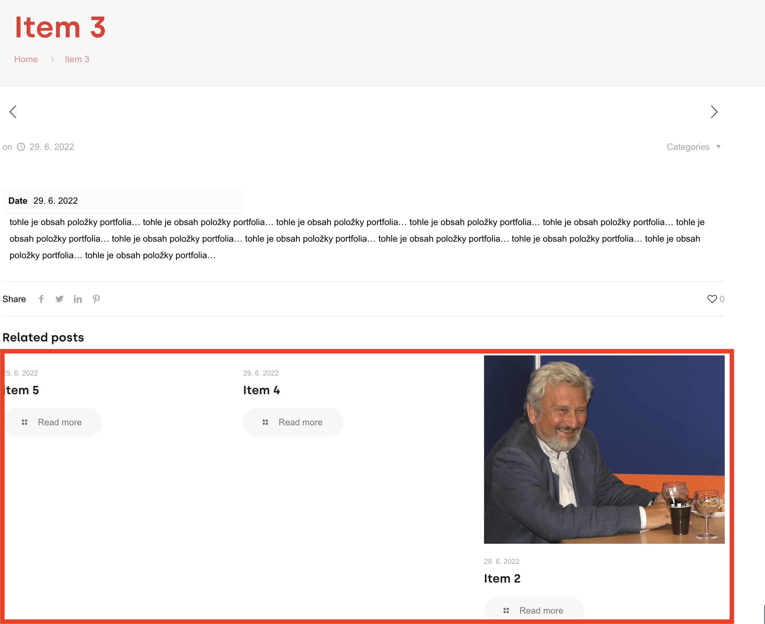
BUT if at least one of the related posts has an image, all related posts display correctly across the width of the page:
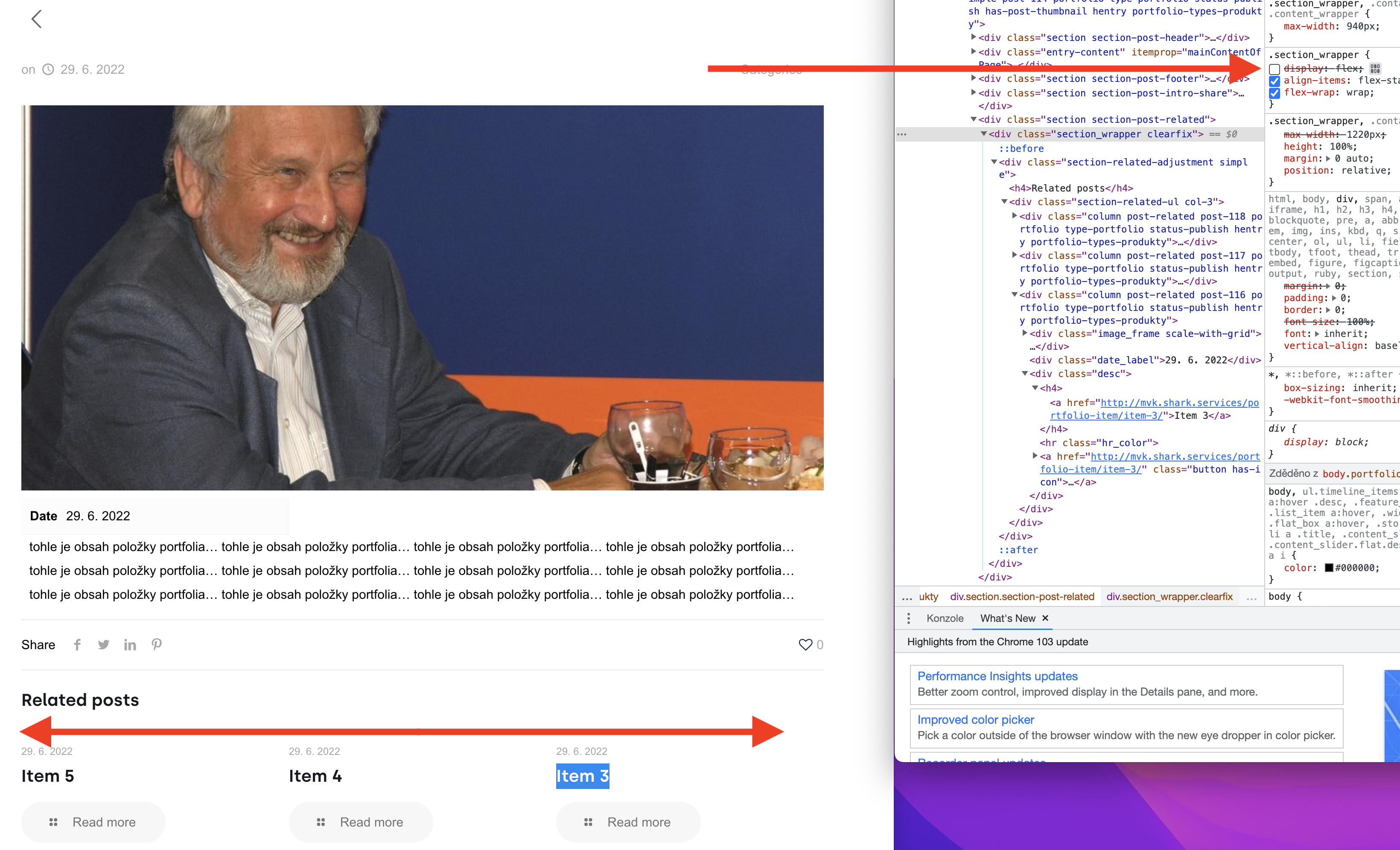
If I 'turn off' CCS class for 'display:flex' for '.section_wrapper', the related posts stretch evenly across the width of the page even without images (which is not a fix obviously, just pointing to a cause):
It seems that nobody is bothered so far, as this issue persists since the release of version 26. But still, there are cases when you do not upload images immediately and then the visual is distorted.
Is this something that can be fixed?
Regards,
David


Comments
Hi,
Please always attach a link to your website so we can check it out. If the page is offline(localhost), then our help will be limited. You will have to contact us when the page is online. Also, please make sure that the page is not under maintenance before you provide us with the link.
Thanks
Hi Phil,
Here is a link to the portfolio page I am writing about:
Thanks
Please, put the following CSS code in Betheme -> Theme options -> Custom CSS & JS -> CSS.
.section-related-adjustment{
   width: 100%;
}
Thanks
Thank you.