
Helper Element on mobile

Hey,
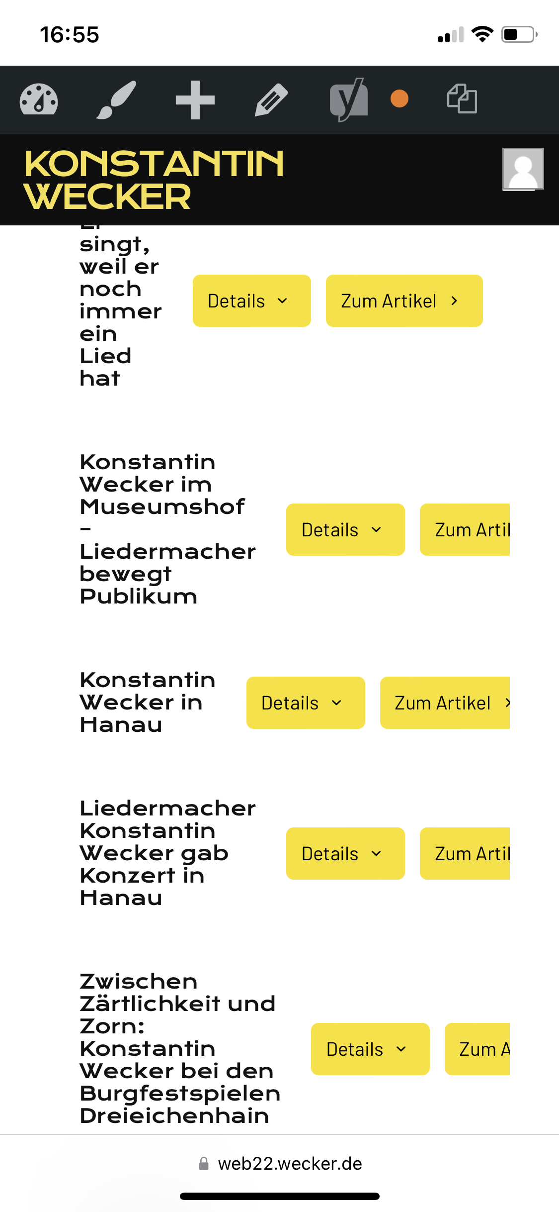
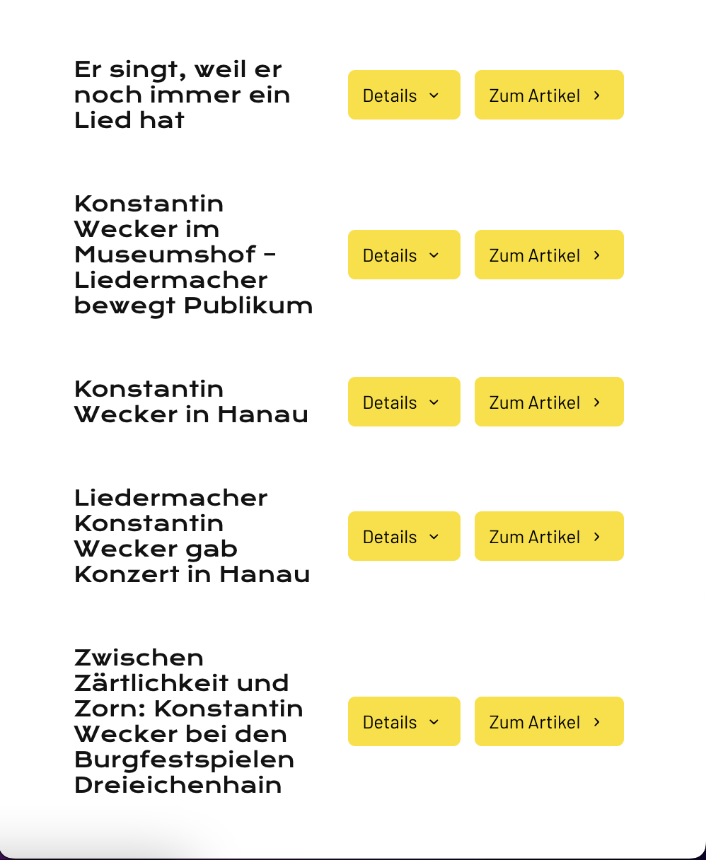
when I use the Helper Element on desktop, the Mobile preview shows everything correctly but on my phone it looks all wrong (see screenshots). How can i fix the view for mobile devices?
Thanks!
password: wecker
Comments
Hello,
Please paste this CSS into Theme Options -> Custom CSS & JS -> CSS
@media(max-width:480px){
   .helper .helper_header{flex-wrap:wrap}
}
thanks
Hey, thanks for your answer.
is it possible to increase the spacing between text and buttons?
Sure, use this CSS code:
@media(max-width:480px){
  .helper .title{
   padding-bottom:20px;
  }
}
Thanks