Responsive & Footer Issues
Hello,
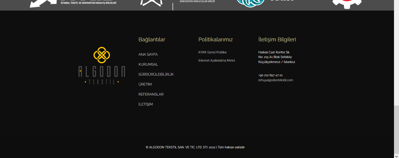
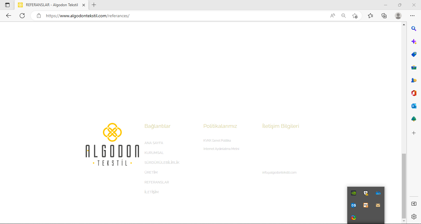
1-) Footer Issue
The footer part comes out of the format I edited and changes its color by itself, even though I save it, it changes automatically after a while.
original
after issue
2-) Responsive Issue
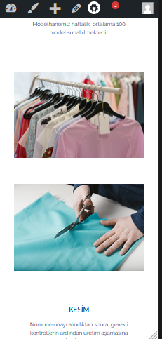
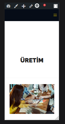
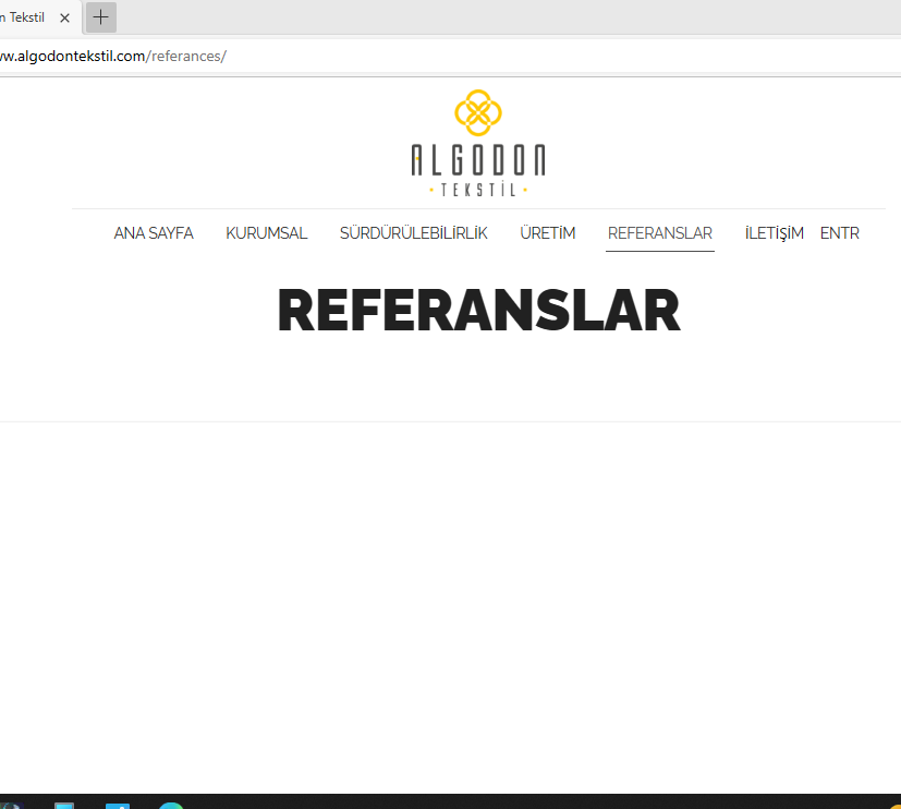
The phone view is very troublesome, the homepage looks like a computer on the phone, but the other pages look like a phone.
The logo on the top is sometimes visible, sometimes not.
The places of the photos change and an undesirable image is formed.
Even though I edited the header size for the phone format, it does not change.
I edit the size of the images and save them, but after a while it goes back to its original state.
3-) Others
A setting I saved gets corrupted by itself after a while and takes on a shape that I did not set.
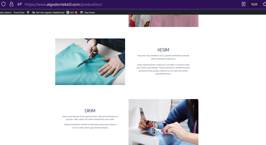
Although it looks fine in the Wordpress editor, it doesn't look the same on other computers or phones.

Comments
Hello,
For now, please check if the settings of the wordpress are set correctly, it's really important now, follow the tutorial from link below.
Thanks
its not working
Please, turn off all of the plugins, refresh your cache, and check if the problem persists.
Moreover if you use a child theme, switch to parent, and recheck it.
If it wont help you, we'll take closest investigation.
Thanks
thanks, problem solved
I have one more question,
In desktop mode, the subheader is fine, but when I switch to phone mode, there is white space, when I adjust its dimensions from the padding settings, it enters the main header, what can I do?
This is because you use the PX value of the padding in subheader.
Head to the Theme Options -> Header & Subheader -> Subheader and change the padding value to the percentage instead of pixels.
Thanks