
Display Mega Menu on Desktop Only

Hi. I have created a mega menu but when I activate it shows on mobile, too. I have turned off visibility in the BeBuilder Templates Header which removes the mega menu from tablets and mobile devices and then leaves no menu at all on tablets and mobile. How do I use the mega menu on desktop only and use the Theme Options -> Responsive -> Header on mobile devices? I cannot figure it out after searching the documentation. Thanks!
Comments
Hello,
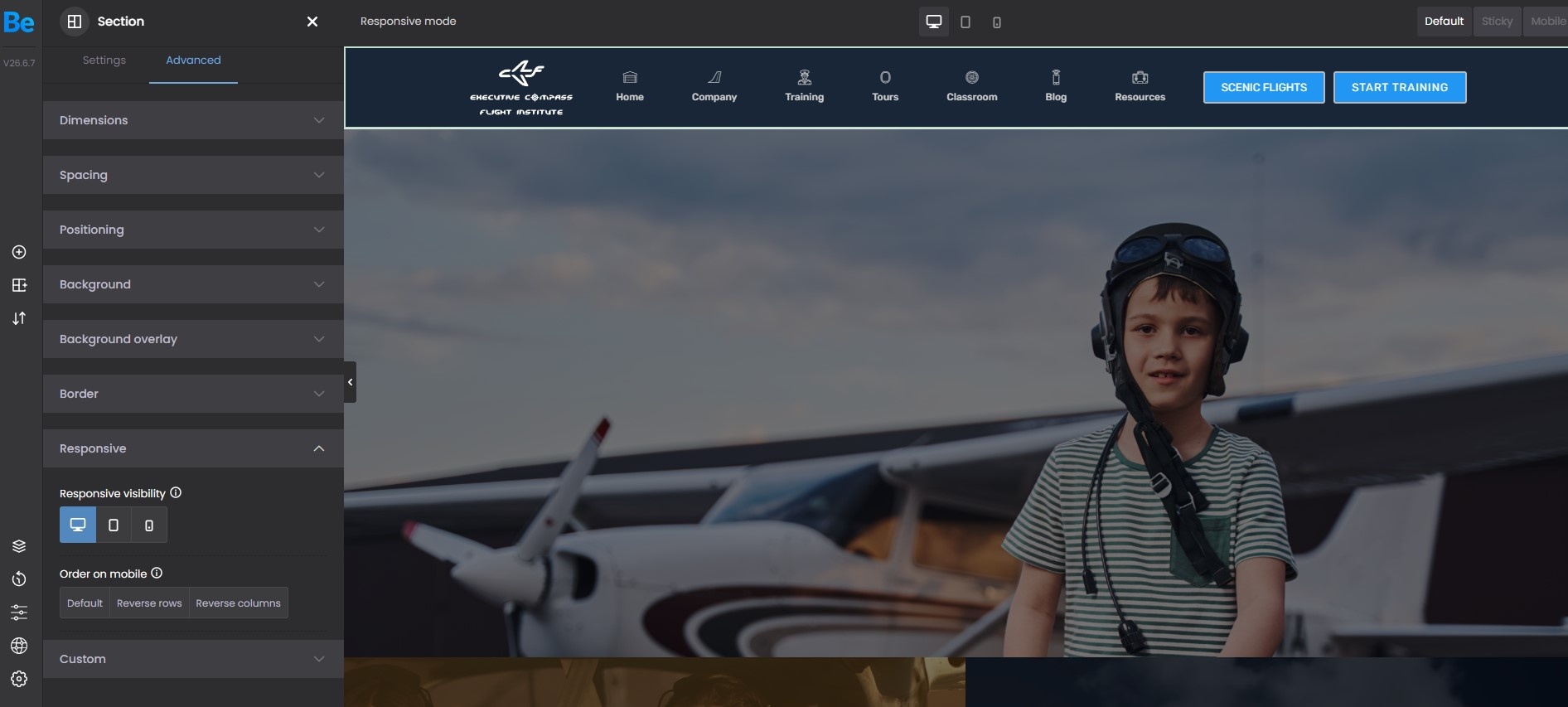
Are you sure that you are referring to Mega Menu? Your screenshot shows the Header template.
Please always attach a link to your website so we can check it out. If the page is offline(localhost), then our help will be limited. You will have to contact us when the page is online. Also, please make sure that the page is not under maintenance before you provide us with the link.
Thanks
Hi Phil,
A link to the site will be of no use because I cannot implement the menu. If I do implement the menu it is a total disaster on mobile and no one will be able to access our website from a mobile device while it is implemented and you are having a look. We do not have a staging site at this time.
I built mega menus and then put the mega menu into a header template. I thought that was the only way to implement a mega menu as per your support videos.
The mega menu I built will not display properly on any mobile device; it's not designed for a vertical screen. I only want the mega menu I built to display on desktop devices. I want the responsive menu that can be set up in Theme Options -> Responsive -> Header to display on mobile devices.
Is that the correct method to proceed? Or should I be creating a mobile mega menu?
Thanks.
Hi Phil. I think I have it all figured out now. The building mobile headers video tutorial was paramount and I think it should be on the same page as the mega menu video tutorial. Thanks. I'm going to have fun building this mobile menu.
https://support.muffingroup.com/video-tutorials/building-mobile-headers/
https://support.muffingroup.com/documentation/mega-menu/
Good to see that you handled it.
If you have any other questions or problems, feel free to ask.
Best regards