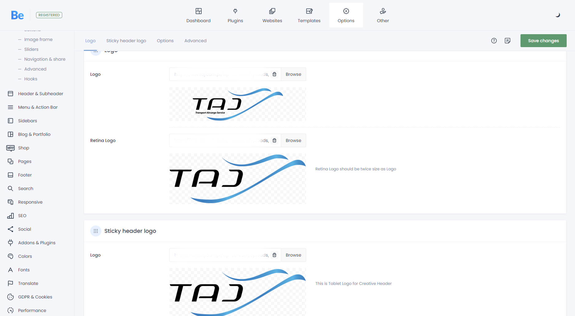
Logo change while loading page on mobile
Hi,
Below is a screenshot of my logo settings, I just noticed when I open the page on a tablet or a mobile phone, while loading I have the pc logo with sub headline at first, and when the page fully loads it changes to the correct mobile logo without headline. I didn't do any changes with it, I think it started occuring after theme update.
How can I fix it?
Thx!

Comments
Hi,
The logo is replaced with a retina version with JS script.
To prevent the replacement, put the retina as the main logo, and lower in the settings set up logo height.
Best regards
But if I understand correct, the solution you proposed will make the logo on PC without sub headline. And I need the headline on PC, I only want it without the headline on tablet and mobile phone. It worked before perfectly.
i had the retina logo shown correctky while loading page.
it looks as if the logo Change was the first thing while loading the page and now it loads as the last element which makes it noticeable.
best Regards
You can set different logo for mobile in Betheme -> Theme options -> Responsive -> Header.
But there is no setting for the tablet version only.
I highly suggest using the Header Builder, where you can easily adjust it for all resolutions.
https://support.muffingroup.com/video-tutorials/header-builder-2-0/
Best regards