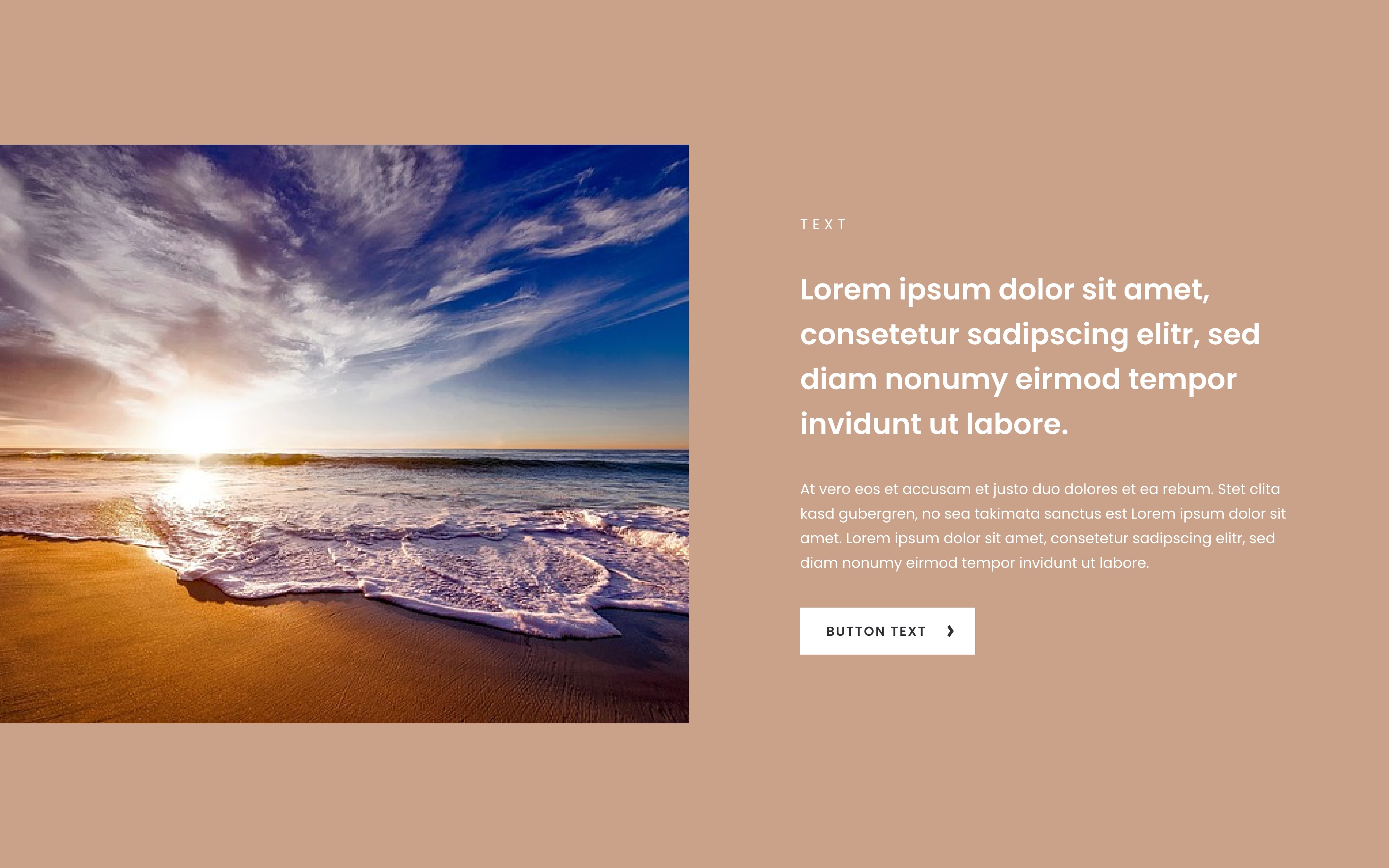
I'm trying to build a layout like in the photo. On the left is an image that always goes to the edge of the screen, on the right is a text box, in the normal page layout. How can I realize this?
In the mobile version, one half should be at the top (image) and then the second half below (text). At the moment I can see a part of the image, then the text box and after that an another part of the image.
We use cookies to personalise content and ads, to provide social media features and to analyse our traffic. We also share information about your use of our site with our social media, advertising and analytics partners who may combine it with other information that you’ve provided to them or that they’ve collected from your use of their services.
Cookies are small text files that can be used by websites to make a user's experience more efficient.
The law states that we can store cookies on your device if they are strictly necessary for the operation of this site. For all other types of cookies we need your permission. This means that cookies which are categorized as necessary, are processed based on GDPR Art. 6 (1) (f). All other cookies, meaning those from the categories preferences and marketing, are processed based on GDPR Art. 6 (1) (a) GDPR.
This site uses different types of cookies. Some cookies are placed by third party services that appear on our pages.
You can at any time change or withdraw your consent from the Cookie Declaration on our website.
Learn more about who we are, how you can contact us and how we process personal data in our Privacy Policy.
Please state your consent ID and date when you contact us regarding your consent.


Comments
Hi,
There is no option to have only one wrap extended to full width.
However, you can achieve this in other ways.
You can set the section to full width and set up the right padding:
Or you can enable the highlight right section option and set up an image as a section background:
In the second scenario, you do not have to set up full-width option.
Best regards
How to setup option 2 for mobile?
Can you explain how you would like it to look on the mobile view?
Thanks
In the mobile version, one half should be at the top (image) and then the second half below (text). At the moment I can see a part of the image, then the text box and after that an another part of the image.
Please see the following topic:
https://forum.muffingroup.com/betheme/discussion/comment/237108#Comment_237108
I explained there how to achieve that.
Best regards