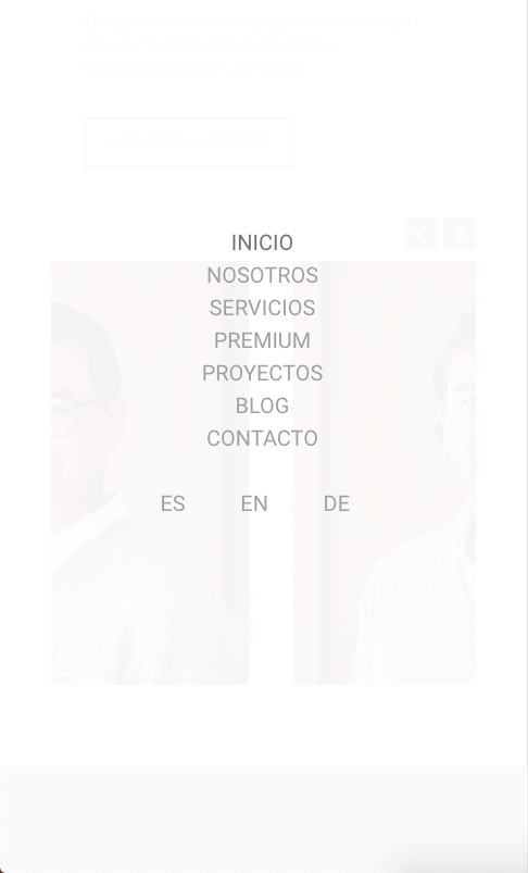
the languages of the menu, do not grab the responsive
You helped me place the menu as I wanted at a visual level but when I open it on mobile it does not grab the responsive correctly
this was the code they sent me:
.menu .wpml-ls-item{
float: left;
margin-top: 30px;
}
.menu .menu-item:nth-of-type(8){
margin-left: 33%!important;
}
.menu .wpml-ls-item a span{
font-size: 20px;
}
.blog_wrapper .post .post-desc *{
text-align: center;
}
.blog_wrapper .post .post-desc .category .cat-wrapper li a{
border-radius: 0;
}


Comments
Hi,
Sorry, but I quite do not understand.
Can you explain in more detail what you want to achieve, please?
Thanks
The responsive does not work in the menu, in the language buttons.
I need the typography on the buttons of the languages in the menu to also decrease in size
screenshot on pc:
mobile screenshot:
Try this code:
@media only screen and (max-width: 767px){
 .menu .wpml-ls-item a span{
   font-size: 16px!important;
 }
 .menu .menu-item:nth-of-type(8){
   margin-left: 36%!important;
 }
}
Best regards
I do not see this code in your website source.
Did you remove it?
Best regards
I still can't solve the responsiveness in the menu buttons. I have the last code sent placed in the topic
link: https://consfutur.com/
Not really sure what exactly you still can't solve but css @Phil gave you above, won't never work as you have bugs in your Custom CSS section. I would start from sorting custom css's. Just look on the screenshot below, you've opened @media only screen but never closed it. This is where you should start fixing your bugs.
All of this code has been sent to me here, if you want I will send it to you in full so that you can help me solve the problems I have with the responsive menu in the languages.
I don't see this buggy code in message above. Like said, please fix this custom css first as it's buggy and nothing below won't work.
Excuse me, could you give me the steps to follow to fix the custom CSS? I just don't handle CSS!
Please add } after the highlighted code or remove it completely