
Mobile menu practices and mobile footer

Hi,
1) I am using Header and Footer in the Templates with BeBuilder so the settings are grayed out in Theme Options. Currently my header menu contains both regular and mobile configurations and layouts. Is it a possible method to create a separate header template for just mobile to have more flexibility and editing options? What is the best way to achieve it?
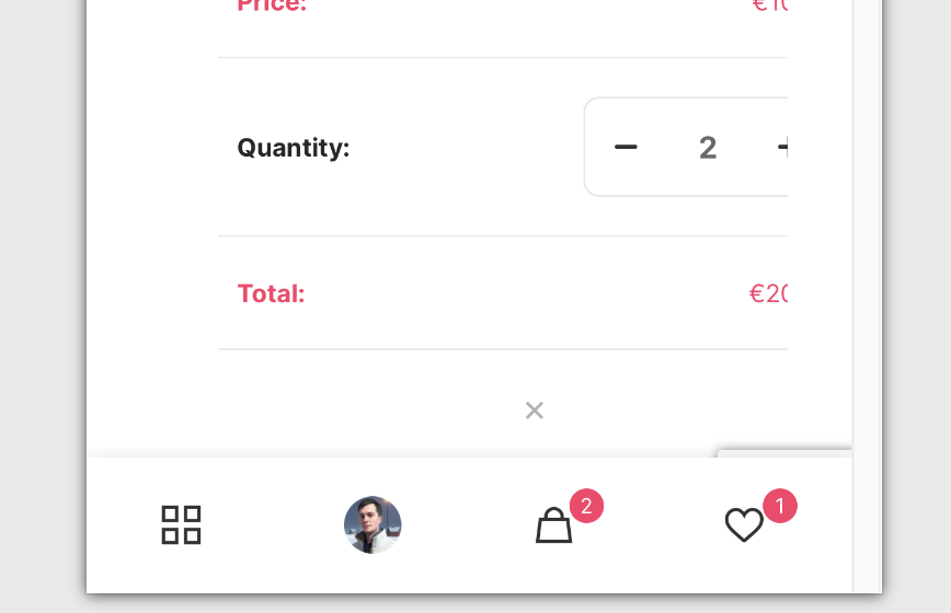
2) There are buttons on the bottom of the mobile view. Where is this design and behaviour controlled?
Comments
Hi,
1) Please see the following video tutorial:
https://support.muffingroup.com/video-tutorials/building-mobile-headers/
2) You can change the icons in Betheme -> Theme options -> Shop -> General.
And it depends on how you want to modify this part. Can you explain that more, please?
Thanks
Thanks. For example, I can't understand what is the purpose of the four dots as the first icon. I'd like to have search there for example.
What is the good way to have a mobile search anyway? I tried it using the custom mobile header and it only allows for a search box but would be great to have an icon that opens search box on clicking.
1) The four dots redirect you to the main shop page, which is irreplaceable as it is hardcoded in theme files.
2) If you use the Header Builder, you need to add an icon element and select Search from Icon type dropdown menu.
Best regards
1) Thank you. The main shop page is taken from where? It's just the Wordpress main shop page? Perhaps it's possible to get rid of the default footer and create my own sticky footer?
2) Thanks. Is there a way to configure the opening search box, for example to make the rest of the site darker so it can be better seen off the white background of the site itself?
1) Yes it is just WordPress/WooCommerce main shop (e.g. https://example.com/shop). You can disable this Footer in Theme option, but there is no setting to create your own in place of that one.
2) Try the following CSS code:
.search-overlay-opened #Wrapper:before{
   content: "";
   display: block;
   position: absolute;
   height: 100%;
   width: 100%;
   background-color: rgba(0,0,0,.7);
   z-index: 1;
}
Put it in Betheme -> Theme options -> Custom CSS & JS -> CSS.
Best regards