
Responsive preview of BeBuilder looks different from the actual view on the smartphone

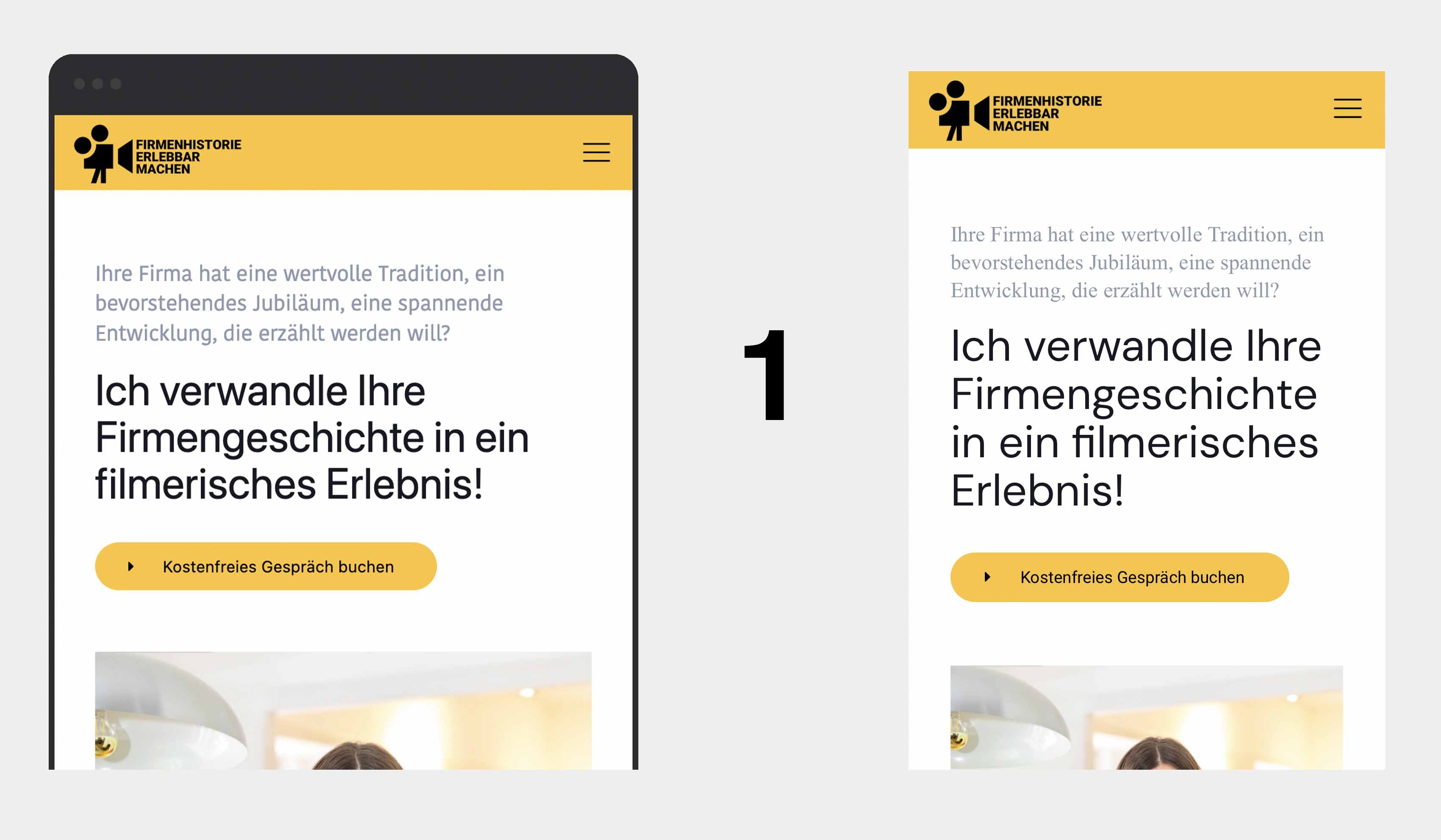
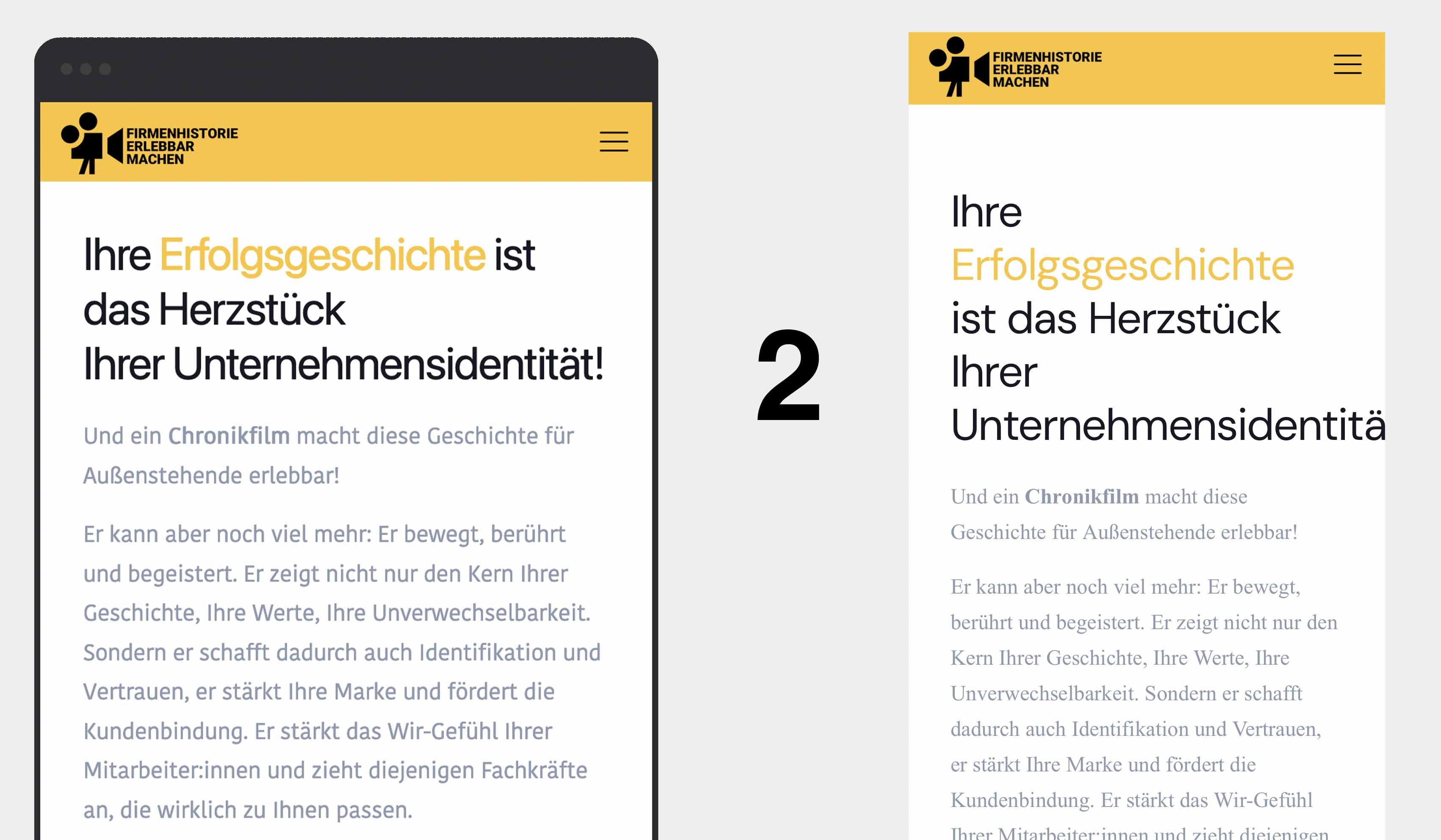
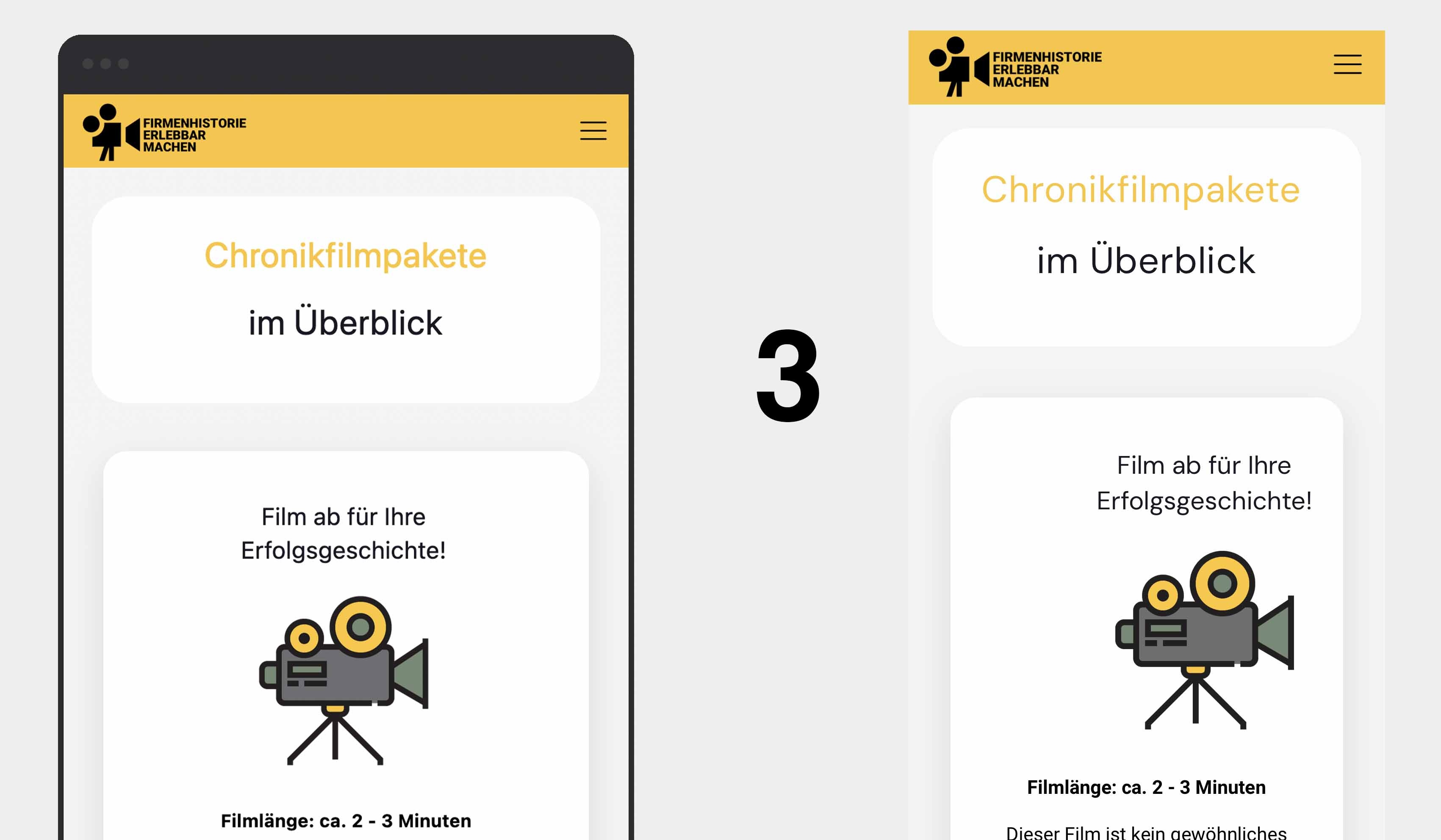
I made adjustments for the mobile version (what is really a great function of the BeBuilder, by the way), which also look great in the responsive preview of the BeBuilder. But unfortunately, these adjustments look different in reality on the smartphone. To illustrate what I mean, I'm sending you three screenshots. On the left side you always see the BeBuilder mobile view, on the right side the real view, how it really looks on my smartphone (iPhone X):
1) The fonts are not the same
2) The font of the title goes beyond the bounding box (and fonts are different again)
3) The elements - here the camera and the title - are no longer centered
Why is there a difference between the responsive preview of the BeBuilder and the real view and how can I fix it? I understand that smartphones are different, wider and narrower, and therefore it will always look slightly different on each smartphone. But the aspects mentioned shouldn't occur, no matter what the dimensions of a smartphone are. When using the mobile preview-function, of cause I must be sure that I can rely on what I see. Thanks for your ideas!
Comments
Hi,
Please always attach a link to your website so we can check it out. If the page is offline(localhost), then our help will be limited. You will have to contact us when the page is online. Also, please make sure that the page is not under maintenance before you provide us with the link.
Thanks
Hi Phil,
The website is not online yet and of cause I have to wait with that, until these points solved, because it really doesn't look good the way it is now. I'll send you and direct link with the login details as I did before and I hope you find the point, maybe it's a general bug?
To summarize: It looks like a general problem, the screenshots above are just examples: What I see in BeBuilder-preview doesn't correspond to the real display on the smartphone. Now I have also noticed that changes in the font in the desktop view are not displayed in the BeBuilder-preview as well, so there are also differences here compared to the real view. I had this problem before and was able to solve it with your help and through this link: https://support.muffingroup.com/video-tutorials/do-never-again-use-same-ids/ But now this happening again even though the settings from the link match. I really hope you can help me with that topic, it looks like a general problem to me.
Thanks!
1) Where did you take this font family?:
I do not see it in theme options custom fonts.
Also, there is no point in writing such inline styles as you can set these things in the Style tab.
2) The text and fonts seems to be the same for me as I checked:
3) Firstly, the wrap does not have positioning set to Center, which is Default right now.
You should change it to the center.
Secondly, the mobile view inherits from the desktop or from the tablet if you made any modifications in the tablet view. And you set an Offset to the image element.
On mobile view you should change the position to static.
Best regards
Perfect, thank you, that was the point! ?
I just still have the problem that some elements go beyond the border (Pages -> Filmbeispiele -> Scroll a bit down)
The preview in BeBuilder looks good:
But when I open the website on my smartphone, the elements go beyond the borders:
There is something wrong with your construction, but I do not want to interfere too much with your page, so I created an alternative solution below the existing one. At the moment, I set it to hidden:
You can show it, and check how it looks and works. You can also use it, but you will have to style it for your needs.
Best regards