
Header Chart settings

Hi,
I implemented Woocommerce in my shop header. The cart does not show if and how many items are in the cart on the desktop and tablett version. On the mobile version it works fine...
Where can I fix this problem, so that it shows the cart and it's contents also on desktop and mobile?
www.erdenkind.com
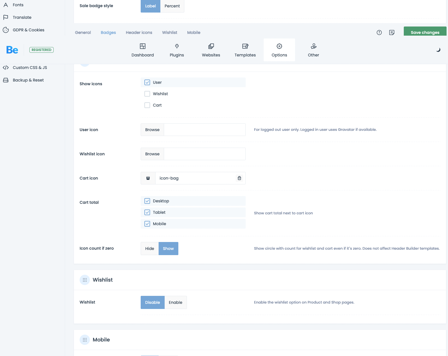
See my theme settings in the screenshot:
Comments
Hi,
Please always attach a link to your website so we can check it out. If the page is offline(localhost), then our help will be limited. You will have to contact us when the page is online. Also, please make sure that the page is not under maintenance before you provide us with the link.
Thanks
Hi,
the page is online since quite some time: https://erdenkind.com
It is built with the betheme muffin builder und woo commerce. The cart does not show if and how many items are in the cart on the desktop and tablett version. On the mobile version it works fine...
Thanks,
nina
I have checked your website, and the cart page works correctly on desktop.
Can you explain what you refer to, please?
Best regards
When you put an item in the cart, the cart Icon should show, that there is an item in the cart - like it does on mobile see screenshot attached!
Also I would like to add an VIEW CART (ZUM WARENKORB) button on the single product pages next to the shop button (IN DEN WARENKORB) , so that the user can get easily from the single product page to the cart page (Warenkorb) and then check out.
Thanks,
Nina
Sorry, I misunderstood you.
I just noticed that the bag icon has been added as a custom menu item with an icon.
The split menu does not have the option to display the shop icons, but you can recreate this layout with working icons with the Header Builder.
https://support.muffingroup.com/video-tutorials/header-builder-2-0/
Best regards
Hi thanks. The turtorial seems to be quite old, as the interface he shows looks very different to what I see in the muffin builder...
If the split menu does not have the option to display the shop icons, which prebuilt header/menu template does?
I don't really want to built a new header from scratch that I need to customise for desktop, tablet and mobile, since this takes quite some time...
Also I would like to add an VIEW CART (ZUM WARENKORB) button on the single product pages next to the shop button (IN DEN WARENKORB) , so that the user can get easily from the single product page to the cart page (Warenkorb) and then check out.
1) How does the interface differ for you? The default BeBuilder layout has not changed significantly since this video was released.
You can speed up building a template by using pre-built headers.
As I mentioned before, the split menu header style from theme options does not have the option to display shop icons.
2) To add this button, you must create a custom product template.
https://support.muffingroup.com/video-tutorials/how-to-create-custom-template-for-the-single-product/
Best regards
Hi,
i did create a header which is saved as a template right now and not life yet.
However it takes the shopping bag icon from the current menu - https://app.screencast.com/FOZKQBUzcJ4mV
so that there are 2 bag icons now. How can I delete the old one in the menu?
Also the new header template does not work for tablett - the logo dissapears and the type breaks in 2 lines instead of scaling...https://app.screencast.com/Z1Pj8kUJqRK8t
On mobile the header does not show at all....https://app.screencast.com/oElQTizGo35a9
Please help me with setting this up properly. I could not find the answers for this in the video.
Thanks,
nina
1) The bag icon in your menu is a custom menu item. You can remove it by editing the menu through Appearance -> Menus.
2) The logo might be hidden for tablet view with responsive visibility options:
https://support.muffingroup.com/video-tutorials/responsive-editing-in-bebuilder/
You can adjust the menu font size and spacings for tablet in the Style tab of the Menu element.
3) See the following video tutorial:
https://support.muffingroup.com/video-tutorials/building-mobile-headers/
Best regards
Hi,
so I manged to built and implement the header. However I have a problem adjusting the cart icon (with count and price).
For mobile everything sits fine.
On Tablet the wrap sits to far left and the gap between the cart/count and the price becomes bigger.
Laptop same issue like on tablet but the gap gets even bigger. Same on desktop.
My problem is, when I change the setting for Desktop, laptop and Tablet, it screws with the mobile settings...
For adjusting I used also the device settings in the left pannel. https://app.screencast.com/gHeHMKcYhq4nn
How can I fix the placement and spacing arccording to the device resolution without screwing up the setting for the other device sizes?
Thanks & regards,
Nina
Also on the iPad the main header image slide gets pushed to the left (see white border on the right of the image).
Why does this happen?
On the subpages the header looks different and is screwed up.... Is the header not set for the whole page, so that the space etc. should stay the same, no?
1) Did you adjust the offset for each device, or only on the desktop?
2) Try the following CSS code:
body{
 overflow-x: hidden!important;
}
Put it in Betheme -> Theme options -> Custom CSS & JS -> CSS.
Best regards
1.) Yes i did adjust it for each device. But when i would adjust it for mobile, it would screw tablet and desktop.
2.) I added the code, but now the burger shows again on tablet.... which means it screwed my previous settings where I did hide the burger on tablet....
And the spacing of the cart/count and the price is still messed up on desktop.
Please send us the WordPress dashboard and FTP access privately thru the contact form, which is on the right side at http://themeforest.net/user/muffingroup#contact, and we will check what might be the reason.
Notice!
Please attach a link to this forum discussion.
Sending incorrect or incomplete data will result in a longer response time.
Therefore, please ensure that the data you send are complete and correct.
Thanks
Hi,
muffin already has a user for my wordpress.
Best,
Nina
1) Please see the modification I made to the cart icon, and check if this is what you wanted to achieve.
2) You did not hide the menu burger for tablet view.
Best regards
Hi great it worked. Thanks a lot!
You are welcome.
Always happy to help.
Best regards