header background-image not responsive
I use the be-theme cleaner and don´t use the revolution slider for the header background.
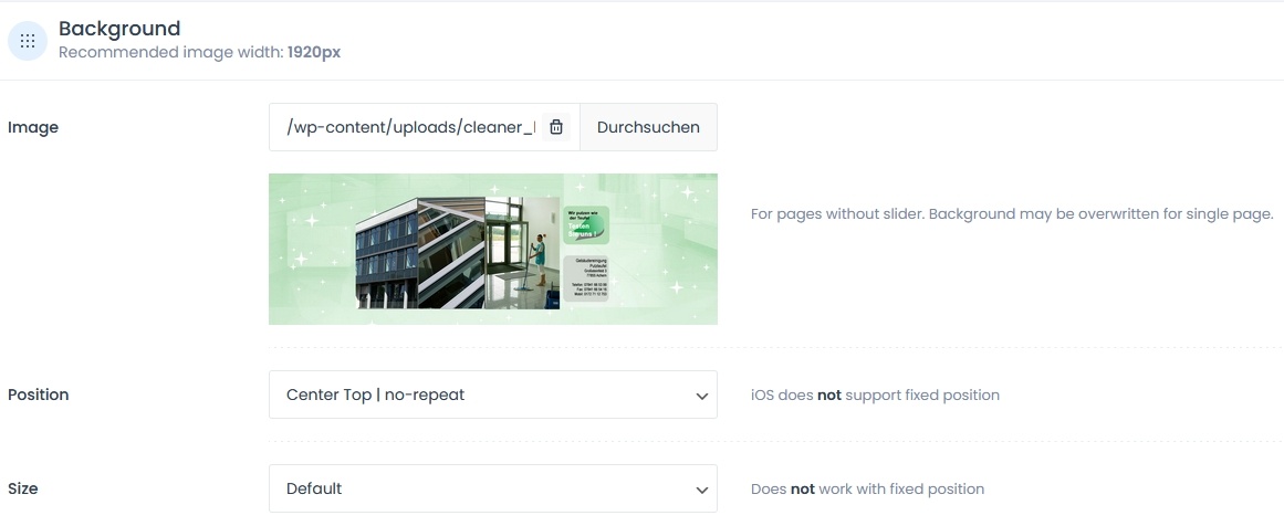
I created a background image and inserted it under Header&Subheader/Header/Background.
However, it does not adapt responsively to different screen sizes.
Image 1 Settings in Theme Options
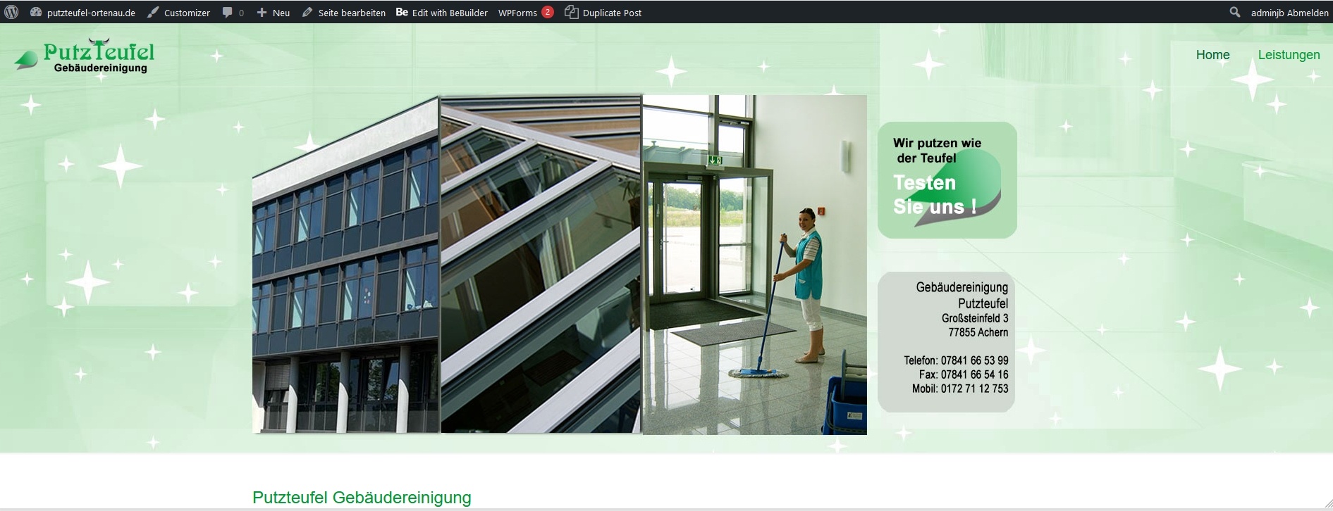
Image 2 resolution 1920x700 in the browser
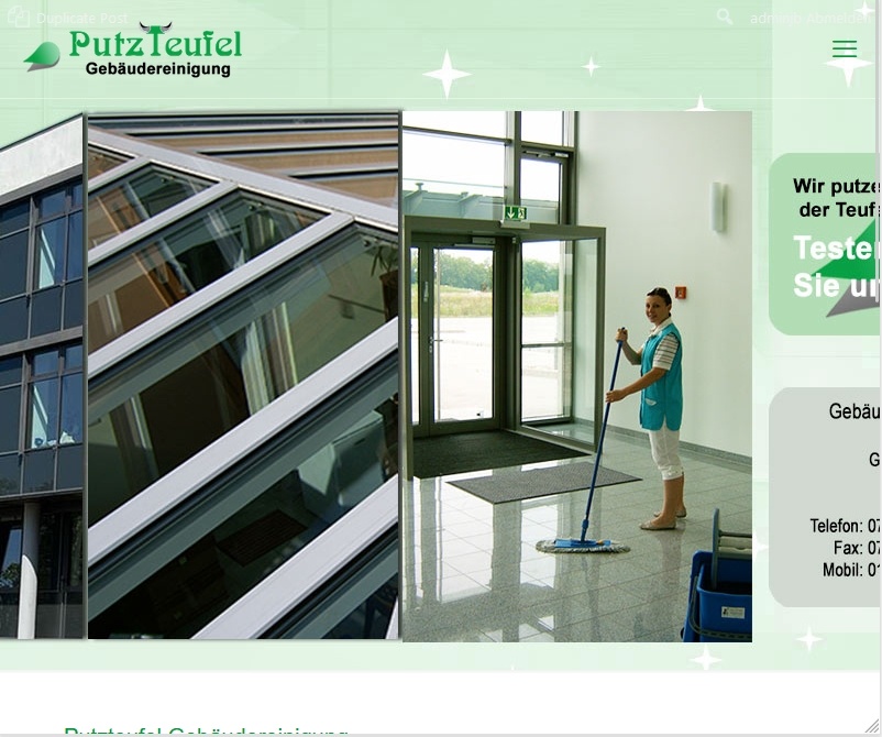
Image 3 resolution 800x700 in the browser
What do I have to set and where?


Comments
Hi,
Change the background image size from Default to Cover.
Best regards
Thank you for your help, but unfortunately nothing changes the view.
No responsive display.
Here is the link: http://putzteufel-ortenau.de.w01e763f.kasserver.com/
I can also give you access to the backend, but only in a secure way!
Alright, set it as contain, and the image will scale down with the window width.
Best regards
Now the header adapts to the screen resolution.
But the background graphic is no longer full width. It is 1920 x 652 px.
And in the mobile view, the distance between the header and the following text area is significantly larger than on the PC!
That's all just CSS. If none of the results suit you, I suggest recreating this in the BeBuilder.
Put three vertical images from the left in a wrap and the two boxes on the right in another wrap/elements/inner wraps.
It will be hard to adjust it when it is an image.
Please let me know if you have difficulties recreating that in BeBuilder, and I will gladly assist.
Best regards
Thank you.
But that's too difficult for me, so I use the Revolution Slider, which is responsive
So, you handled it with Slider Revolution?
Is there anything else I can help you with?
Best regards