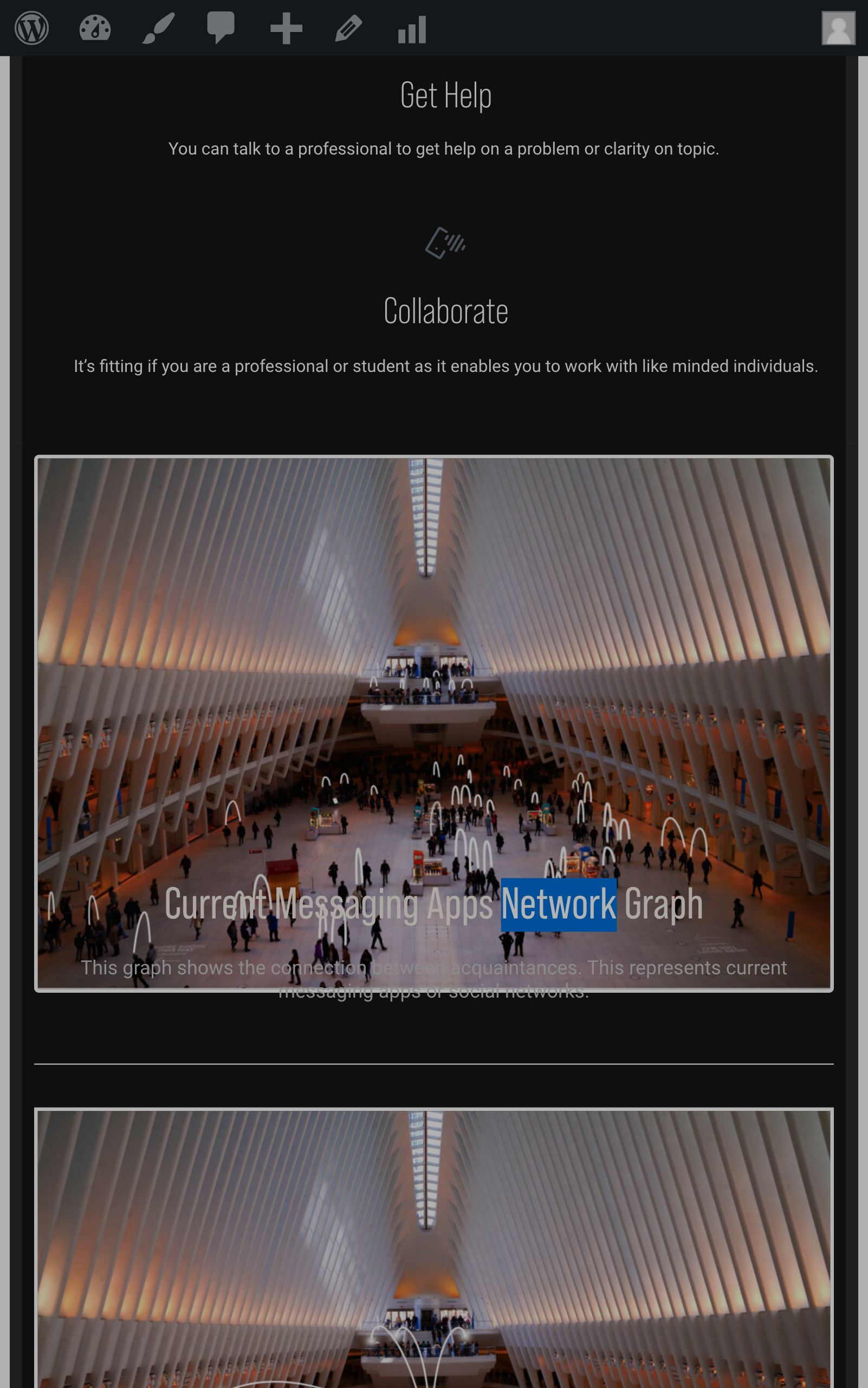
Image and Text overlap in device widths 540px-767px
I have an image and text below the image on my home page https://klokly.com. It works fine in tablet and desktop. But in mobile widths 540px - 767px, the text overlaps the image instead of being below it. You can also see this in chrome inspector, devices if you choose Galaxy Tab S4.
- I contacted Elementor and when they changed the theme to another one, the problem doesn't occur. So the issue might be with the theme.
Thanks,
Binyam

Comments
If you can provide a fix for this, it would be great.
Hi,
Sorry, but I could not answer you because you wrote beyond my working time.
Please turn off all of the plugins, refresh your cache, and check if the problem persists.
If this will not help, keep minifying plugins off because I need to check your website with them disabled.
Thanks
Hi Phil,
I did as you suggested. I disabled all plugins (except Elementor & Pro) and the problem persists. So I have disabled all minifying and caching in plugins. The problem still occurs, btw.
Thanks,
Binyam
Please send us the WordPress dashboard access privately through the contact form, which is on the right side at http://themeforest.net/user/muffingroup#contact, and we will check what might be the reason.
Notice!
Please attach a link to this forum discussion.
Sending incorrect or incomplete data will result in a longer response time.
Therefore, please ensure that the data you send are complete and correct.
Thanks
I have sent the wordpress admin access with a link to this forum through the contact form.
Thanks
I have set up Container wrap option to No-wrap, and the display is correct now.
Best regards
Thanks. It seems to be working.