
Horizontal Spacing Issues with Elements on Mobile

Hello,
First, thank you for your prompt, excellent support!
On this site, https://f6a.128.myftpupload.com I'm having horizontal spacing issues with elements on mobile. The challenge is that the way elements appear or are set in the mobile editor are not the way they appear in a live iPhone view.
I want to accomplish the following things without disrupting any part of the desktop, laptop, and mobile views.
1) Spacing on photo/box: I want to center the blue box containing the photo and keep the photo centered, too. I tried to accomplish this with Wrap -> Advanced -> Positioning -> Elements Horizontal Align -> Center. When that didn't work, I adjusted the left margin on the wrap, but the view in the mobile editor is different from the live iPhone view. Both are off-center, but in opposite directions. Please see screenshots below.


2) Spacing on text: I'm having the same horizontal spacing issue with the text in the screenshot below. In the mobile editor, there's plenty of margin on the right, but in the live iPhone view, the text runs right into the right edge. I tried setting a narrower custom width to prevent this, but no matter how wide or narrow I set the text box width, the text runs into the right edge. Screenshots:


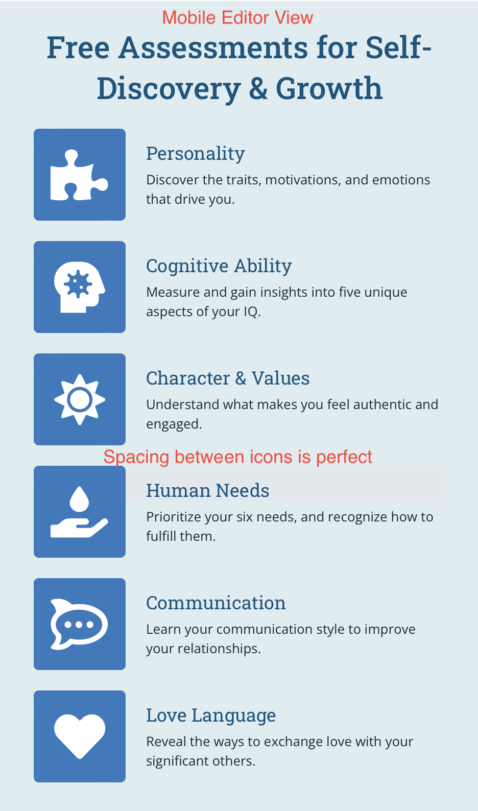
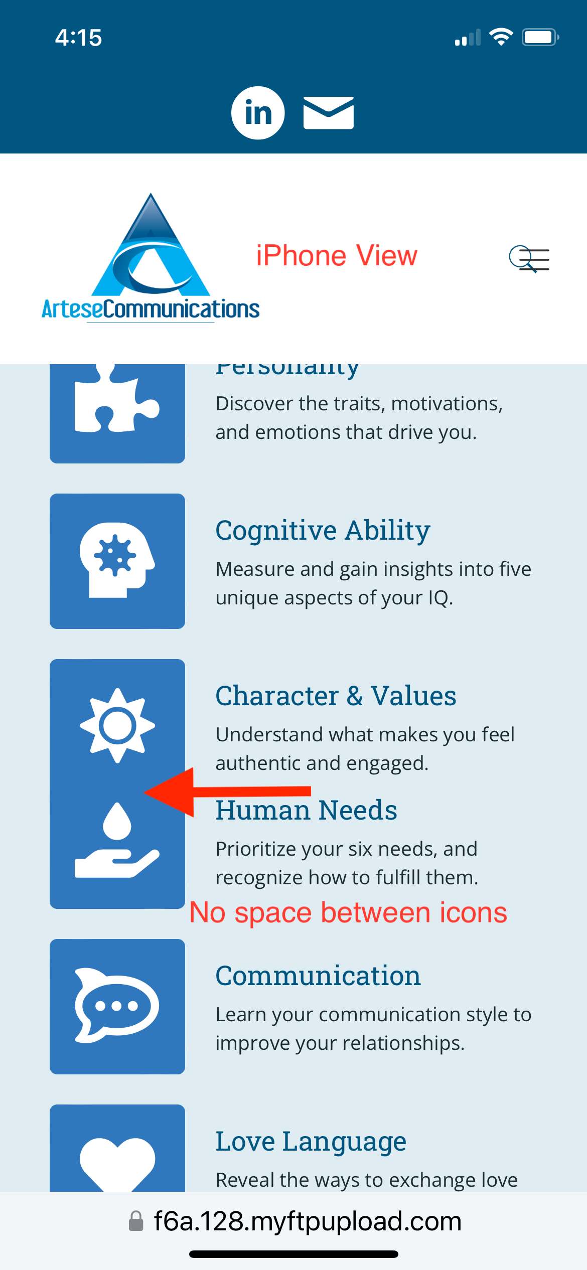
3) Spacing between icons: In the mobile editor, the horizontal spacing between these two icons is perfect. In the live iPhone view, the icons blend together. Screenshots:
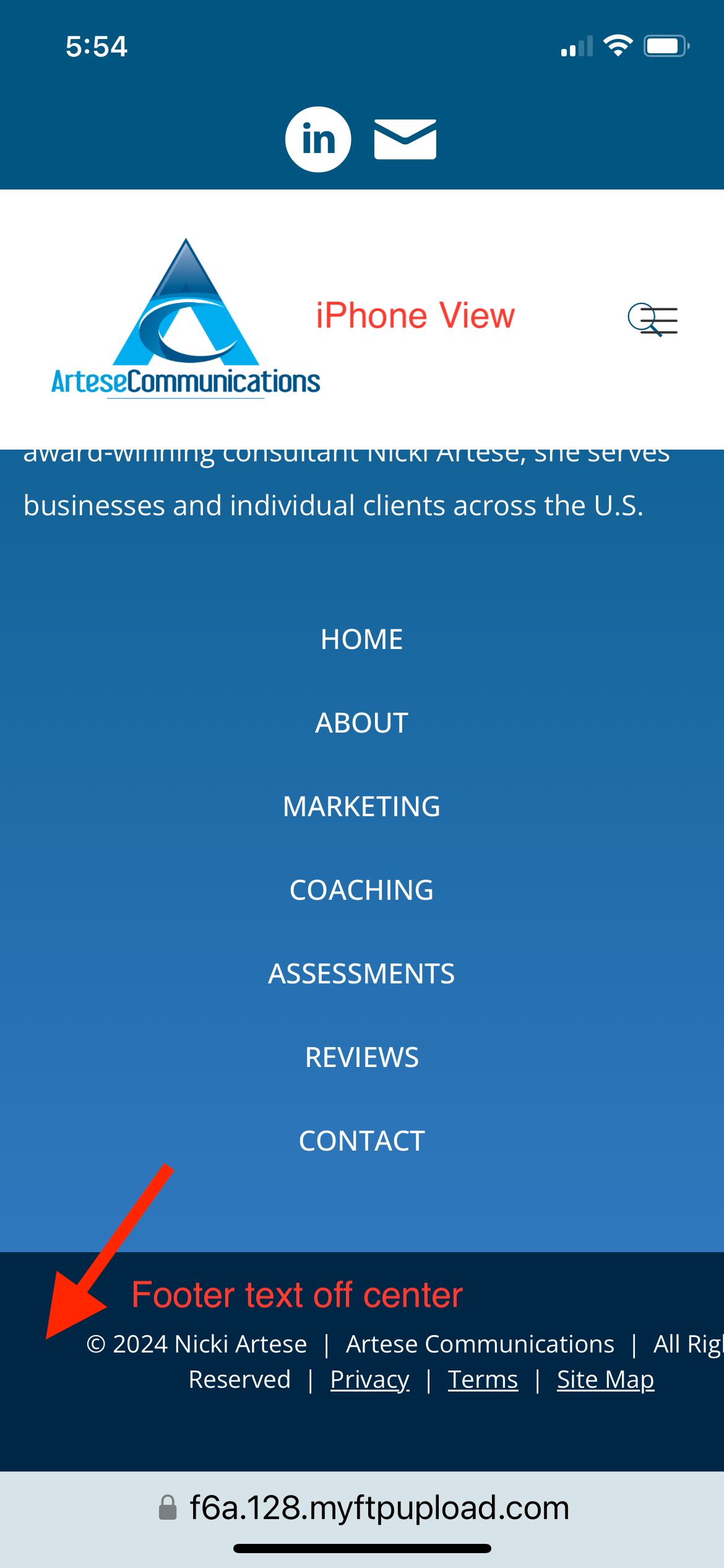
4) Footer text: In the mobile editor, this footer text is centered, though it looks a bit off-center to the left, but in the live iPhone view, it completely runs off the page on the right. Screenshots:

I have previously provided access to my site to help Muffin diagnose other problems. Please let me know if this is a better way to help and if you need me to resend login credentials through the Contact form.
Thanks!
Comments
Hi,
Please send us the WordPress dashboard privately thru the contact form, which is on the right side at http://themeforest.net/user/muffingroup#contact, so we can have a look. Seems like you didn't done necessary adjustments for mobile the way we explained in the following video tutorial https://youtu.be/8gRTpdSHF9U Or the problem might be related with unclosed html tags if you use but this is something we have no impact on.
Notice!
Please attach a link to this forum discussion.
Sending incorrect or incomplete data will result in a longer response time.
Therefore, please ensure that the data you send are complete and correct.
Thanks
I have sent dashboard access through the contact form.
I did watch your video on how to edit/optimize for mobile, and successfully managed every other page of the site without issues. The home page is the only one that isn't cooperating in a few places.
I am not a programmer and wrote no HTML or custom CSS for this page, so there shouldn't be any coding errors created by me.
The reason why things do not align the way you like are your custom settings, like padding, margin, custom width, height, etc.
1) Here, for global section, you set custom padding for the section, and custom height. This should be also set for mobile devices or removed completely. Unless you won't set own values for mobile, they are inherited from larger device, in this case desktop.
2) Same as above.
3) This spacing in the BeBuilder comes from Divider and is set by min height for each item (35px) - this is required in case of empty and short items so toolbar can fit or you can click on it. But there is no such height in frontend so Divider is 0px. If you want to have a spacing between elements in frontend, you have to set 35px value for this element.
4) Just look what settings you set. Whole alignment have been destroyed and that's why it doesn't align correctly on site.
All of those adjustments in margins, spacing, padding, dimensions etc became necessary because I've found that some pre-built modules and elements do not automatically resize appropriately and well for mobile or other devices on their own. Otherwise, I would have left all of those measures alone or in default.
I've also found that the responsive view editor tends to break things in one mode or view when you're trying to exclusively edit in another.
Like said, smaller devices inherits values from larger devices, so if you're styling something on desktop, you should also style it for all other devices and not just desktop.
Right... that's what I've been doing.
So, if you make adjustments individually for each device, then everything should look fine :)
Thanks - I was all along, but sometimes unless I edit an element using the Navigator, even when the element is clearly otherwise selected or highlighted, the changes didn't seem to stick... or a change on one device broke its display on other.
Anyway... it all worked out eventually. The lesson learned was, use the Navigator instead if per-device edits aren't otherwise working.
Thanks!