Menu appearance
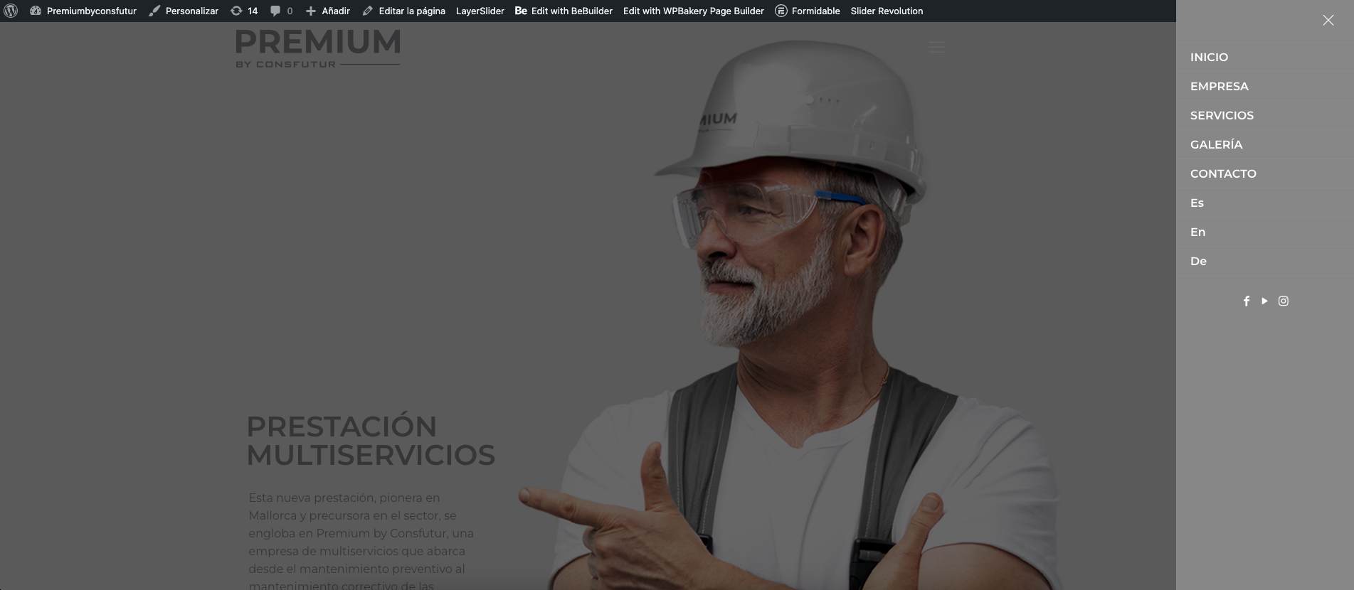
At this moment I have a question, the language section of the menu of the website I am developing looks like this, as you can see in the following image.
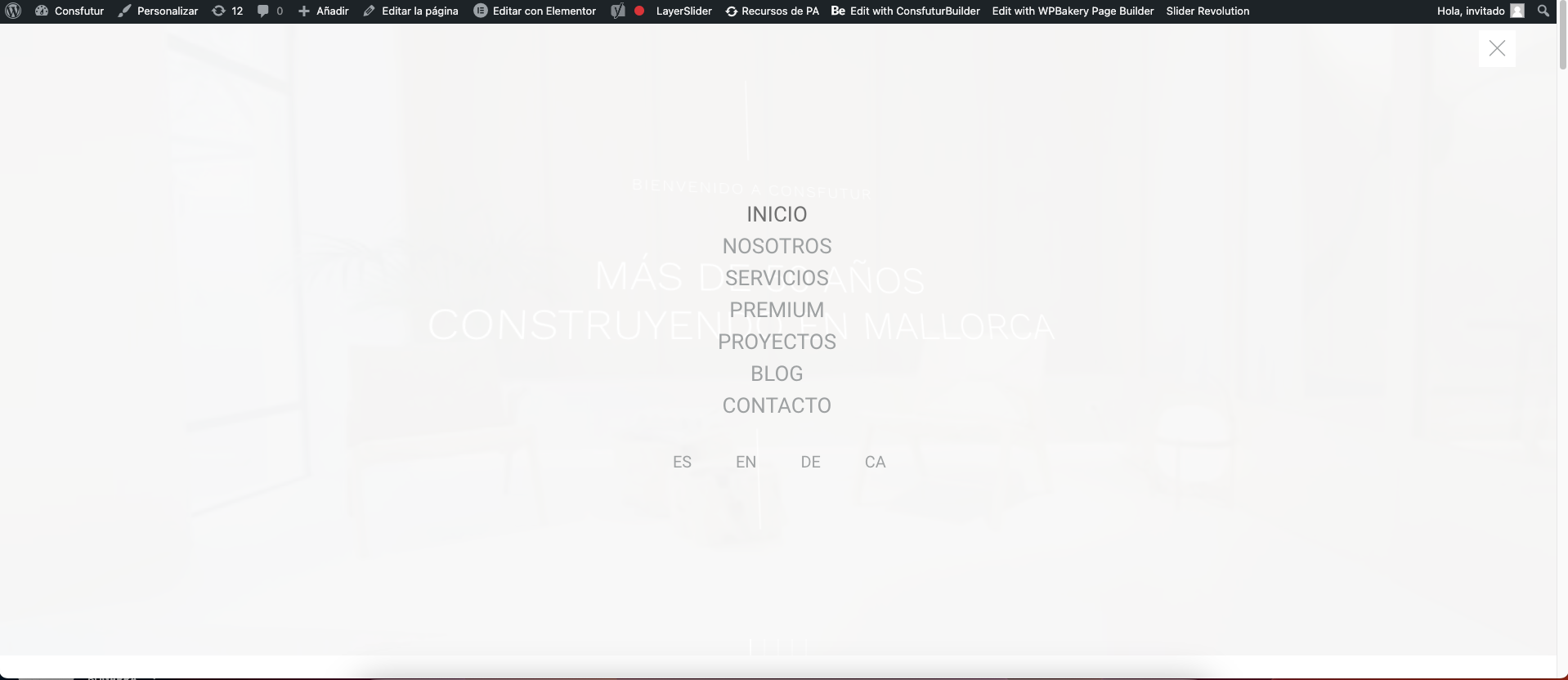
How can I make it look like the image below? If I alter the menu style I currently have
is the section that is appreciated (es,en,de).
The 2 websites were developed with betheme, and the translation plugin is WPML.
Link to website under development: http://premiumbyconsfutur.com/home/
Sample website link, how I want the languages to look: https://consfutur.com/
thank you very much for your help


Comments
Hi,
To achieve this look, I suggest using the Header Builder and Sidebar Menu Builder.
https://support.muffingroup.com/video-tutorials/header-builder-2-0/
https://support.muffingroup.com/video-tutorials/sidebar-menu-vertical-header-builder/
In the Header Builder, you should have a hamburger menu element that displays the sidebar menu, which is set to 100% width.
Best regards
Last time I was able to solve it by adding a ccs catch
There was no configuration to do it either and they helped me by sending me a CSS code
CSS is not an elegant solution, as it depends on the screen width.
Now as we have Sidebar Menu Builder with which it is easily possible to achieve, I suggest using that.
Of course, these video tutorials do not show every possible configuration, but they are for getting to know these tools so later, you can try them out and build the layout you desire.
Best regards